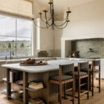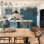
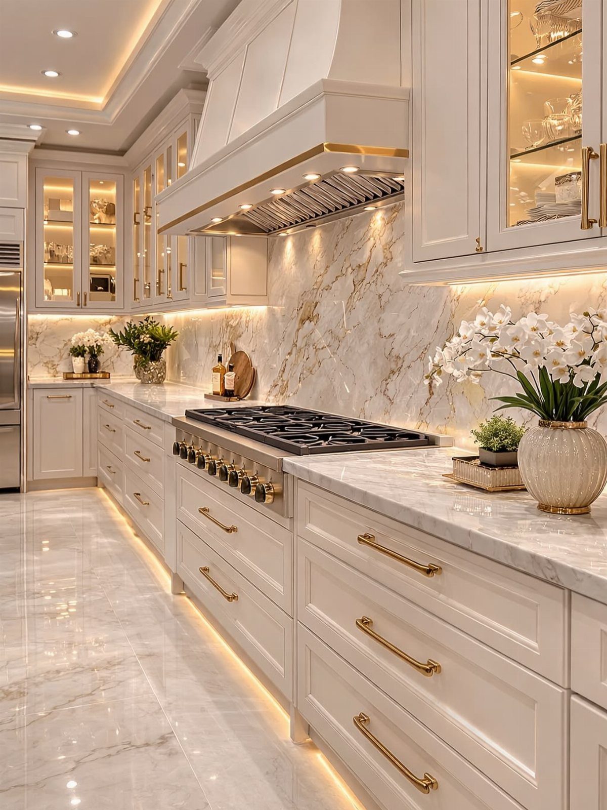
Modern kitchens run from open-plan layouts that borrow space from the rest of the house to two-tone cabinetry that breaks up a long wall without adding pattern.
The choice comes down to how you use the space, how much storage you actually need, and whether the room gets enough light to handle darker finishes.
Waterfall countertops wrap stone down the side of an island with a mitered seam, handleless cabinets open with push latches or recessed grips cut into the edge, and pull-out pantry shelves bring jars forward in a narrow gap beside the stove.
1. Open-Plan Kitchen Layout
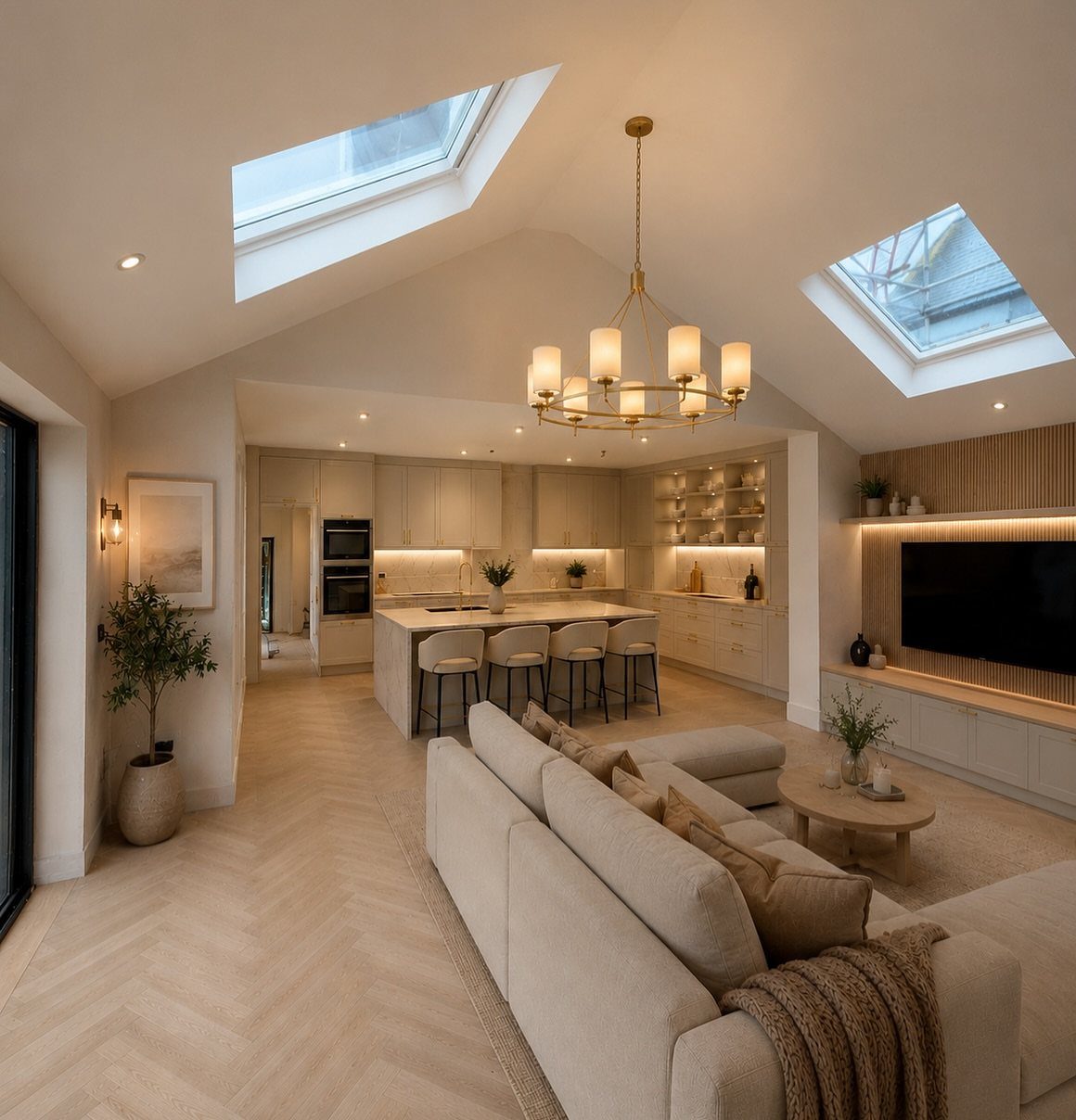
An open-plan layout puts the kitchen in the same room as the dining table or living area, so cooking and conversation happen in one space.
This suits anyone who wants the kitchen to feel less isolated, whether you’re feeding a family or hosting friends.
The visible ceiling height and natural light make the layout feel generous, but even a modest footprint benefits when the wall between rooms comes down. The trade is noise.
Cooking sounds travel, and so do smells. A strong range hood helps, as does good ventilation.
If the kitchen sits against one wall, keep the floor material consistent across both zones so the space reads as one room.
2. Open Shelving
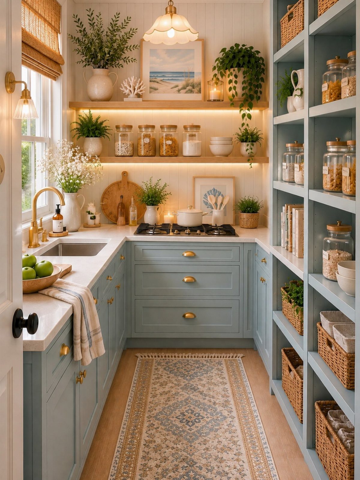
Open shelves replace or supplement wall cabinets, putting dishes, jars, or cookware on display and within arm’s reach.
This works best when you actually use what sits on them. A shelf that holds everyday plates and glasses is more practical than one that holds decorative objects you never touch.
The visible under-shelf lighting is worth adding if the shelves sit above a counter or prep zone.
It brightens the work surface and shows off whatever you store. Wood shelves add warmth, but they need sealing if they sit near steam or splatter.
The downside is maintenance. Open shelves collect dust and grease faster than closed cabinets, so plan to wipe them down weekly.
3. Wood and Stone Accents
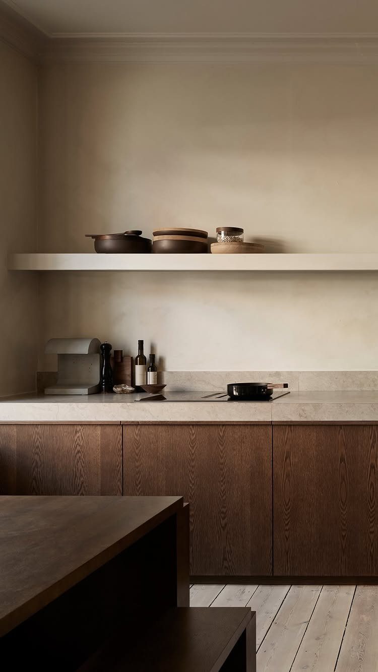
Pairing wood cabinets with stone countertops brings texture and contrast into a modern kitchen without adding color or pattern. The combination works because the 2 materials balance each other: wood softens the space, stone keeps it clean-lined.
Dark wood like the visible base cabinets reads formal and grounds the room.
Light stone on top lifts the overall tone and reflects more light, which matters in kitchens without a lot of windows. The floating shelf repeats the stone finish, which ties the wall and counter together.
This approach suits anyone who wants a modern kitchen to feel warm instead of clinical. Keep hardware minimal so the materials stay the focus.
When in doubt, lean into a black, white, and wood color scheme for your modern kitchen. Here, ATX Interior Design creates beautiful contrast with a black island underside (complete with sleek black chairs), white cabinetry and backsplash, and wooden floors and shelving.
— Yahoo
4. Statement Kitchen Islands
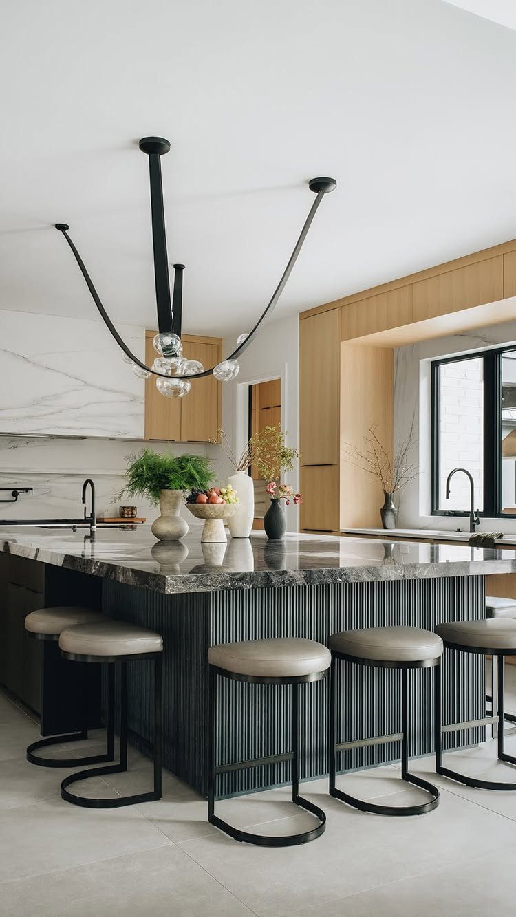
A statement island uses shape, material, or finish to separate itself visually from the surrounding cabinetry.
The visible fluted panel and marble top do both. The island becomes the room’s focal point, and because it sits in the center, every angle shows it off.
This suits kitchens with enough floor space to let the island breathe.
If the room is tight, a simpler island with good storage does more useful work. The visible barstools add seating, which turns the island into a casual dining spot or a place to sit while someone cooks.
Budget for material and labor. Fluted panels take more time to install than flat fronts, and stone slabs with veining like this cost more per square foot than solid-color quartz.
5. Minimalist Design
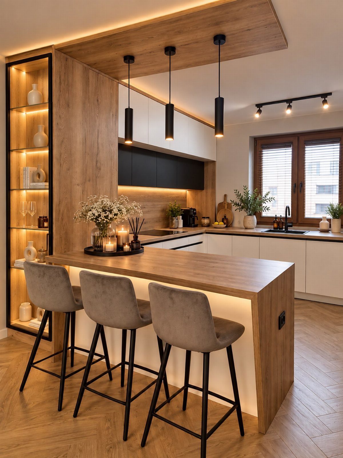
Minimalist design strips the kitchen down to what you need and leaves out the rest.
Cabinets sit flush, hardware disappears or never appears, and surfaces stay clear between uses. The visible light wood and integrated lighting keep the look warm without adding clutter.
Fewer visible details mean fewer places for dust and grease to collect.
The trade is storage discipline. If counters stay clear, everything you own has to fit inside the cabinets, which means you either pare down or plan more storage than you think you need.
The visible island adds seating without breaking the clean lines, and the grey barstools stay neutral enough to blend in.
6. Neutral Kitchen Palette
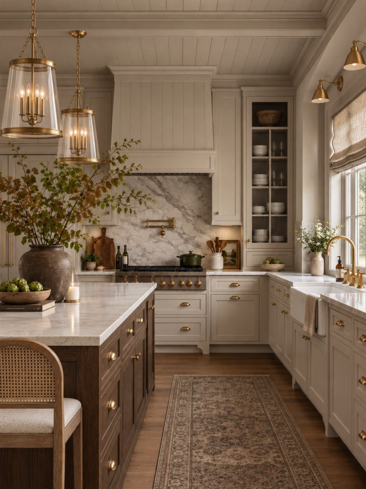
A neutral palette builds the kitchen around beige, cream, grey, or soft white, with little to no strong color.
The visible wood island and gold lighting add warmth without shifting the overall tone. This approach suits anyone who wants the kitchen to feel finished but not bold, and it pairs easily with adjacent rooms when the finishes flow through.
Neutral does not mean boring if you vary the materials.
The visible marble has natural veining, the cabinets have a matte finish, and the wood grain adds texture. All 3 read as neutral, but the room holds interest because each surface looks different.
This palette ages well. Trends change faster than cabinets do, and neutral finishes stay current longer than saturated color.
7. Hidden Appliances
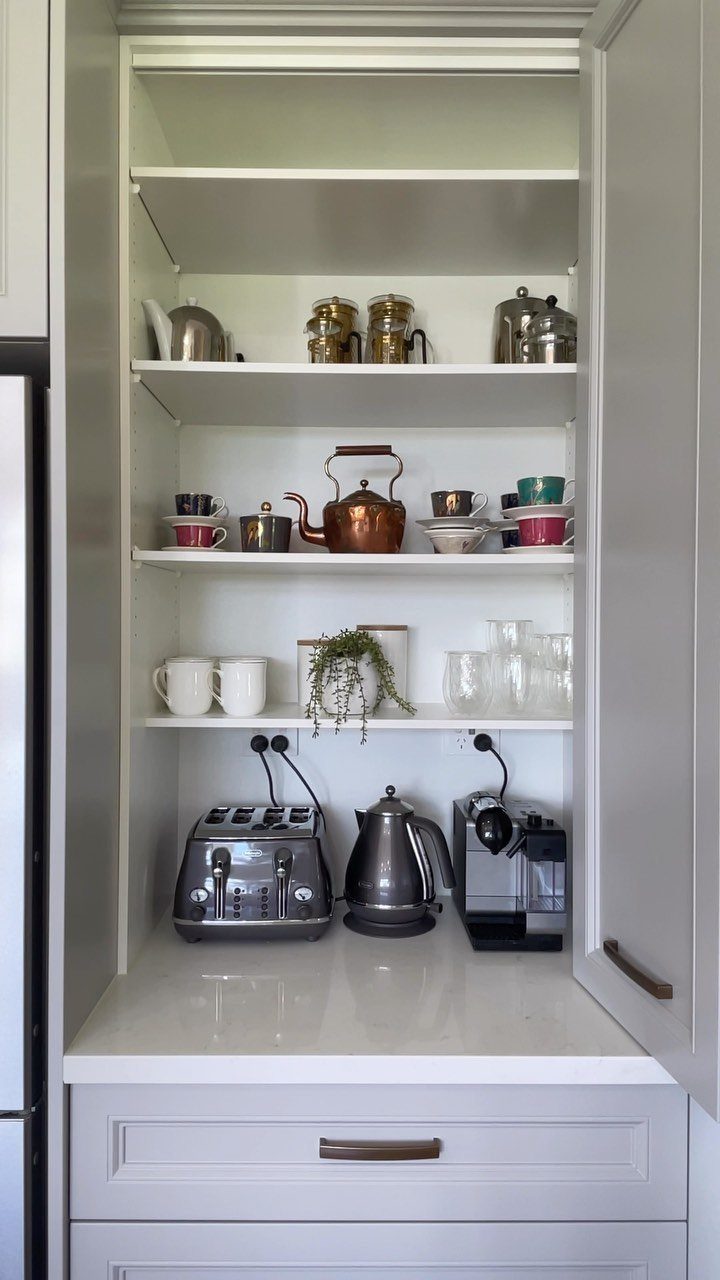
Appliances tucked behind cabinet doors clear the counter and keep the kitchen looking finished between uses.
The cabinet holds a toaster, kettle, and coffee machine on a pull-out shelf that brings everything forward when you need it and tucks it away when you don’t.
It’s ideal for small appliances you use daily but don’t want on display. The cabinet needs an outlet inside, and if you’re running a toaster or kettle, leave the door open while they’re hot.
The pull-out shelf is the detail that matters. Without it, reaching into a deep cabinet every morning gets old fast.
8. Quartz Countertops
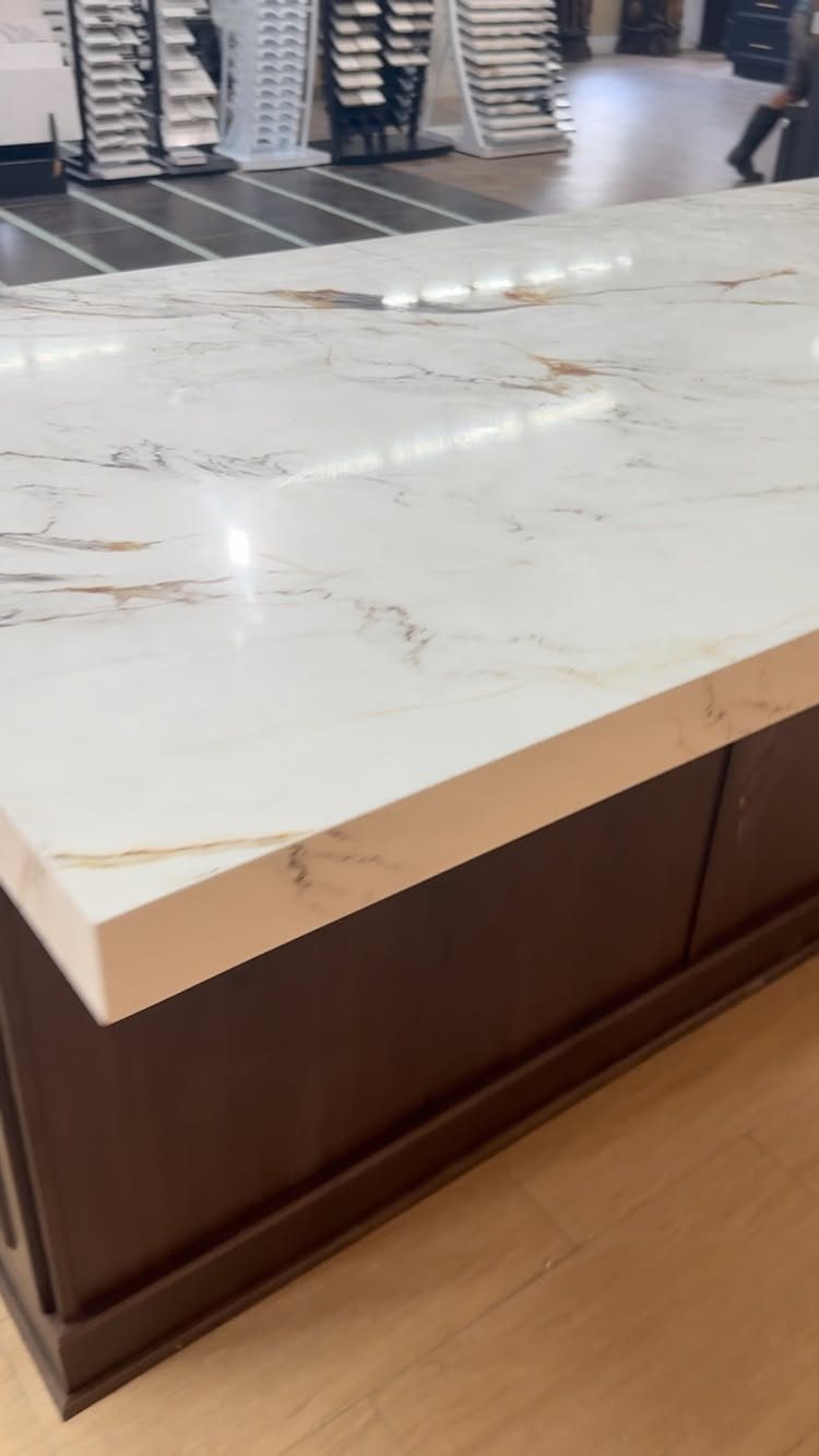
Quartz countertops resist staining and scratching better than natural stone, and they don’t need sealing. The visible white slab has gold and grey veining that mimics marble but holds up to daily use without the maintenance.
Quartz comes in slabs, so seams will show if your counter is long. The visible dark cabinets keep the light countertop from washing out the room, and the veining adds movement without pattern that repeats.
This material costs less than marble and more than laminate, but the durability closes the gap over time.
9. Bold Backsplashes
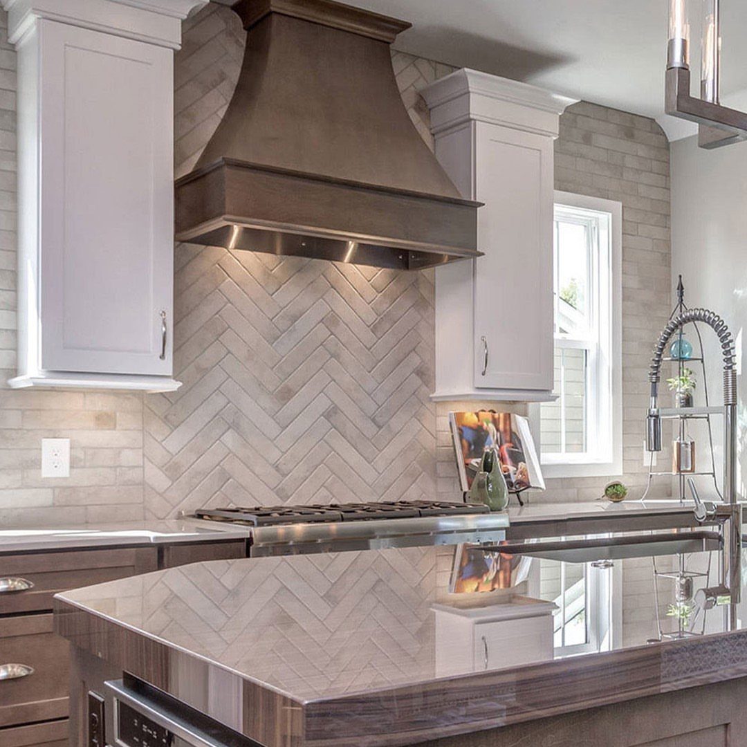
A backsplash with pattern or texture pulls attention and gives the kitchen a finish that paint alone can’t. The visible herringbone tile in grey sits between white cabinets and a polished counter, so the pattern reads clearly without competing.
Herringbone takes longer to install than straight-set tile because every piece is angled, which adds labor cost.
Grout lines show dirt faster on a backsplash than on a floor, so seal them after installation and wipe the wall down after cooking anything that splatters.
If the rest of the kitchen is neutral, the backsplash can carry more pattern or color than you’d use anywhere else.
10. Two-Tone Cabinetry
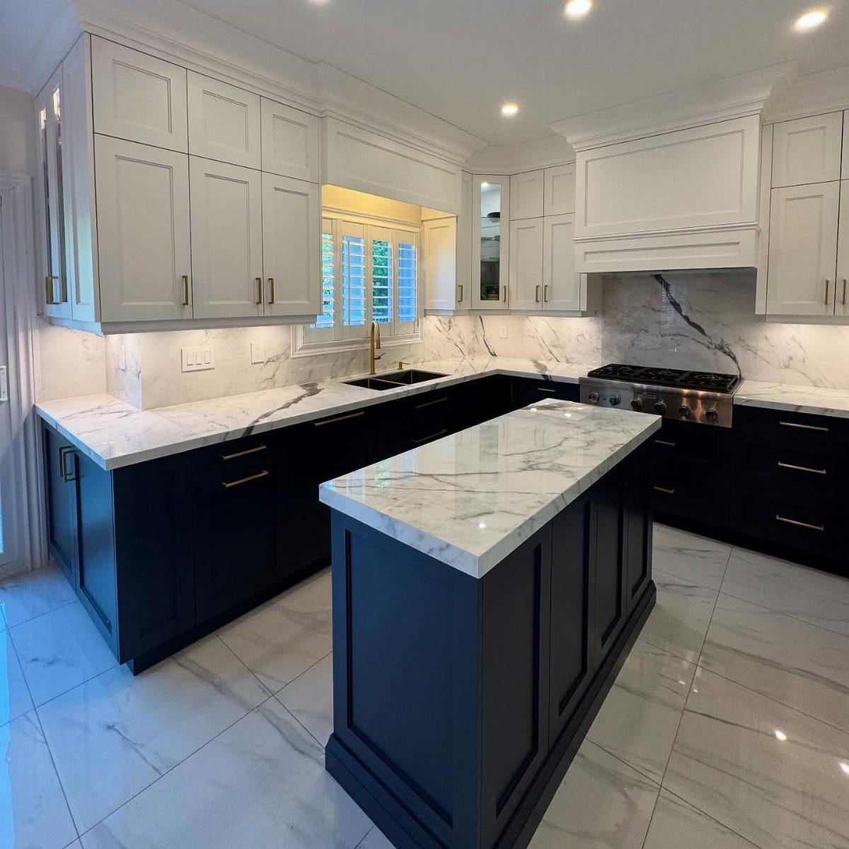
Splitting cabinet colors between upper and lower runs adds contrast without paint on the walls. The visible navy lower cabinets and island anchor the room, while the white uppers keep the space from feeling too dark.
This approach works especially well when the ceiling is low or the room doesn’t get much natural light, because the lighter upper cabinets lift the eye. The visible white marble countertop bridges both colors and keeps the transition smooth.
If you’re repainting existing cabinets, start with the darker color on the lowers.
11. Minimalist White Kitchen
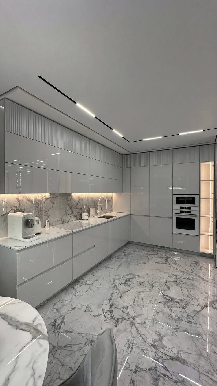
White cabinets, white countertops, and white walls create a kitchen that feels open and reflects light from every surface.
The visible glossy finish on the cabinets adds depth without color, and the marble floor brings in subtle veining that keeps the room from feeling flat.
This look suits small kitchens or spaces with limited windows, because white bounces whatever light comes in.
The trade is upkeep. Glossy white shows fingerprints and smudges faster than matte or darker finishes, so plan to wipe down cabinet fronts regularly.
The visible built-in ovens and coffee machine keep the wall unbroken, which is part of what makes the minimalist approach work.
12. Pull-Out Pantry Shelves
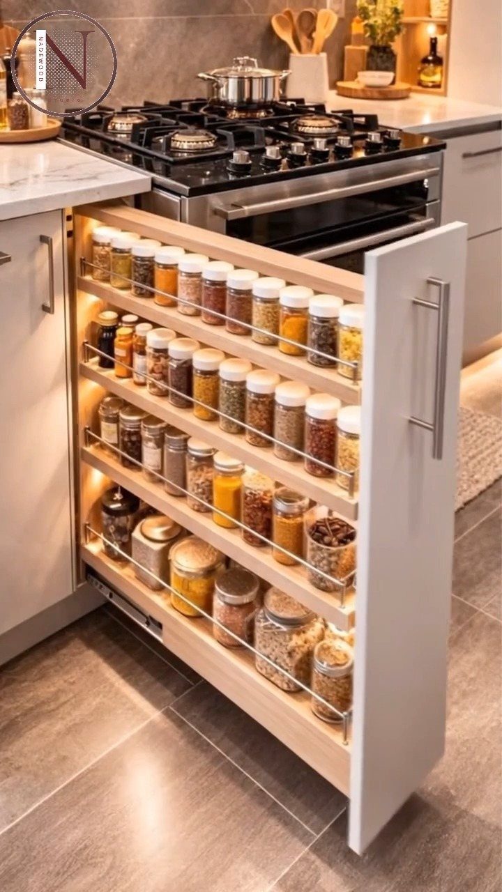
Pull-out shelves bring pantry contents forward so you can see what you have without reaching into a deep cabinet. The visible spice rack pulls out beside the stove, which keeps jars within arm’s reach while you cook.
It’s ideal for narrow cabinets where depth is the problem. A pull-out shelf fits in a narrow gap, and visible lighting on each tier makes labels easier to read in a dim corner.
If you’re retrofitting an existing cabinet, measure the interior width before ordering hardware. Most pull-out systems need at least half an inch of clearance on each side.
13. Handleless Cabinets
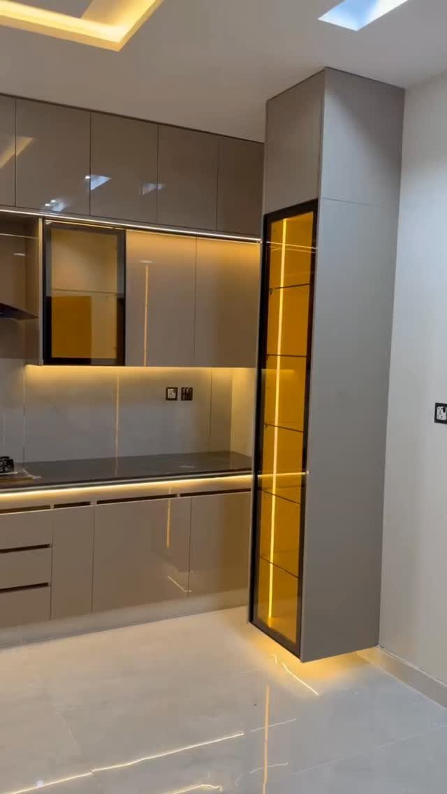
Cabinets without handles open with a push latch or a recessed grip along the top or bottom edge.
The visible taupe fronts stay smooth because there’s nothing to break the line, which suits anyone who wants a sleek look and fewer places for dust to settle.
Push latches cost less than recessed pulls, but they need adjustment over time as the mechanism loosens.
A recessed grip cut into the edge costs more to install because it requires precise routing, but it holds up better and never needs realignment.
The vertical display cabinet with yellow lighting becomes a focal point when the surrounding wall stays flat and handleless.
14. Modern Lighting
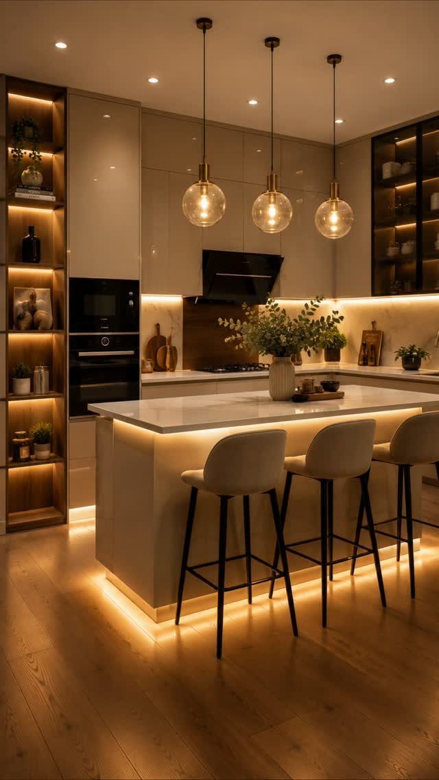
Layered lighting uses different sources at different heights to control how the kitchen looks and functions after dark.
The visible globe pendants light the island, under-cabinet strips brighten the counter for prep work, and the illuminated shelves add a glow that fills in shadows without adding fixtures.
Pendants over an island need enough clearance to light the surface without blocking sightlines. Under-cabinet lighting works best with LED strips, which run cool and last longer than puck lights.
If the kitchen opens to another room, dimmers on each circuit let you adjust the mood without turning everything off.
15. Waterfall Countertops
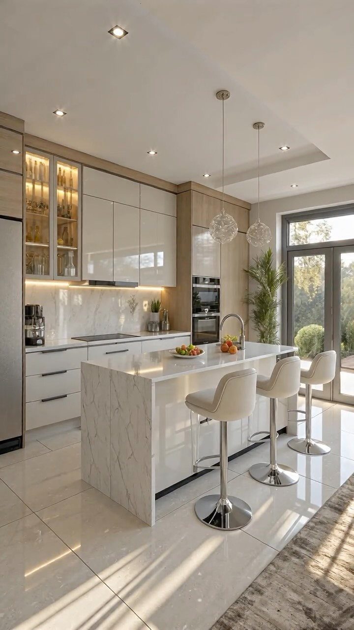
A waterfall edge wraps the countertop material down one or both sides of the island, so the slab turns the corner and meets the floor.
The visible white marble runs vertically along the end, which gives the island a finished look and shows off the veining in a way a flat top can’t.
This detail adds material cost because you’re using more slab, and it adds labor because the mitered seam has to line up perfectly. Quartz and marble both work, but the thicker the slab, the more the edge will weigh.
Waterfall edges suit islands that sit in the middle of the room where every side is visible. If the island backs up to a wall, the extra cost doesn’t show.
16. Kitchen Island Seating
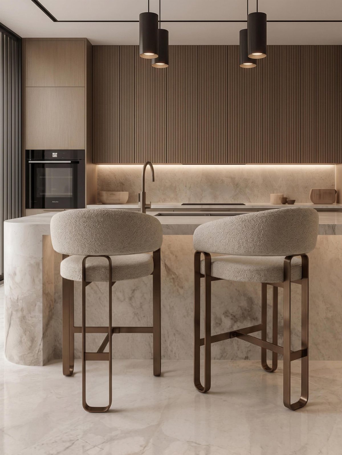
An overhang on one side of the island creates room for stools and turns the surface into a place to sit.
The visible beige stools with bronze frames add seating without a separate table, which suits small kitchens or anyone who wants a casual spot for breakfast or conversation while someone cooks.
The overhang needs enough depth for knee clearance, and going deeper makes the seating more comfortable. Stools need to sit low enough that your knees clear the counter and your feet reach the footrest.
If the island includes a cooktop or sink, seat people on the opposite side so they’re not in the way.
17. Exposed Brick and Metal Shelving
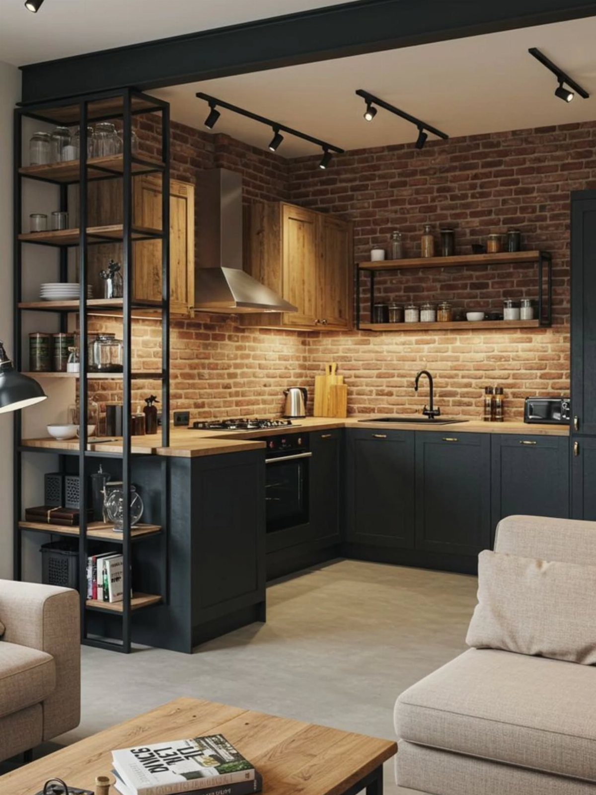
Brick left exposed and paired with metal shelving brings industrial texture into a modern kitchen.
The visible red brick wall and black metal shelves add roughness that contrasts with the smooth dark cabinets and wood countertop, which keeps the room from feeling too polished.
Metal shelving mounts directly to brick with masonry anchors, but the wall has to be plumb or the shelves will tilt. Brick absorbs moisture, so seal it if the wall sits near a sink or stove.
This combination suits open-plan kitchens where the brick wall is already in place. Adding faux brick is more work than it’s worth.
18. Warm Wood Accents
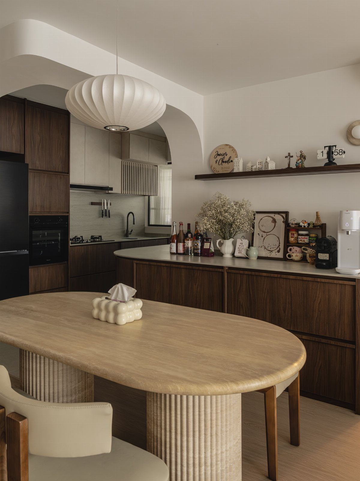
Wood cabinets, shelves, or furniture warm up a modern kitchen that might otherwise feel too stark.
The visible dark wood lower cabinets and oval wood table bring grain and tone into a space with light countertops and neutral walls, so the room reads as inviting instead of clinical.
Dark wood grounds the room and works best when the upper cabinets or walls stay light.
Light wood lifts the space and pairs well with white or grey finishes. Either way, the wood should have a matte or satin finish, because high gloss looks dated.
If the kitchen opens to a dining or living area, repeating the same wood tone in both spaces ties them together.
19. Classic Cabinetry with Modern Features
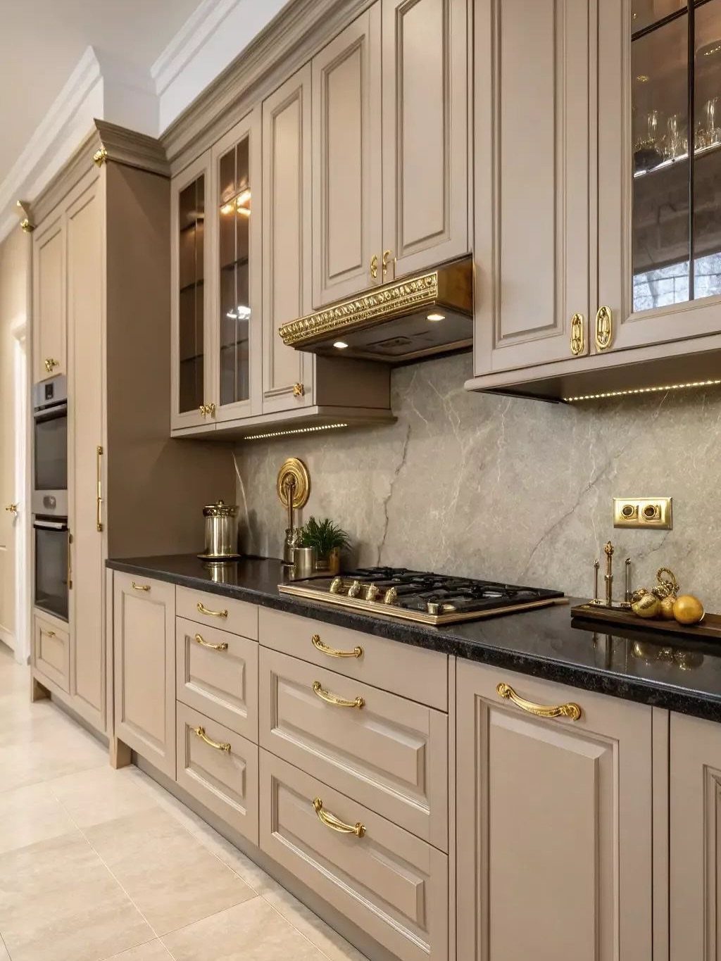
Shaker-style cabinets with inset panels and traditional proportions hold their look when you pair them with modern finishes instead of rustic hardware.
The visible beige cabinets use gold pulls and knobs, which read contemporary against the black countertop and grey marble backsplash.
The built-in oven and gas cooktop keep the wall clean, and the black counter anchors the lighter cabinet color without introducing a third tone.
If you’re keeping existing cabinets, swapping the hardware and countertop can shift the whole room without a full remodel.
20. Bright Kitchen with Large Windows
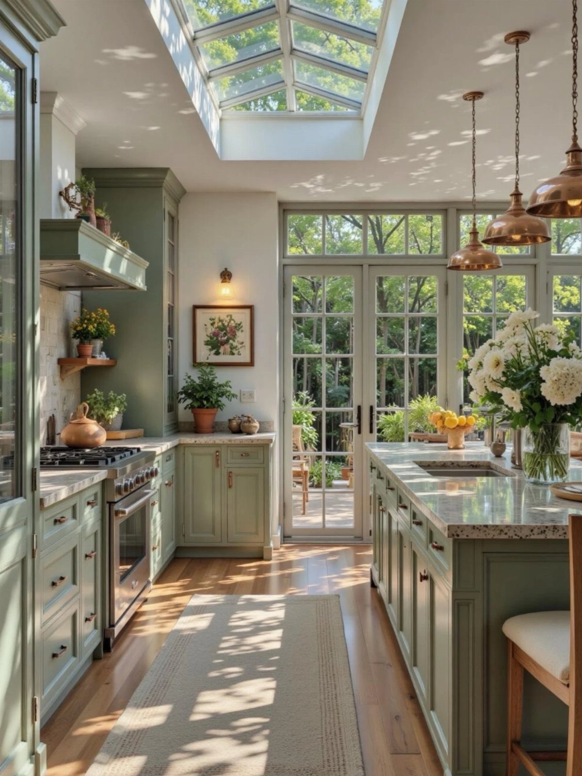
Large windows and skylights bring in daylight that makes the kitchen feel larger than its square footage.
The visible skylight floods the center of the room with overhead light, and the glass doors extend the sightline to the yard, which keeps the space from feeling enclosed.
Light finishes amplify the effect. The sage green cabinets and wood floor reflect daylight without darkening the room, and the copper pendant lights over the island add warmth without blocking the light path.
This setup works best when the kitchen backs onto a yard or patio. If the windows face a neighboring wall, sheer blinds soften the view without cutting the light.
Planning for Space and Use
Counter depth matters more than most layouts acknowledge.
If the island or main prep surface is too shallow, chopping and assembly work crowd the edge. Deeper counters let you set a cutting board, bowl, and ingredients side by side without pushing anything back toward the wall.
Wall-mounted racks and pull-out shelves do more than add storage. They bring what you need into reach without bending or digging, which speeds up cooking and keeps the counter clear between meals.
Extendable tables work in tight spaces when you need occasional seating but can’t give up floor area to a fixed piece.
Shaker cabinets and built-in nooks fit small kitchens because they use wall and corner space that open shelving wastes. If the room is compact, storage that hides inside the walls keeps the floor plan open.
Modern Design and Home Value
Clean lines and durable finishes hold their appeal longer than trend-driven details, which matters if you plan to sell. Buyers notice countertops first, and materials like quartz or stone read as quality without requiring explanation.
High-end finishes attract attention, but they also raise expectations for the rest of the house. If the kitchen is polished and the bathrooms are not, the contrast works against you.
A modern kitchen that functions well day to day is easier to show than one designed only to photograph.
Buyers walk through and picture themselves cooking, and a layout that supports that routine closes the gap between interest and an offer.
Frequently Asked Questions
How do I design my new kitchen?
Start by deciding whether you want the kitchen open to the dining or living area, which makes the space feel less isolated but sends noise and smells into the next room.
Pick materials that balance each other, like wood cabinets with stone countertops, and keep the palette neutral so the finishes age well.
Plan deeper counters than you think you need so prep work doesn’t crowd the edge, and add pull-out shelves or wall-mounted racks to bring what you use into reach without digging.
What are the latest trends in kitchens?
Right now most of the requests I get are for layouts that open directly into the dining or living space, which keeps the cook from working in a separate room.
Two-tone cabinetry, handleless fronts, and neutral palettes with warm wood accents also show up frequently. Statement islands with bold materials and waterfall edges are gaining traction in kitchens with enough floor space to let them breathe.
What are the basic kitchen layouts?
When the kitchen shares the floor plane with the living or dining furniture, the whole level feels larger and more fluid.
Islands in the center add seating and prep surface, while pull-out pantry shelves and wall-mounted storage make tight corners more useful.
How do you update your kitchen while staying on budget?
Repaint existing cabinets in a neutral shade and swap the hardware to shift the look without replacing the boxes. Change the countertop or backsplash to add contrast, or use removable peel-and-stick tile if you rent.
If you’re keeping the same cabinets, darker paint on the lowers and lighter color on the uppers adds depth for less than a full remodel.
How to modernize any kitchen?
Use a neutral palette with minimal hardware and keep counters clear between uses so the space looks finished instead of cluttered.
Add natural light with larger windows or skylights if you can, or use light finishes and glossy surfaces to reflect what light you have.
Pair smooth cabinets with warm wood accents or stone countertops to keep the room from feeling clinical.