Matte finishes on KitchenAid mixers span neutrals like black and almond cream, pastels including light blue and pink, and deeper tones such as olive green and fog blue, each reading differently under kitchen lighting and against existing counters.
The right color depends on whether the mixer stays visible permanently or gets stored between uses, because finishes that photograph well may not hold up to daily scrutiny on open shelving.
Capacity separates the 5-quart Artisan, which handles 9 dozen cookies in one batch, from the 3.5-quart Mini that maxes out at 5 dozen and suits tighter counters.
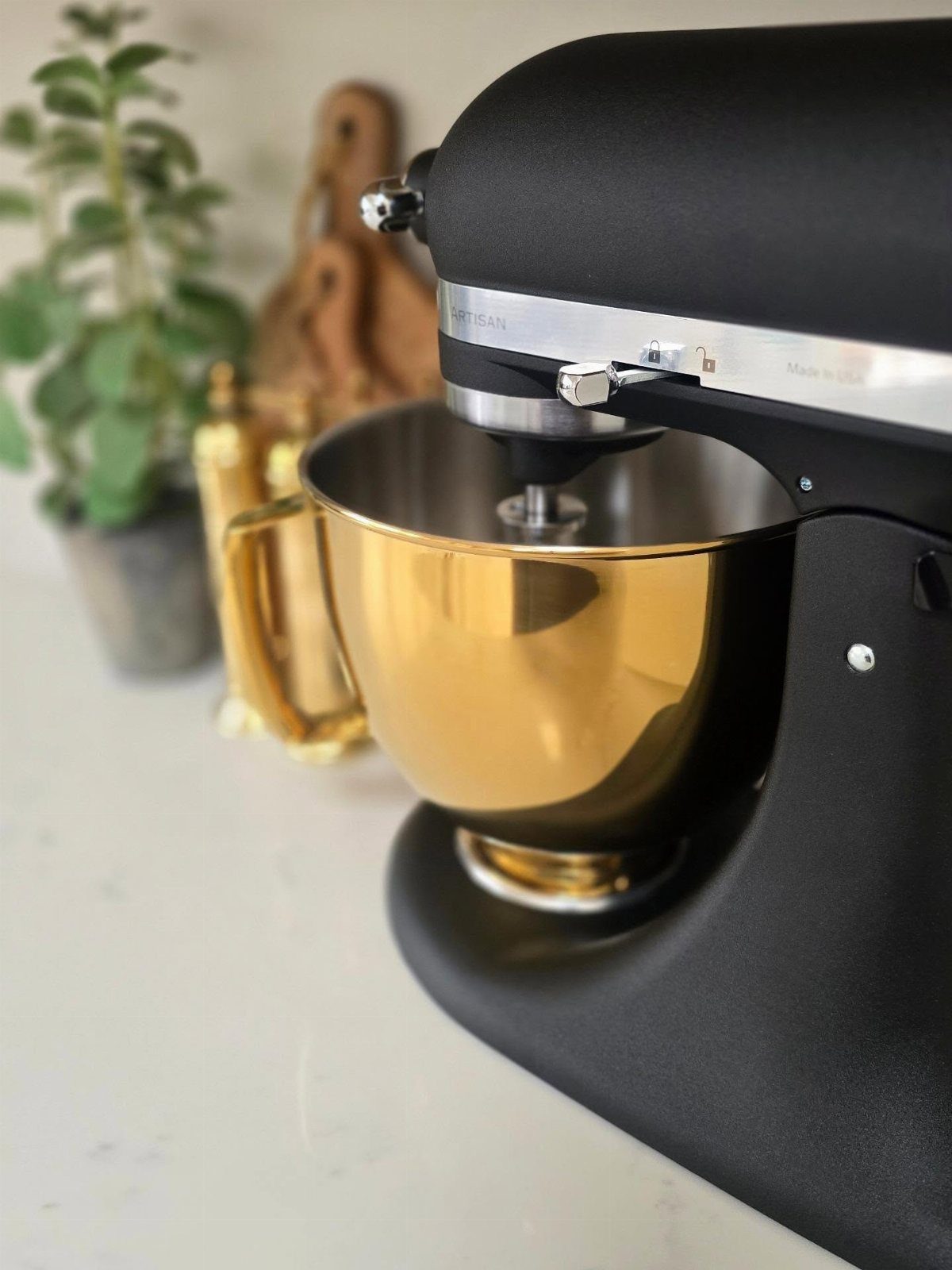
1. Matte Black Mixer
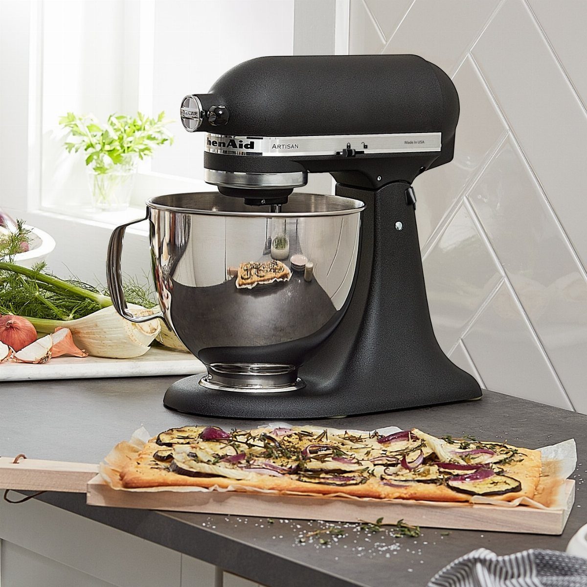
Matte black finishes on stand mixers look sharp against lighter counters and disappear into darker kitchens without turning into a focal point.
The color hides fingerprints better than polished metal, which matters if the mixer sits out permanently. I usually pair it with a stainless steel bowl for contrast or a matching black ceramic bowl if I want everything to match.
Matte black works in nearly any kitchen style, from modern to farmhouse, because the finish reads neutral rather than trendy.
2. Matte Pink Mixer
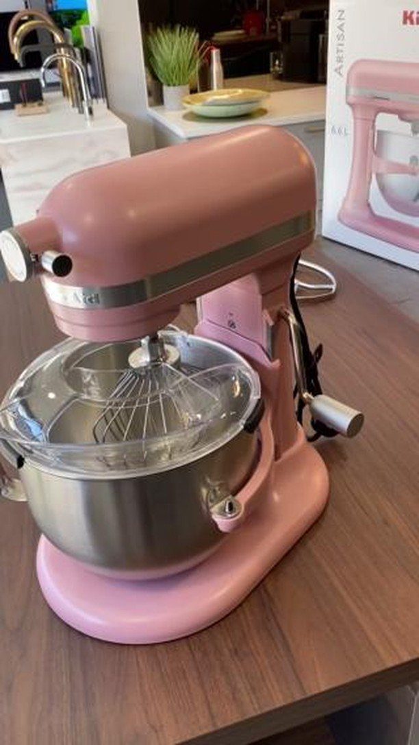
A matte pink mixer brings color without leaning too bright or juvenile, especially in kitchens with warm wood tones or white tile.
The stainless steel bowl adds weight so the whole setup doesn’t read too soft. I find this finish works best in smaller kitchens where the mixer becomes part of the design rather than an accent that fights for attention.
If pink feels too bold for your space, it still photographs well enough that you can tuck it away between uses without missing it on the counter.
3. Matte Olive Green Mixer
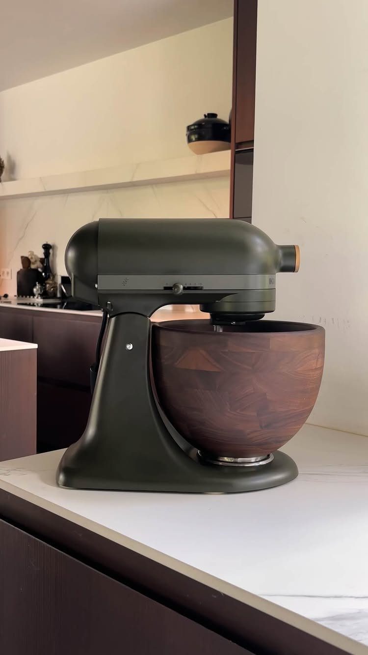
Pairing an olive green mixer with a dark wood bowl adds warmth that a stainless steel bowl would flatten. The wood softens the industrial side of the machine and ties it into kitchens with natural textures or darker cabinetry.
I like this combination when the mixer stays visible, because the wood bowl turns it into something worth looking at rather than just appliance storage.
If you go this route, know that wood bowls need hand washing and oiling, so they add a maintenance step that metal does not.
4. Fresh Linen Copper Bowl
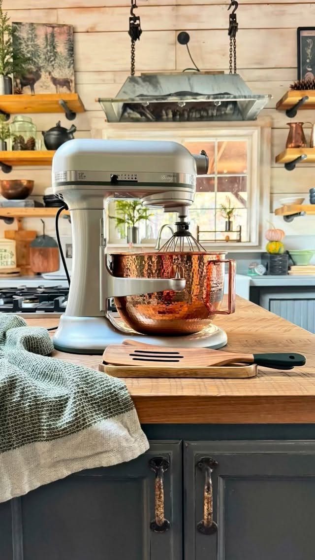
A hammered copper bowl paired with a cream matte mixer gives you 2 finishes that age visibly instead of looking worn.
The copper develops a patina over time, and the cream stays soft against wood counters or rustic walls. I choose this setup when the kitchen leans traditional or farmhouse and the mixer lives on the counter full-time.
The copper bowl costs more than stainless and requires polishing if you want to keep the shine, but the look justifies the upkeep in the right setting.
5. Matte Fog Blue Mixer
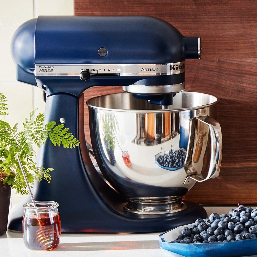
This grey-toned blue reads cooler and quieter than brighter blues, which makes it easier to live with long-term. The Artisan size fits most counter depths without crowding prep space, and the stainless bowl keeps the palette simple.
I find this color works in kitchens where you want personality without committing to something bold. It pairs well with white or light wood and does not clash with stainless appliances the way warmer colors sometimes do.
6. Matte Black Mixer with Kettle and Wood Countertops
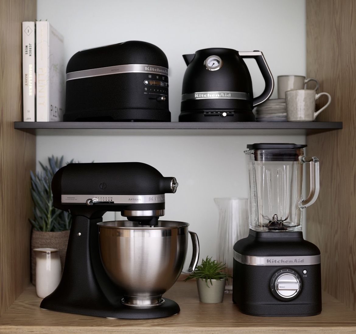
Matching your mixer to a kettle, toaster, or blender in matte black creates a cohesive appliance lineup that feels deliberate instead of collected over time.
The look works especially well on open wood shelving where everything stays visible. I recommend this approach when your counters are tight and you need appliances to feel like part of the design rather than clutter.
The cost is commitment: once you start matching, replacing one piece means finding that finish again or accepting a mismatch.
7. Matte Black Mixer and Whisk on Marble
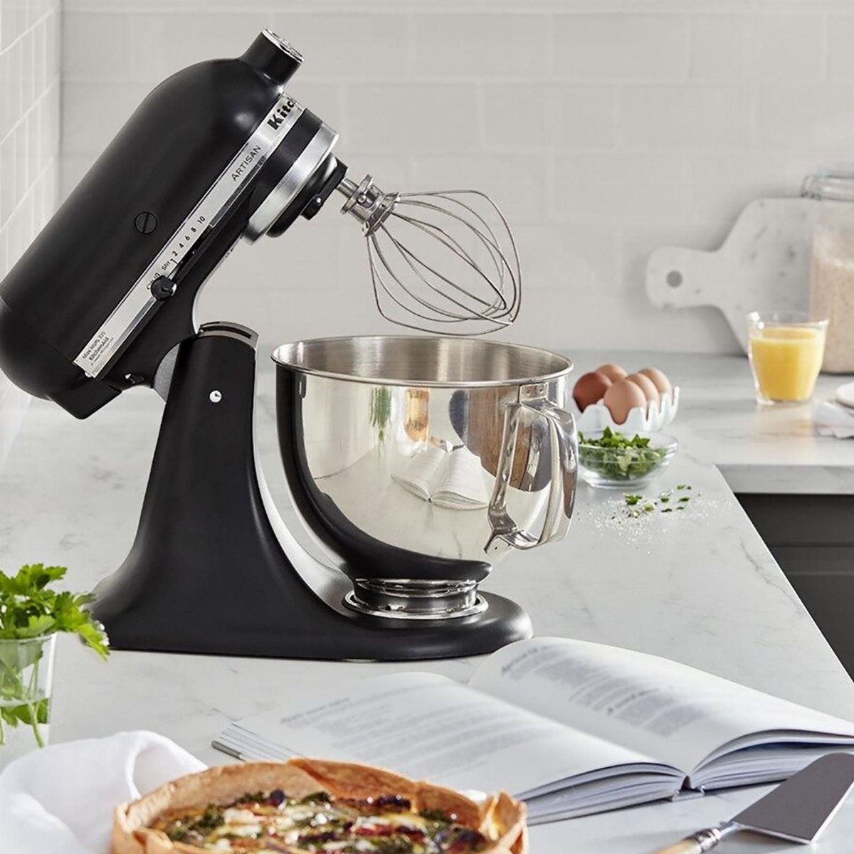
A black mixer on white marble gives you contrast that sharpens the whole setup instead of blending it into the counter.
The dark finish shows less wear than lighter colors, and marble stays cool enough for pastry work if you roll dough directly on it.
I choose this pairing when the mixer lives out permanently and the counter is already white stone. If your marble shows etching easily, consider honed rather than polished, because the matte surface hides marks better.
8. Matte Light Blue Mixer
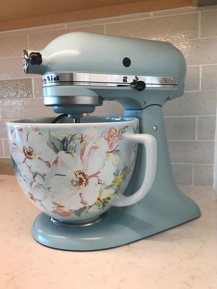
Light blue with a patterned ceramic bowl softens the machine side of a stand mixer and turns it into something you want visible.
The ceramic bowl absorbs less cold than metal, which helps when whipping egg whites to stiff peaks. I use this setup in kitchens where color feels right but bright shades would overwhelm.
The bowl adds cost and weight, and it chips if dropped, so this choice makes sense only if the mixer stays on the counter most of the time.
9. Matte White Peach Bowl
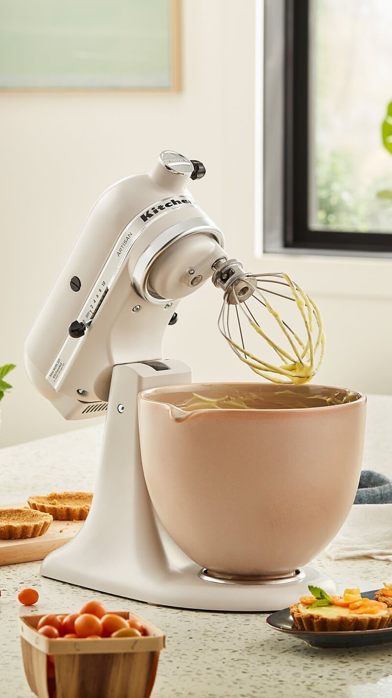
Switching the bowl to a warm peach tone while keeping the body white gives you color without committing the whole appliance to it.
The peach draws attention in a way that white alone does not, and ceramic bowls in warm tones photograph well if you bake for an audience.
I find this balance works when you want personality but prefer the mixer itself to stay neutral. Ceramic costs more than stainless and does not conduct cold, so recipes that rely on chilled bowls need a workaround.
10. Matte Almond Cream Mixer
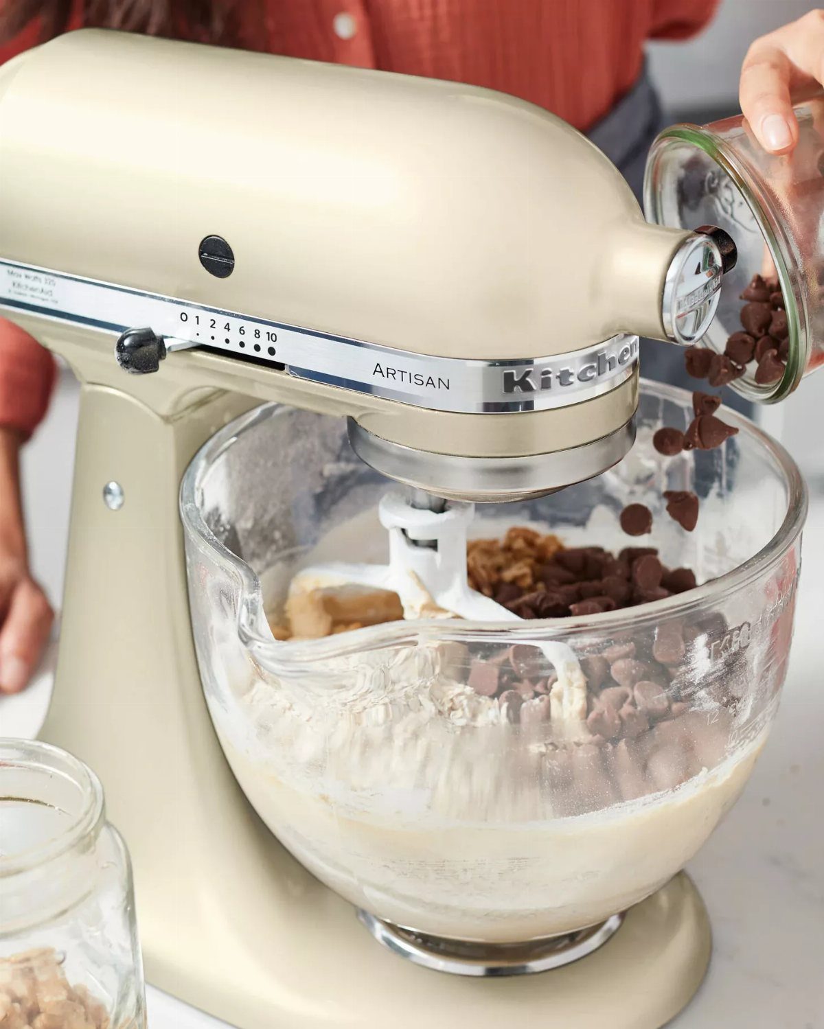
Almond cream reads warmer than true white and pairs cleanly with stainless or white attachments. The glass bowl lets you watch dough or batter from the side, which is useful when you’re judging texture instead of running a timer.
I choose glass when I want to see gluten development in bread dough or check emulsification in mayonnaise without stopping the machine.
Glass is heavier than metal and cracks if it hits tile, so it suits steady counter setups better than tight spaces where things get bumped.
11. Matte Milkshake Mixer
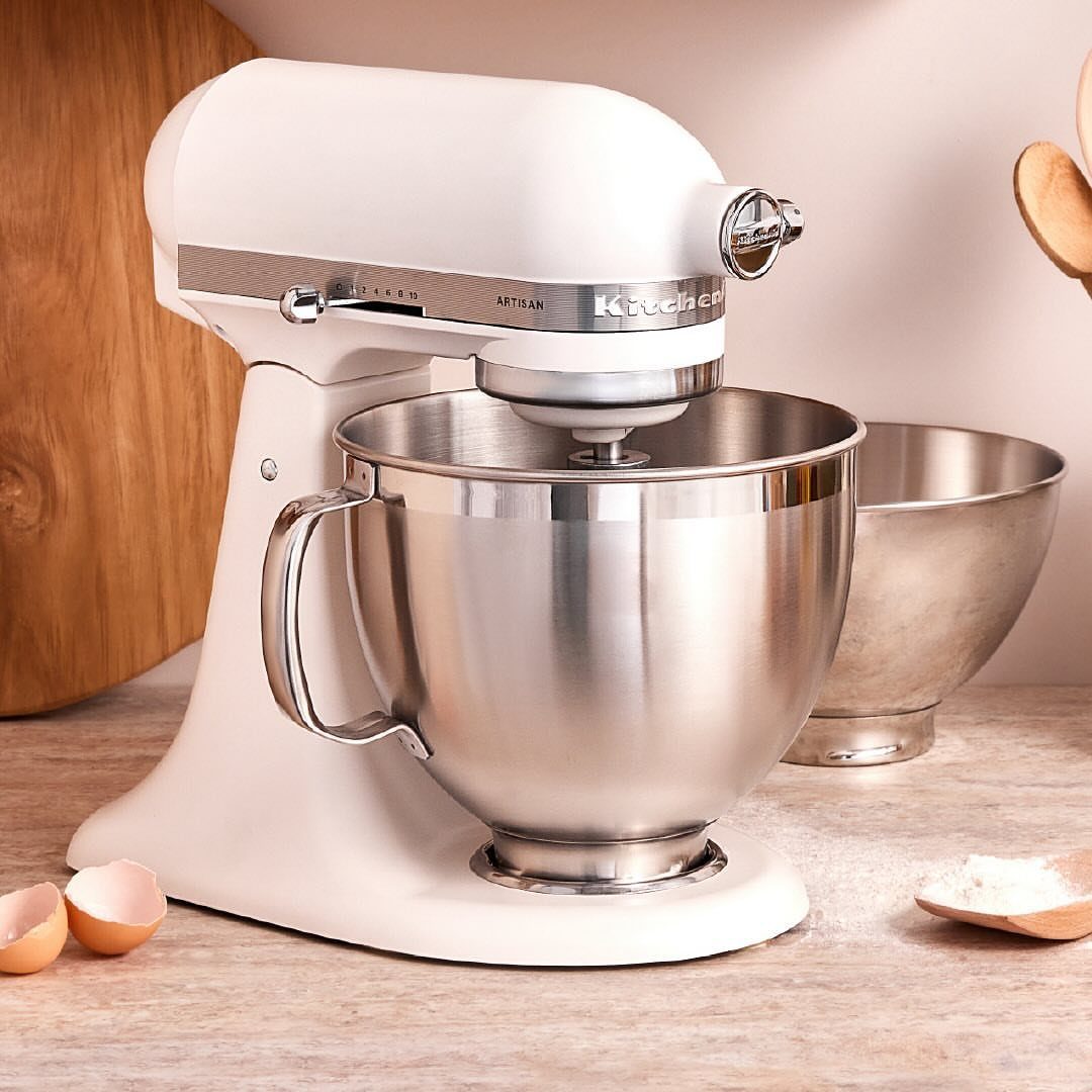
Milkshake sits between white and cream, warm enough to soften stark kitchens but light enough to pair with stainless appliances.
The stainless bowl keeps the whole setup simple and easy to clean. I recommend this color when you want something other than pure white but do not want the mixer to become the room’s focal point.
It works in small kitchens where a darker finish would feel heavy and in open-plan spaces where too much white starts to look clinical.
12. Matte Beige Mixer
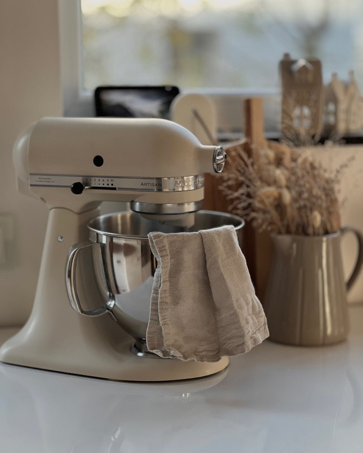
Beige stays quieter than white and works in kitchens where warm wood or natural stone sets the tone.
The stainless bowl keeps cleanup straightforward and does not add visual weight the way ceramic does. I choose this finish when the mixer needs to blend into a neutral palette rather than stand out.
If your counters are dark or your backsplash has color, beige can disappear too much; in that case, a darker matte finish holds its presence better.
13. Porcelain White Mixer
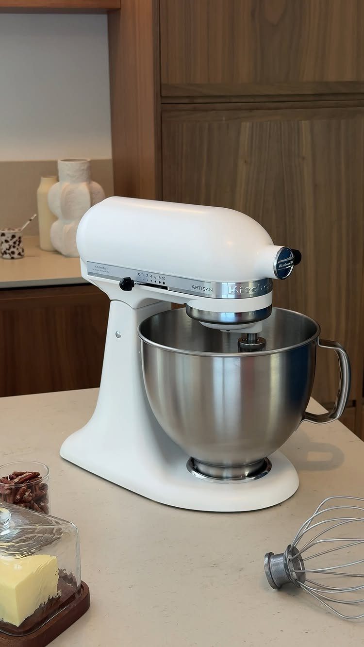
Porcelain white leans warmer than bright white and sits comfortably in kitchens where cream cabinetry or wood tones already set the palette. The stainless bowl keeps maintenance simple and works across most recipes without adding weight or fragility.
I find this finish easiest to place when the space already favors soft neutrals over stark contrast. If your counters or backsplash run cool or grey, porcelain white can look dingy; in that case, pure white holds up better.
14. Matte Black and White Mixer
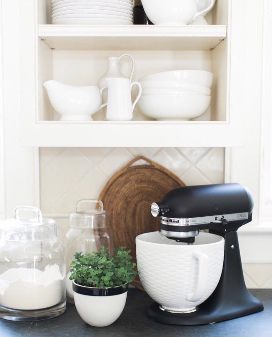
A white ceramic bowl on a black mixer body splits the visual weight and gives you 2 finishes that work separately or together.
The ribbed texture on the bowl adds grip when you pour batter and makes the ceramic feel less slippery in hand.
I choose this setup when I want the mixer to read as furniture rather than equipment. Ceramic adds cost and chips if dropped, so this pairing suits counters where the mixer stays put rather than tight spaces with heavy traffic.
15. Matte Mixer Color Choices
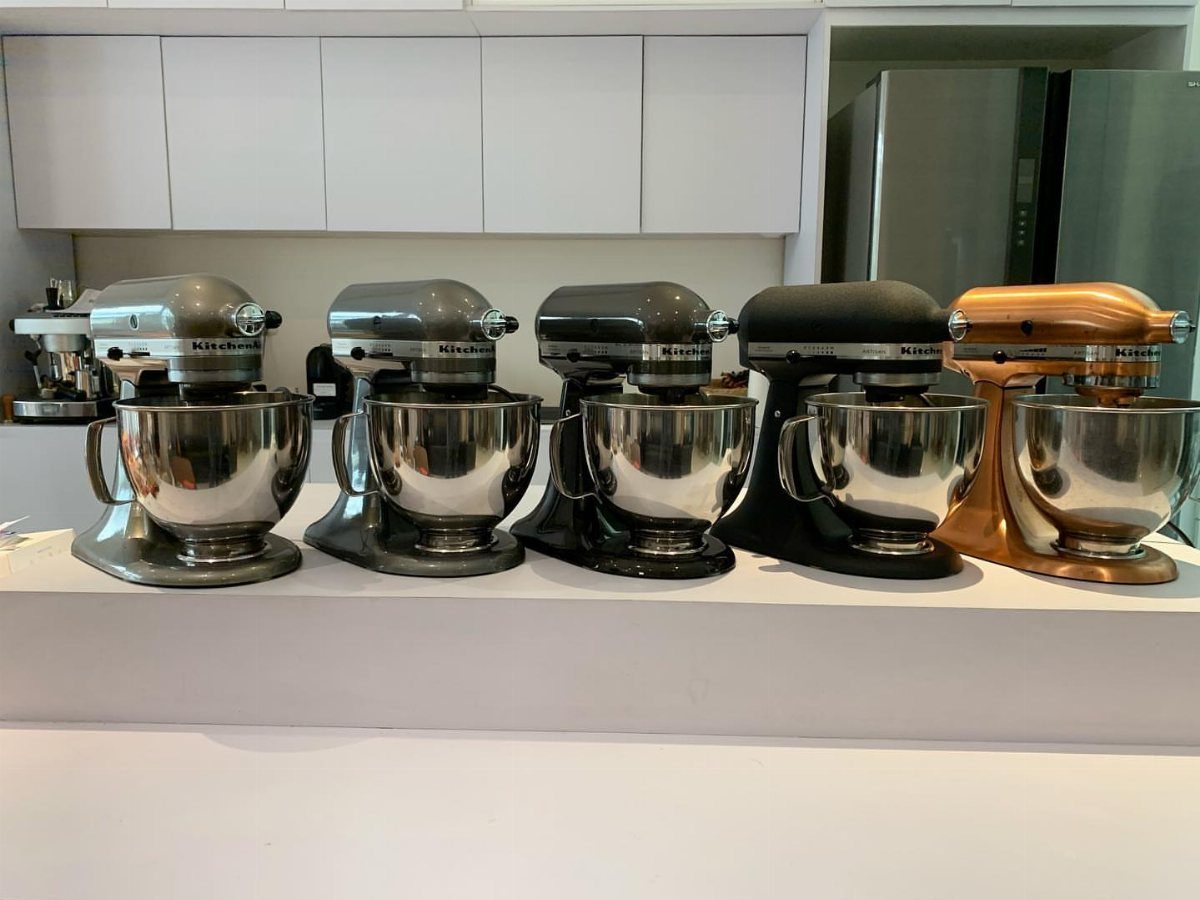
Seeing several colors side by side makes it easier to compare how warm or cool each finish actually reads under your own lighting.
Matte options span neutrals, pastels, and deeper tones, and the range lets you match cabinetry, tile, or simply choose the color you prefer looking at daily.
I recommend gathering samples or viewing mixers in person when possible, because screens shift tone enough that a color can look different once it arrives. If your kitchen palette is still forming, neutrals give you more flexibility later.
16. Matte Light Green Mixer
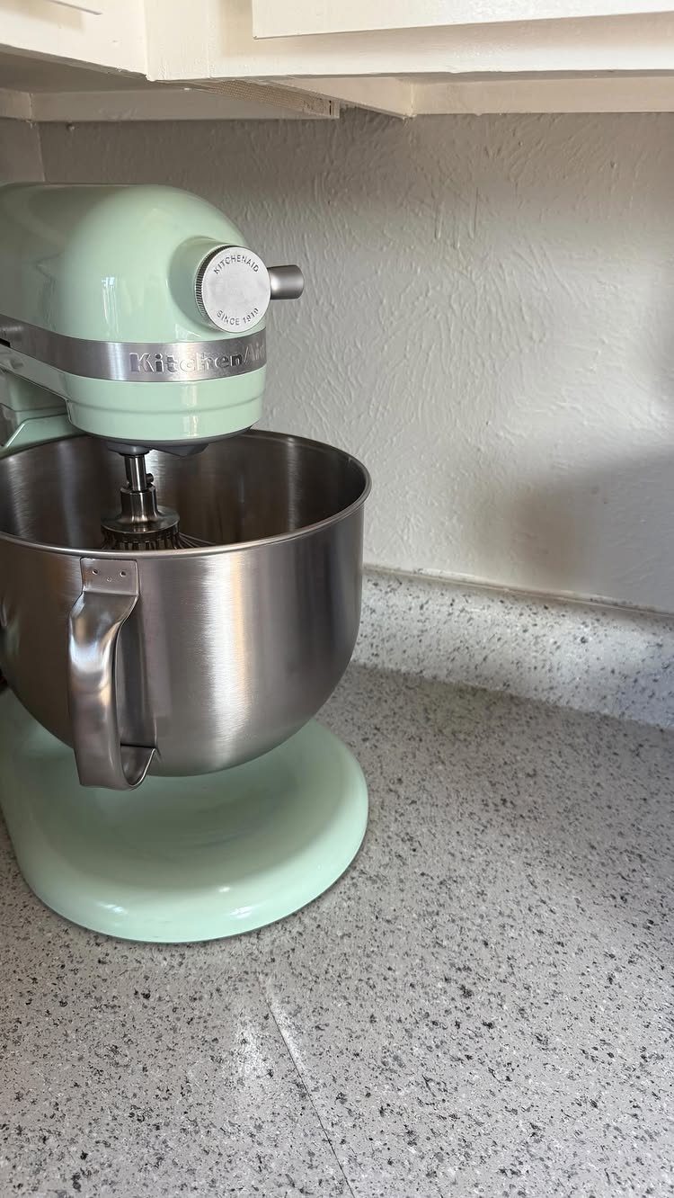
Light green with a stainless bowl sits between mint and sage, soft enough to avoid overwhelming small kitchens but present enough to count as color.
The speckled counter absorbs some of the green’s brightness, which keeps the whole setup from reading too Easter. I find this tone works best in kitchens with white or natural wood where a darker green would feel too heavy.
If your space leans modern or industrial, this pastel can look out of place; a deeper green or a neutral matte holds up better there.
17. Matte Light Blue Mixer
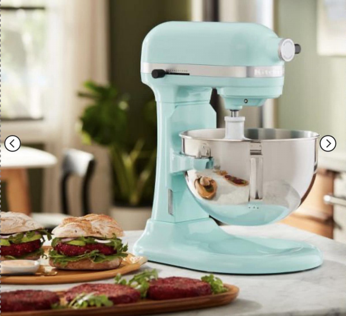
Light blue in matte keeps the machine looking approachable without tipping into toy territory, and the stainless bowl simplifies cleanup when you’re working with sticky dough.
The dough hook attachment shown handles bread, pizza, and pasta dough without overworking the gluten the way a paddle can.
I reach for this color in kitchens where white feels too plain but brighter blues would compete with existing finishes. Stainless bowls chill faster than ceramic, which helps when recipes call for cold ingredients.
Mixer Versatility and Batch Size
The 5-quart Artisan Series handles enough dough or batter for 9 dozen cookies in one batch, which covers most home baking without needing to split recipes. That capacity works when you’re baking for a crowd or want to freeze portions ahead.
The 3.5-quart Mini maxes out at 5 dozen cookies, half the full-size bowl, and fits tighter counters or smaller kitchens where the larger machine would crowd prep space.
I find the Mini sufficient for single households or couples who bake occasionally, but if you regularly double recipes or make bread, the smaller bowl becomes a limitation fast.
Batch size outweighs counter space when the mixer runs weekly, because working in halves adds time every session.
Frequently Asked Questions
What colors are retired from KitchenAid mixers?
KitchenAid retires colors periodically, and older shades like certain reds, yellows, and purples no longer appear in the current lineup.
Matte finishes now include neutrals like black, white, almond cream, and beige alongside softer tones like pink, light blue, and olive green.
What’s the average lifespan of a KitchenAid mixer?
A KitchenAid stand mixer lasts a long time with regular home use, and many run for decades if maintained properly.
The metal housing and motor hold up better than plastic alternatives, which is why the machine justifies the upfront cost when you bake often.