

The right small kitchen cabinets idea depends on how much visual clutter you can live with in the open. Light finishes and full-height runs stretch the room vertically, but open shelving or glass fronts will expose every mismatched mug unless you edit ruthlessly. A six-inch pull-out beside the refrigerator, which most layouts treat as dead space, can hold thirty-two spice jars or six sheet pans depending on how you divide it.
1. Light-Colored Cabinets
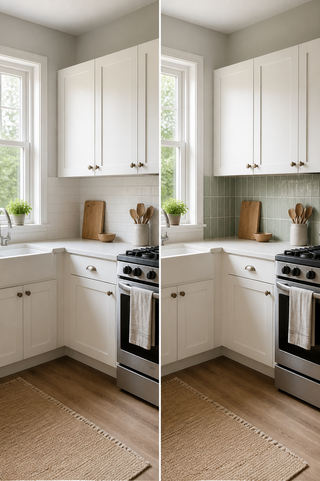
Bright whites, soft grays, and natural wood tones on cabinet faces do the heavy lifting of bouncing light around a room that has no more square footage to give. Dark colors absorb that same light and can push a small kitchen toward cave-like, so use them cautiously, maybe as a toe-kick accent or inside a single glass-front cabinet, not across a full bank where the visual weight lands hard.
Shaker-style simplicity pairs naturally with these lighter palettes. The clean lines and understated profile avoid the busy ornamentation that makes compact spaces feel crowded, letting the eye move across the room without stopping on decorative noise. I noticed this most clearly looking through finished kitchens where the combination of pale paint and flat-panel detail read as intentional rather than apologetic, even in galley layouts under a hundred square feet.
White, cream, or light gray cabinets reflect light and make the space feel airy and open. The effect holds up best when wall colors stay consistent and complementary, reducing contrast that would otherwise chop the room into smaller visual pieces.
2. Full-Height Cabinetry
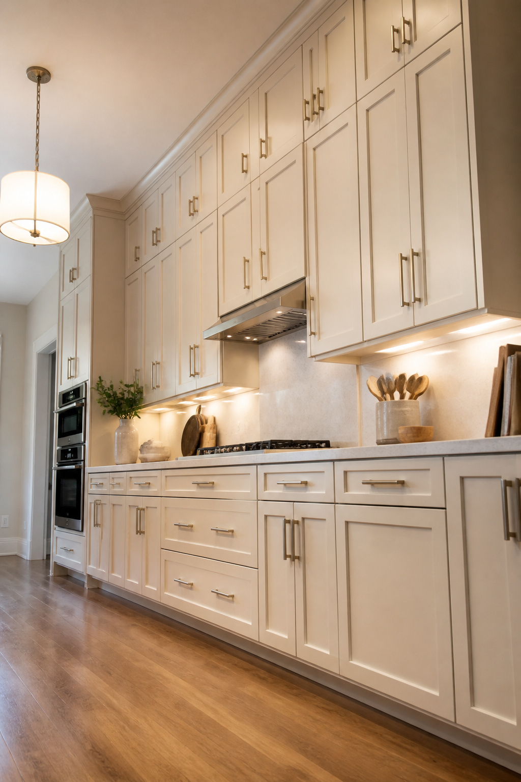
The gap above standard cabinets is usually twelve to fifteen inches of dead space that collects grease and whatever else drifts up there. Extending cabinetry to the ceiling closes that gap and adds roughly one extra shelf per cabinet run, which in a small kitchen is where the holiday plates and the stand mixer live without crowding the daily dishes.
The visual shift matters too. The eye travels up a continuous vertical line instead of stopping at a horizontal dust ledge, so the ceiling reads higher even when the measurement has not changed. In my own reading through dozens of kitchen layouts, the rooms that felt larger almost always had this detail; the ones that felt compressed kept that awkward soffit or open gap.
There is a practical limit. Ceiling-height cabinets need a step stool for the top shelf, so what goes up there should be the twice-a-year stuff, not the morning coffee grinder. Light finishes on the cabinet faces keep that tall mass from turning into a wall that leans in on you. White, cream, or light gray reflect what natural light the room gets and keep the volume airy.
3. Open Shelving
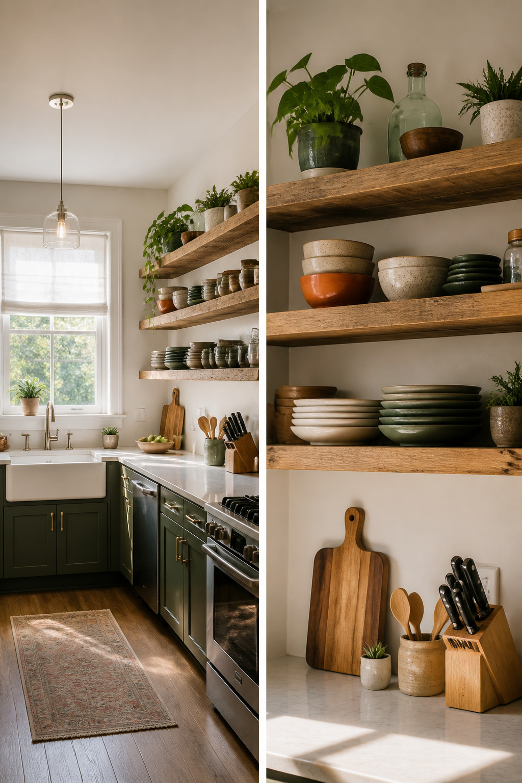
Replacing the upper cabinets on one wall with open shelves changed the feel of my kitchen more than any paint color could have. The room stopped reading as a box of boxes and started breathing. Light moves across the wall now instead of dying against slab doors.
The trade is real: every plate and bowl sits in the open, so the neatness you fake behind cabinet doors becomes visible architecture. What convinced me, reading through a dozen of these setups, is that the people who live with them successfully store everyday dishes on the open shelves and hide the rest behind whatever closed cabinets remain. Mugs you grab three times a day earn the open spot. The blender base and mismatched storage containers do not.
Bulky cabinets at eye level only make an already tight space seem smaller.
Running shelves the full length of a wall keeps the storage math honest; you are not giving up capacity, just the hidden kind. The mix matters more than the ratio. One closed cabinet flanking each open run gives you somewhere to stash the visual noise, and that pairing is what keeps the airy feeling from tipping into cluttered.
4. Two-Tone Cabinetry
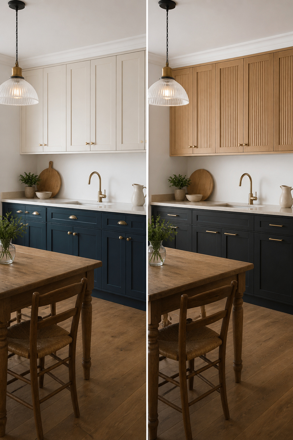
Lighter uppers with darker lowers is the pairing that keeps a small kitchen from flattening into one visual plane. The eye reads the pale wall cabinets as part of the ceiling line, so the room holds onto its height, while the deeper tone below gives the base cabinets weight that doesn’t compete for attention upward. Stock combinations like Millennium White uppers over Shaker Blue or Dark Grey bases do this without a custom order.
The contrast works because it creates depth without demanding square footage. A single dark color everywhere would push the walls inward; a single light one would read as a box. Splitting the difference lets the upper half stay open while the lower run still carries some character. Keep the darker color on the base cabinets only; reversing it caps the room and costs you that vertical lift.
Paint is the cheap way in if your existing cabinets are sound. Two coats in two shades turns tired boxes into something intentional, and the weekend timeline holds whether you spray or brush. The risk is choosing blues or blacks with too much saturation; they bounce less light back and can swallow a narrow galley. A soft navy reads calmer than a true primary, and grey keeps the neutrality if you change hardware or counters later.
5. Glass-Front Cabinets
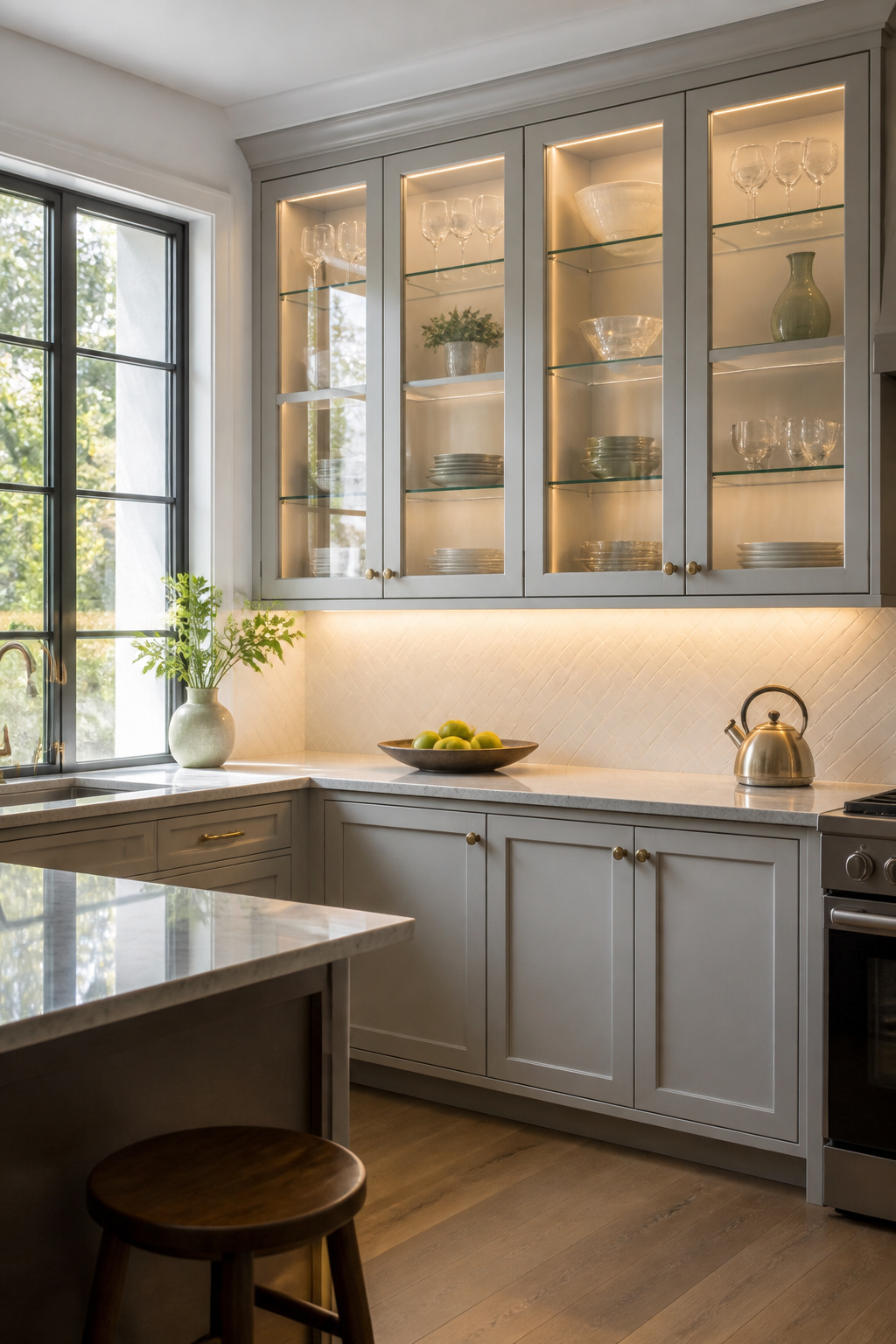
Glass-front cabinet doors give you the storage of standard cabinets with the openness of shelving, and in a small kitchen that trade matters more than it sounds. Solid doors chop a wall into flat planes that box the room in; glass lets the eye travel past the frame to whatever sits behind it, adding depth that makes tight quarters read as larger than they measure.
The real payoff comes when you coordinate what shows. A full block of wall cabinetry can feel heavy, but swapping even a pair of center doors for glass breaks that mass into something lighter. Fill them with actual dishware, not clutter: matching plates, a row of glasses, the nicer pieces you reach for daily. The glass bounces light around too, especially if you add interior lighting, and fluted or textured options let you obscure the contents if the day-to-day reality is less Instagram than you’d prefer.
I would not go all-glass in a small kitchen. Two or three upper doors, placed where they catch window or under-cabinet light, hit the balance between openness and the forgiving coverage of solid fronts below. The lower cabinets hide the mismatched pots and the half-empty cereal boxes; the uppers give the room breathing room.
6. Slim Pull-Out Cabinets
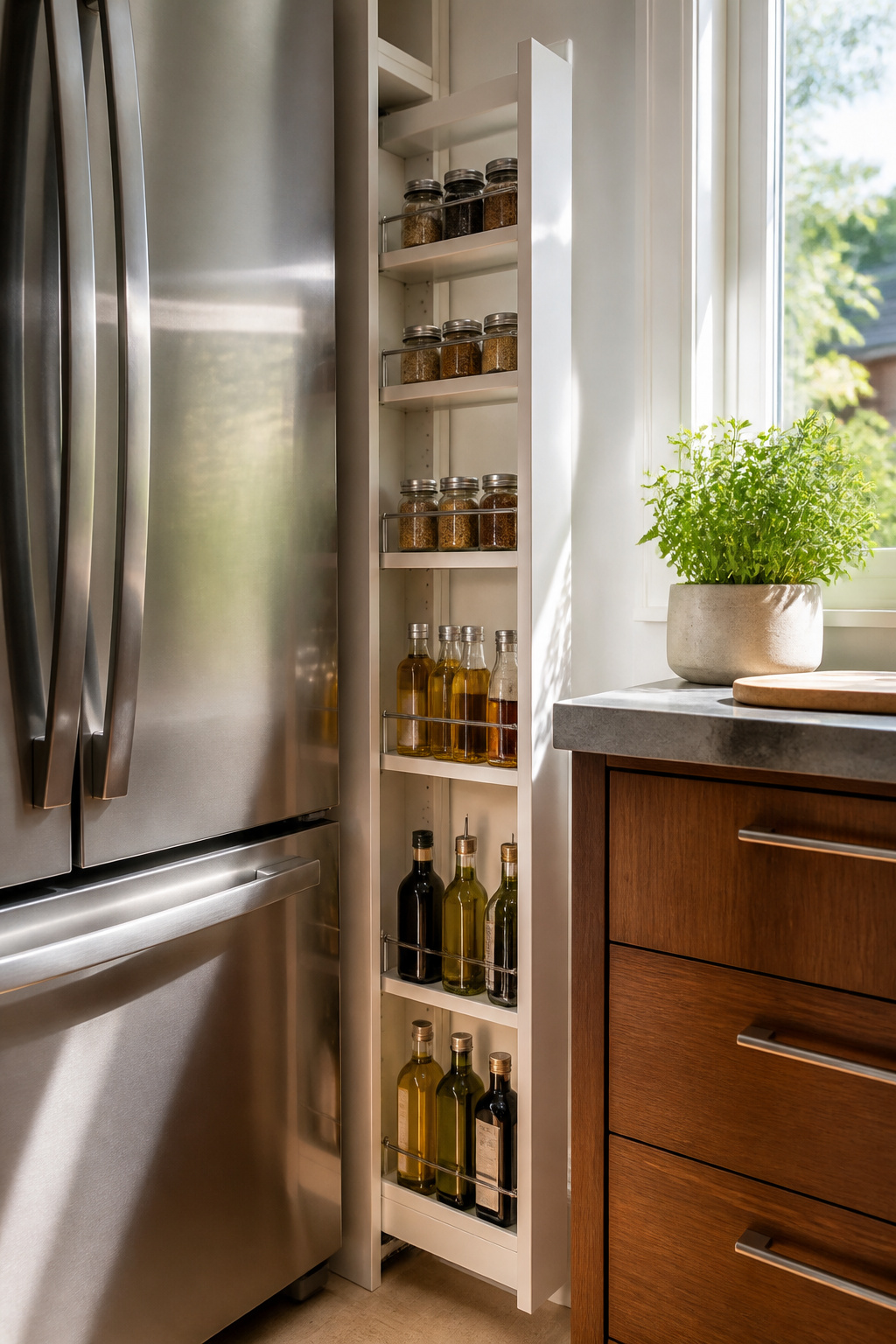
The six-inch gap between my refrigerator and the wall sat empty for two years because I assumed nothing useful could fit there. Then I installed a slim pull-out cabinet on a Saturday afternoon and finally had a home for spice jars, oils, and the cutting boards that used to slide around in drawers.
These narrow units work because they travel on full-extension slides that bring everything into view, not just the front row. Measuring matters more than with standard cabinets: a pull-out meant for spices needs different depths and rail spacing than one sized for baking sheets or muffin tins. I have seen the same 6-inch-wide chassis hold either thirty-two spice jars or six sheet pans depending on how the interior gets divided, so the hardware catalog is only half the decision.
The tradeoff is weight. A tall slim cabinet packed with glass jars and canned goods puts serious load on those slides, and cheap hardware sags within a year. For a renter solution, a shorter unit, maybe counter-height, spares the floor from anchor holes while still reclaiming the dead zone beside the stove.
7. Handle-Free Designs
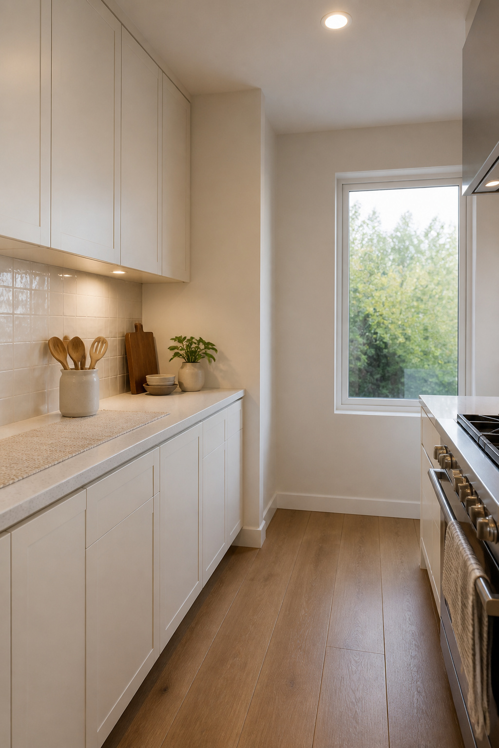
Handle-free cabinet fronts strip away the visual noise that makes a small kitchen feel crowded. Without knobs or pulls breaking up the surface, the eye travels smoothly across the room, and the whole wall reads as one continuous plane. The clean lines keep the space feeling light, which matters more in tight quarters than in a kitchen where you can step back ten feet.
The practical side is what stops most people. Edge pulls routed into the top or side of the door solve it without adding bulk. You slip your fingertips behind the lip and pull. Integrated hardware works the same way, built into the frame itself so nothing protrudes. Both methods keep that streamlined look while still letting you open the cabinet with wet or flour-dusted hands.
Shaker-style doors pair well here because their flat center panel and simple frame already lean minimal. Adding hardware would fight the whole point. In my own research, what convinced me was seeing how busy ornamentation shrinks a room visually. The cabinets with nothing extra looked like they belonged in a larger kitchen, even when the footprint was identical.
The modern aesthetic this creates suits renters and first-time owners who want the kitchen to feel intentional without a full renovation. A coat of paint on existing Shaker doors plus a routered edge pull turns stock cabinetry into something that reads custom. The edge pull needs at least a half-inch lip to grip reliably; anything shallower and you are prying with your fingernails every time you reach for a plate.
8. Built-In Appliance Cabinets
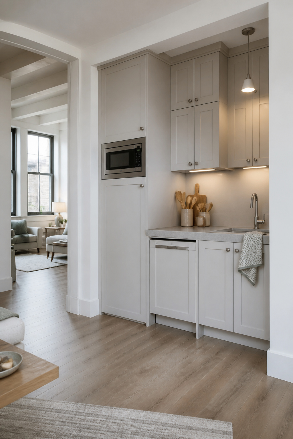
A microwave that sits on the counter eats twelve to eighteen inches of prep space you probably do not have. The same unit, slipped into a dedicated cabinet slot at eye level or tucked above a wall oven, disappears into the run and keeps the counter clear for actual cooking. The same logic holds for dishwashers and refrigerators: a slimline dishwasher built into the base cabinet avoids the protruding bulk of a standard appliance in a tight galley, and an under-counter fridge panelled to match the surrounding doors reads as another drawer bank rather than a hulking box.
The visual continuity matters more than the integration itself. Running materials uninterrupted from floor to ceiling, as you would with a full-height cabinet wall, anchors the room and keeps the eye from stopping on every separate object. Stainless steel appliances help here because the finish already reads as sleek; set them flush and the whole line looks intentional rather than apologetic.
What convinced me, reading through the options, is that this approach trades a little cabinet volume for a lot of workflow. You lose one base cabinet to the dishwasher, but you gain the ability to stand at the counter without dancing around an open door or a jutting handle. In a kitchen under a hundred square feet, that clearance is worth more than the storage.
9. Vertical Pull-Out Pantries
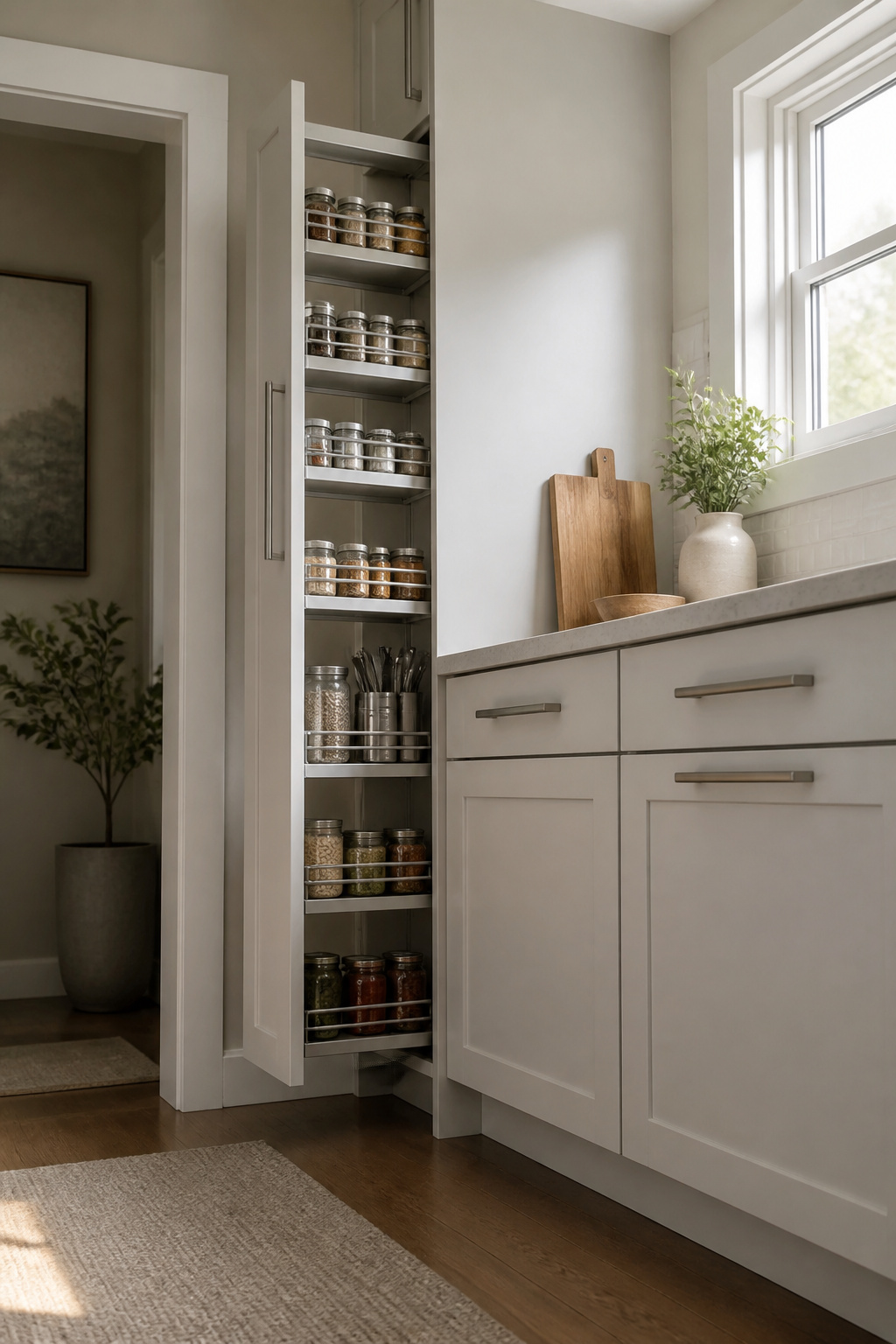
Tall, narrow pull-out pantries can squeeze into gaps as slim as 6 inches and still return serious storage. That is the width of a standard wall stud bay with drywall on it, which means the sliver beside a refrigerator or the dead end of a cabinet run is suddenly in play.
I spent an afternoon measuring my own kitchen for one of these, and the math is what sells it. A floor-to-ceiling column six inches across and twenty-four inches deep, pulled out on full-extension slides, gives you shelf frontage comparable to a four-foot wall of base cabinets, only stacked vertically. You lose almost no floor area because the footprint stays inside the gap you already were not using.
The catch is the hardware. Full-extension pantry slides rated for the weight of canned goods and small appliances are not the same drawer slides you would use for pots. Cheap hardware sags, binds, or tears out of a narrow carcase that has no room for error. In a space this tight, rummaging in dark corners is not a frustration; it is the whole point you are trying to solve.
10. Toe-Kick Drawers
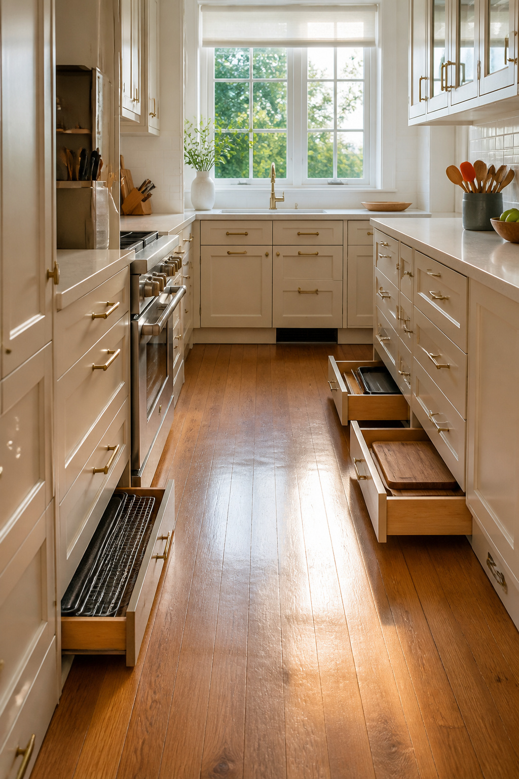
The recessed strip at the bottom of base cabinets, usually covered by a fixed panel, is dead space in most kitchens. Toe-kick drawers convert that gap into shallow storage for flat items: baking sheets, cutting boards, placemats, and the lids that never stack neatly anywhere else. In a small kitchen, that is roughly four inches of height across every cabinet run, which adds up to meaningful real estate.
These drawers do not hold much vertically. A standard sheet pan slides in fine, but a tall pot or a mixer bowl will not. The practical limit is about three inches of interior height, which means you are really organizing the things that slide, not the things that stack. Installation means cutting out the existing toe-kick panel and fitting a drawer box with a push-latch or small pull, so renters should check lease terms before committing, and owners should expect a weekend of measuring twice and trimming once. The finished look stays clean because the drawer front matches the cabinet line, and from across the room the kitchen reads exactly the same. Only the person cooking knows the storage is there.
Under-Cabinet Lighting
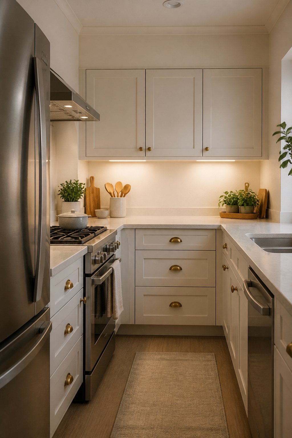
The dark strip beneath upper cabinets is where a small kitchen goes to feel cramped. Adding light there does two jobs at once: it brightens the work surface for actual cooking, and it keeps the cabinet bank from reading as a heavy wall that closes the room in. LED strips are the usual choice now, and the decision that matters is hardwired versus plug-in. Hardwiring means a switch on the wall and no cords to hide, but it pulls you into electrical work that most weekend timelines cannot safely absorb. Plug-in strips run from an existing outlet, often the one powering the range hood or a countertop appliance, and the whole install is peel, stick, and find a route for the cord that does not cross the sink. A $30–$50 plug-in kit with a warm white temperature, around 2700K to 3000K, reads as intentional light rather than clinical glare. The finish of the strip housing matters more than the product name: white or brushed aluminum disappears against most cabinets, while black tape shows the boundaries of a small kitchen rather than dissolving them.
Open vs. Closed Storage Balance
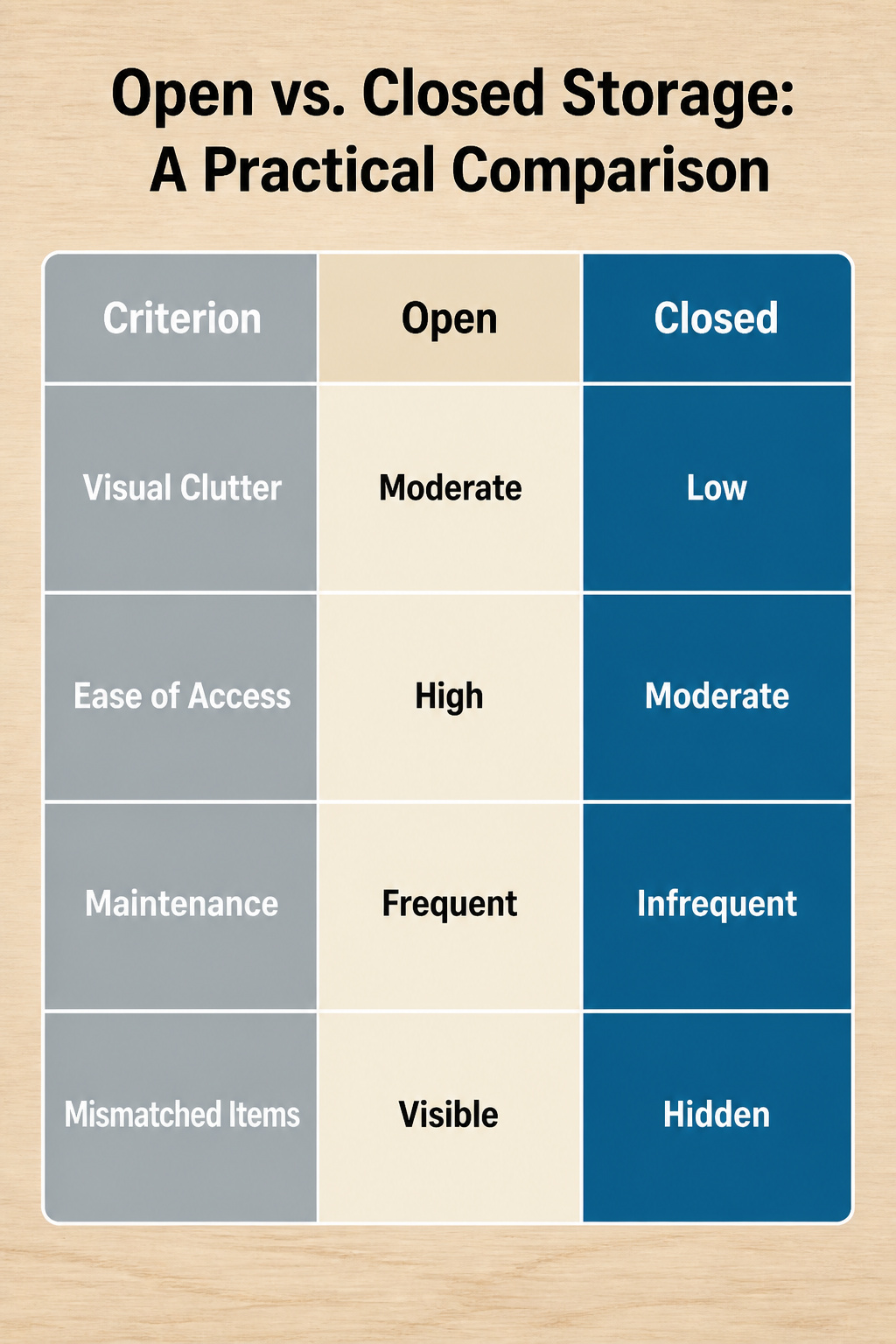
Open shelving breaks up the visual weight of a full cabinet run, but the Pinterest shots rarely show the morning-after reality of grease dust on stacked plates. I start every small-kitchen conversation with the same question: how many of your dishes match, and how much do you care?
Closed cabinetry hides the mismatched mugs, the bulk rice bin, the blender you use twice a month. Open shelves demand a tighter edit. The sources land on a split that matches what I’ve seen work: everyday dishes live open, everything else gets a door. The plates you reach for three times a day earn the convenience of a quick grab; the specialty bakeware and backup pantry stock stay behind closed panels where visual clutter can’t shrink the room further.
Glass-front doors split the difference, but they still expose color chaos. Use them for the one zone where your storage already looks intentional.
The real limit is maintenance tolerance, not square footage. A single open shelf above the prep counter keeps cooking tools within arm’s reach and lightens the wall. Run it the full length and you have committed to daily styling and weekly dusting. For renters especially, who can’t reconfigure later without landlord negotiation, the reversible choice is leaning closed with one deliberate open interruption rather than the reverse.
Where Custom Cabinetry Pays Off
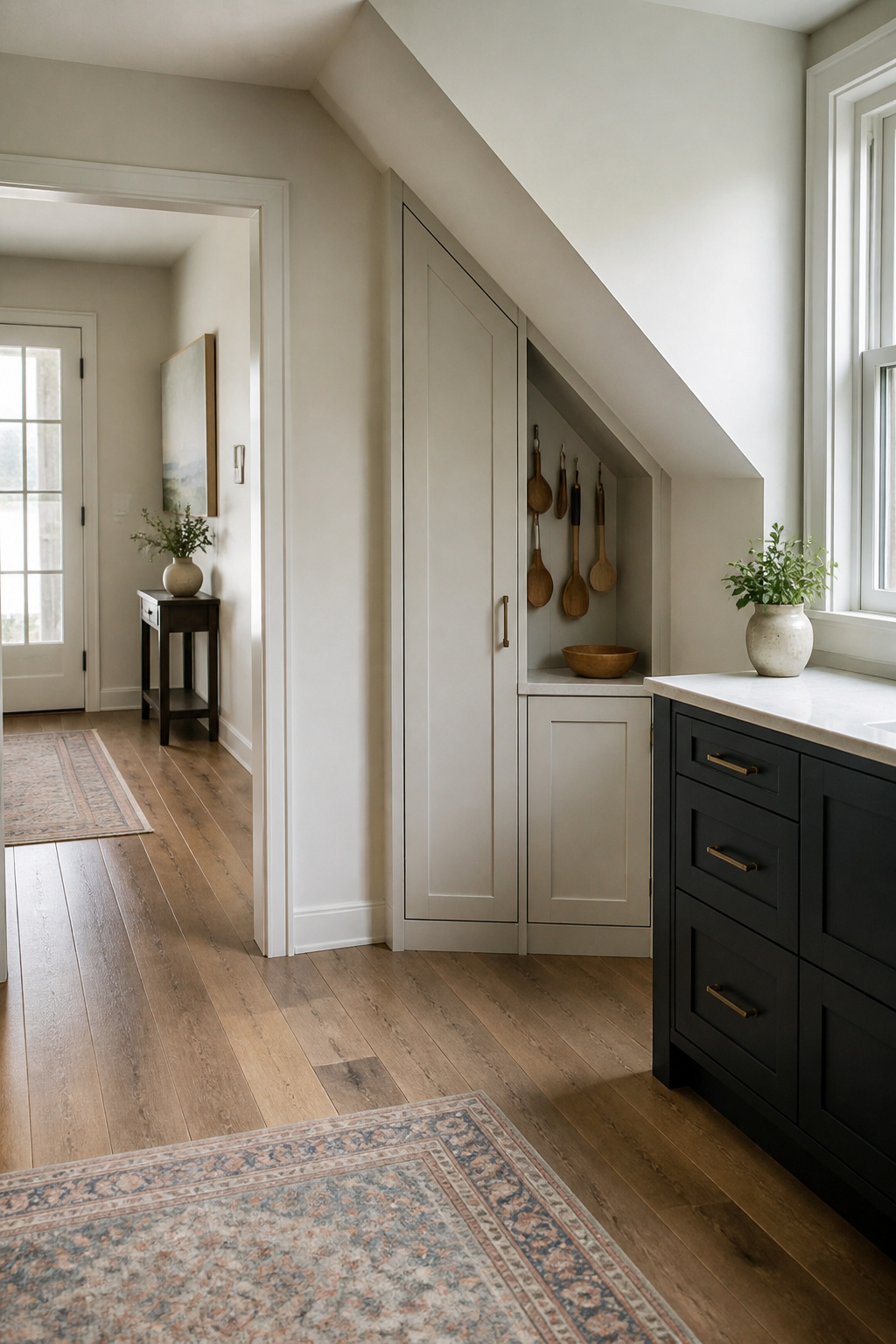
Stock cabinets leave dead space in angled ceilings, tight corners, and the sliver beside a radiator. For those spots, a cabinet built to the exact slope or dimension turns what would be storage loss into usable room. A sloped ceiling that swallows a standard wall cabinet, for instance, can take a custom-fit unit with a utensil rack hung in the triangle above it.
The catch is that custom work only pays off when the awkward geometry is permanent. In a rental with a one-year lease, the cost rarely comes back to you. The same cabinet that justifies itself over a decade of ownership becomes money you hand to the next tenant. Resale value helps only if you stay long enough to sell; otherwise you are paying premium prices for a problem that is technically the landlord’s.
If the space is truly odd, the smaller footprint keeps the total cost lower than a full custom kitchen would run. An appliance garage tucked into a made-to-fit cabinet, or a refrigerator relocated to open the layout, can turn a galley kitchen into something that functions modern while keeping early 20th-century bones intact. The judgment call is whether that gain is worth it for your timeline, not whether the cabinet itself will be beautiful.
Sliding Doors for Tight Clearances
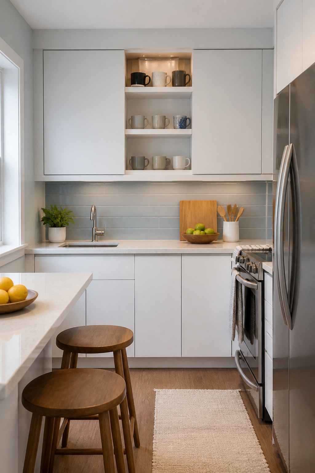
Swinging a standard cabinet door open in a galley kitchen eats up roughly the depth of the door itself, sometimes 12 to 15 inches of precious aisle. In the tight corridor between two parallel runs of cabinets, that swing can block the whole walkway or clip your hip on the corner. Sliding doors move parallel to the face of the cabinet instead, which means zero swing clearance and full access even when someone else is already standing at the stove.
I noticed this most in a friend’s row-house kitchen, the classic galley layout with two walls facing each other across about 36 inches of floor. Her upper cabinets had sliding panels, original to the 1940s build, and the difference was immediate: she could open the cabinet above the coffee maker without backing her husband away from the sink. The same logic applies anywhere a door would otherwise collide with a wall, an appliance, or another cabinet at ninety degrees. Upper cabinets over corner sinks and pantry units at the dead end of a corridor both benefit.
The tradeoff is access style. You slide one panel to reach the left side, then the other to reach the right; nothing opens wide and stays there while you load groceries. For smaller cabinets holding cups or dry goods, that friction is minor. For a full pantry where you want to scan everything at once, it takes more choreography.
Mirrored and Reflective Finishes
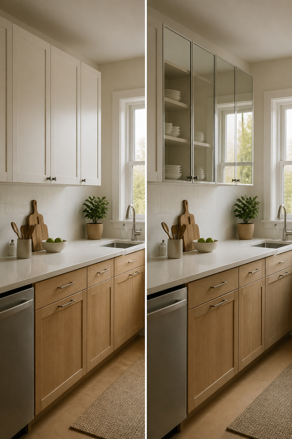
Mirrored cabinet fronts push light back into a small kitchen and trick the eye into reading more depth than the wall actually holds. The effect works best in spaces that already get some natural light; in a dim galley, the reflection just bounces shadow around and the room ends up feeling like a restaurant restroom. High-gloss paint does nearly the same job with less risk, especially in white or another pale finish that keeps the reflection soft rather than sharp.
The catch is durability. Mirrored surfaces show every water spot, grease fleck, and fingerprints from the coffee routine, so the maintenance load is real. Antiqued glass hides wear better than clear mirror, but it reads period, not contemporary. For renters or anyone who cooks daily, high-gloss is the safer bet between the two; you get the brightness without the polishing schedule.
Frequently Asked Questions
What cabinet color works best in a small kitchen?
White, cream, or light gray cabinets reflect light and make the space feel airy and open. Dark colors absorb light and can push a small kitchen toward cave-like, so use them cautiously. Shaker-style simplicity pairs naturally with these lighter palettes, letting the eye move across the room without stopping on decorative noise.
How do I maximize storage in a small kitchen?
Extend cabinetry to the ceiling to add roughly one extra shelf per cabinet run, and use slim pull-out pantries that squeeze into gaps as narrow as six inches. Toe-kick drawers convert the recessed strip at the bottom of base cabinets into shallow storage for flat items like baking sheets and cutting boards. Vertical pull-out pantries give you shelf frontage comparable to four feet of base cabinets, only stacked vertically.
Are open cabinets good for small kitchens?
Open shelving can lighten the space and make it stop reading as a box of boxes, but the neatness you fake behind cabinet doors becomes visible architecture. Store everyday dishes on open shelves and hide the rest behind whatever closed cabinets remain. One closed cabinet flanking each open run gives you somewhere to stash visual noise, keeping the airy feeling from tipping into cluttered.
How can I make my small kitchen cabinets look bigger?
Use light colors to reflect light, extend cabinets to the ceiling so the eye travels up a continuous vertical line, and minimize hardware with handle-free designs that let the eye travel smoothly across one continuous plane. Glass-front cabinet doors also help by letting the eye travel past the frame to whatever sits behind it, adding depth that makes tight quarters read as larger than they measure.


