

A plaid living room uses crossed bands of color on a few pieces, from armchairs to pillows, and the pattern changes with the type.
Wallace tartan, with its red ground and bold green and blue bands, reads as lodge. The catch across all of them is quantity: plaid on the sofa, curtains and rug looks like a time capsule.
Tartan
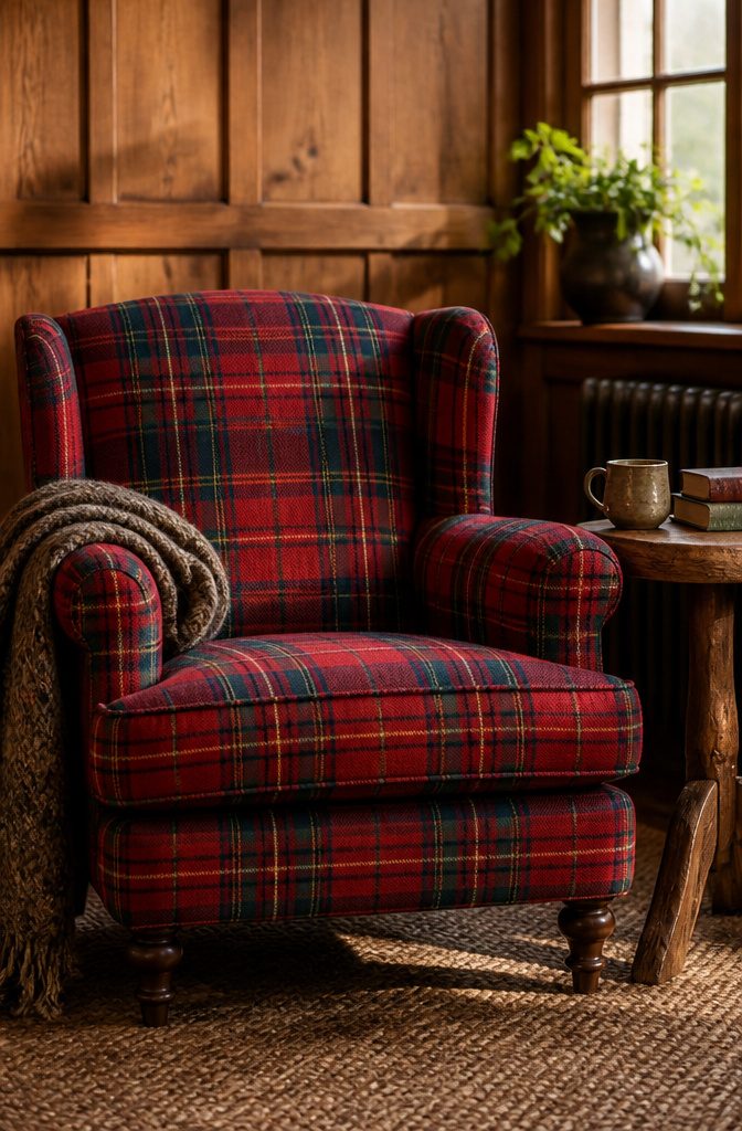
Tartan is the original woven plaid: bands of color crossing at right angles in a twill weave, usually wool, so the pattern is built into the cloth rather than printed on it.
Wallace is a good name to know. Its red ground with bold green and blue bands, plus thin yellow and black lines, is the tartan most people picture first.
Tartan has long been tied to Scottish clans, and it moved into homes through lodges, libraries and country houses, which is why it reads as classic and a little nostalgic.
It suits dens, reading corners and traditional living rooms best, on armchairs, ottomans and a single upholstered bench. For a rental, I’d pick one tartan piece in a deep, muted tone and let the rest stay solid.

Charming Decor: Infuse your home with holiday cheer using these MIULEE plaid throw pillow covers. Their classic red, green, black, and white tartan design embodies the spirit of Christmas, creating a warm and inviting winter ambiance for your living room or bedroom.

Soft fabric: Made of high-quality polyester fiber, these plaid pillow covers bring a warm and inviting touch to your sofa or bed while remaining durable for everyday use

Classic Tartan Plaid Design:Featuring timeless Scottish tartan plaid in a warm tone, these pillow covers bring a rustic farmhouse touch to your home. The vintage-inspired pattern blends easily with modern and traditional decor styles.
Buffalo Check
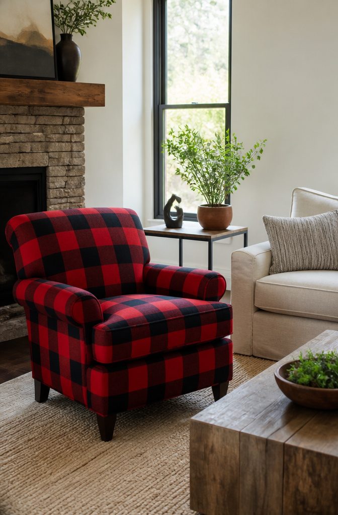
Buffalo check is the plaid with the least subtlety: a large, even two-color check, usually a bold color against black or white.
Red and black is the version everyone pictures, though the same grid works in green, navy or blue on white. With only two colors, the pattern reads from across the room.
That size is why it works best in one place.
A single armchair, a throw over the sofa arm or a rug under the coffee table gives the room a focal point without taking it over. I’d pick one of those, not all three.
In a small living room, the big squares can overwhelm the space.
A full sofa or wall-to-wall rug in buffalo check shrinks the room visually, so keep it to a chair or a throw and let solid neutrals carry the rest.

CLASSIC GINGHAM‑CHECKED DESIGN‑These pillow covers feature a timeless red‑and‑white gingham pattern, bringing fresh rustic charm to your living space. Perfect for farmhouse, boho, and patriotic‑themed decor, they instantly refresh your sofa, couch, bed for everyday and fall‑season styling.

This chair is a great addition for any room. With the bright, soul soothing Pattern of this chair, It is sure to lift anyone’s spirt. Place it near a window and you will feel as if you are sitting outside on a grassy Hill with the breeze flowing through your hair. The studs around the external frame of the chair Add the perfect touch to Bring this piece together for your home.

Multiple Size Options for a Customized Fit: Multiple sizes are available to fit various furniture types. Please measure the couch before purchasing. Specific size guides: 71"x 91" for single or small loveseat.
Glen Plaid
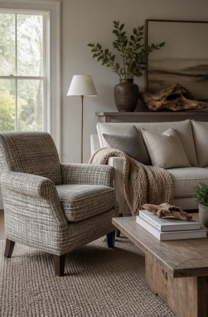
Glen plaid is the quiet one in the family: a small woven check built from broken stripes in two tones, borrowed from menswear and tailoring.
Because the contrast is low, it reads closer to a texture than a pattern from across the room.
That restraint is why it suits upholstery and curtains.
A glen plaid armchair or a pair of drapes adds structure without competing with the rest of the room, and it pairs best with neutrals like cream, oatmeal, gray, and warm white.
Add one deeper accent, such as a rust or navy pillow, if the room needs a little life.
I’d skip it if you want a bold statement piece. Glen plaid flattens out when the two tones sit too close together, so check a fabric swatch in your own daylight before you commit.

Lodge Styling - The Madison Park Anaheim Plaid Rod Pocket & Back Tab Single Panel with Fleece Lining offers a stylish and casual cabin update to your home décor

STYLISH BLACKOUT CURTAINS: Elevate your space with our timeless plaid curtains with sophisticated blackout linen fabric. This farmhouse-inspired pattern blends perfectly with various art styles, suitable for living room & bedroom, ideal for your winter festival home deocr.
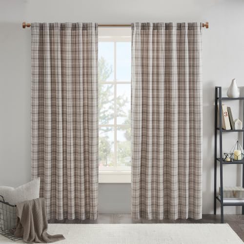
Lodge Styling - The Madison Park Anaheim Plaid Rod Pocket & Back Tab Single Panel with Fleece Lining offers a stylish and casual cabin update to your home décor
Madras
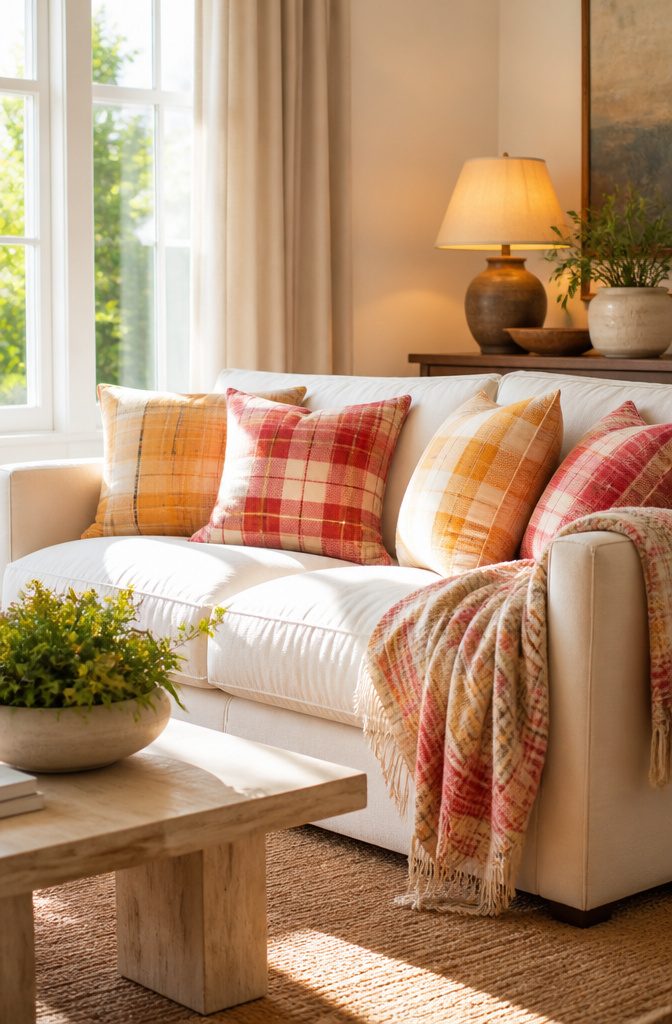
Madras is the plaid I reach for when a living room needs to loosen up.
The checks are irregular and the colors run lighter and brighter than tartan, with the sunny turmeric and paprika of Indian madras napkins as a good example. That warmth reads as summer rather than lodge.
Madras is usually cotton, so it suits small doses better than a big upholstered piece.
Pillows are where it works best: two or three on a neutral sofa add color without committing the whole room. A cotton throw or a table runner works the same way.
Keep the rest of the room calm, with solids and deeper tones, so the loose pattern has room to look relaxed instead of busy. For a heavy cabin-style room, I’d skip it.

【Vintage Plaid Design】 Boho look, retro double-sided plaid and stripes pattern lumbar pillow covers. They are perfect decorations for living room, bedroom, patio furniture, porch swing, balcony, car, office and etc. They can match well with other farmhouse boho decorations.


DURABLE AND HIGHER QUALITY: Made of machine washable Polyester, with no bleeding, fading or fraying issue,can be used outdoors.(Insert or filler not included) Material: 100% Polyester.
Tattersall
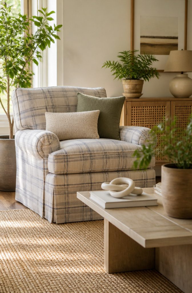
Tattersall is the quietest plaid you can put in a living room: thin, evenly spaced lines, usually in two colors, running over a light ground.
Because the lines cross at regular intervals and the background stays open, the eye reads it as a soft grid instead of a block of color.
Tartan crowds the surface with wide bands and layered colors, and that is where the noise comes from.
That calm makes tattersall a background pattern. Use it on the big, quiet surfaces, like a sofa slipcover, curtains or a large armchair, and let solid colors or a bolder plaid sit on top as pillows.
Pick line colors that already appear in your rug or walls, and the pattern will fade into the room instead of competing with it.

Classic Plaid Design: Featuring a timeless tartan plaid in rich red, green, blue, and white lines on a red ground, this vintage red plaid rug adds a cozy farmhouse touch to any living room, bedroom, or dining room and more
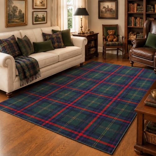
Classic Christmas Tartan Design: this Christmas plaid rug features timeless green, navy blue and red Scottish tartan patterns, bringing a cozy holiday touch to traditional, vintage and farmhouse Christmas home decor

Festive Atmosphere and Classic Check Pattern: this 4.92 x 7 ft/ 149.86 x 213.36 cm feet buffalo scottish tartan christmas area rug, based on the traditional green scottish tartan pattern and incorporating classic christmas green hues, instantly brightens up a wintery home; Whether placed in front of the fireplace, in the center of the living room, or in the entryway, it creates a rich farm style christmas atmosphere
Windowpane
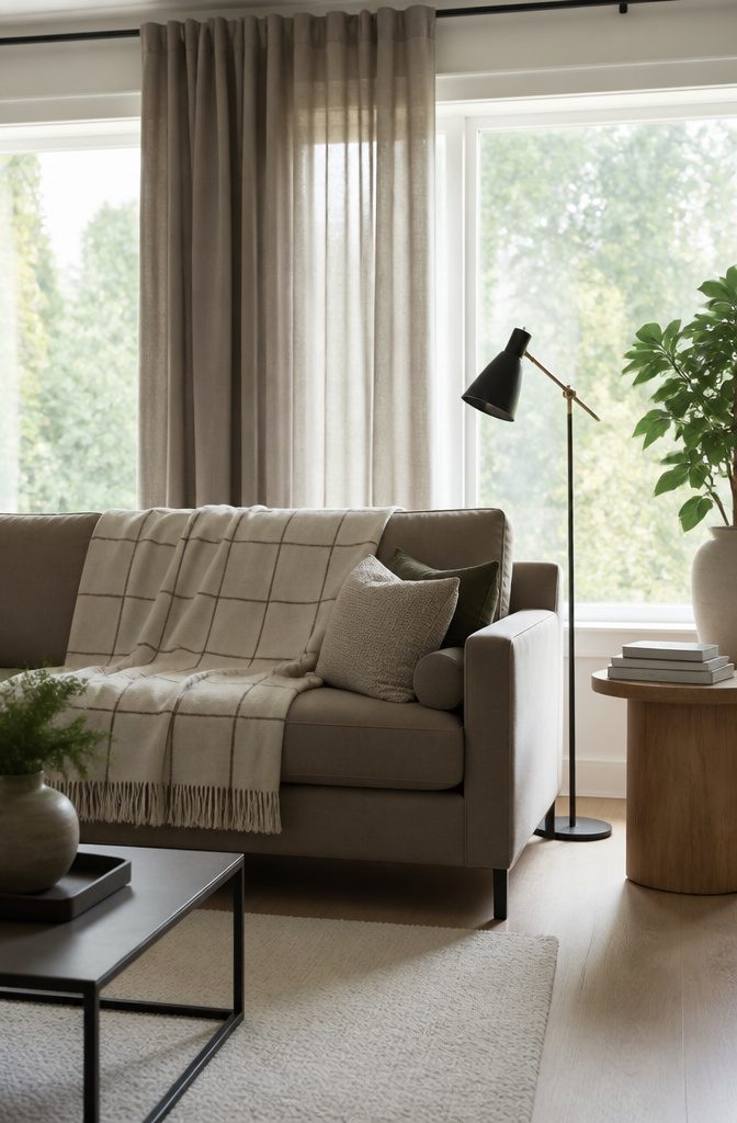
Windowpane is plaid with the weave stripped down to single thin lines, spaced far apart so they box in large open squares of plain background.
With no overlapping bands and no second or third color, it reads closer to a grid than to a traditional plaid, which makes it the most restrained version you can bring into a living room.
That quiet quality is why I’d start cautious decorators here. A windowpane throw or a pair of pillows looks tailored beside solid upholstery, and it won’t fight a patterned rug or art.
Pick a line color close in tone to the background if you want it barely there, or a darker line for a crisper look.
Keep it to one or two pieces at first, then add more once you know you like living with it.

Package Includes: 2 PCS pillow covers. Pillow inserts are not included. Due to manual measurement, please kindly allow a 1-2 inch discrepancy.

Charming Decor: Infuse your home with cheer using these MIULEE plaid throw pillow covers. Their classic tartan design creating a warm and inviting ambiance for your living room or bedroom

Complete Set of 4: this kit has 4 velvet Christmas pillow covers with solid jewel-toned and tartan plaid styles, 2 festive tartan plaid, a deep green solid, a navy blue solid, matched tones create warm Christmas home decor layout, plaid pillow covers fit standard throw pillow inserts, inner fillers are not included
Gingham
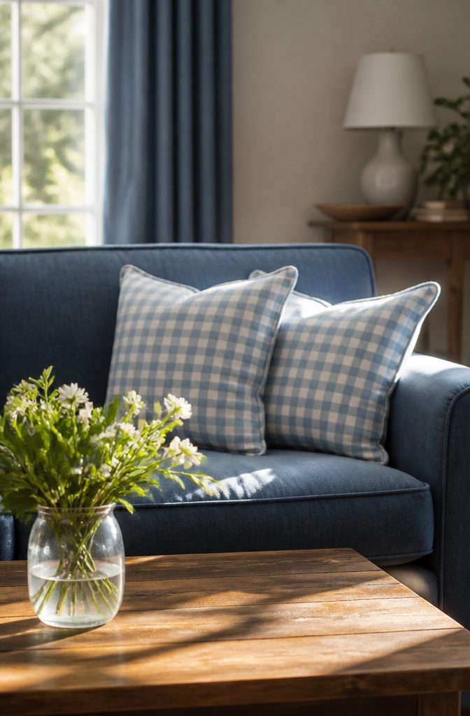
Gingham is the plaid you can use without it taking over the room: small, even checks in white and one other color, woven or printed so the squares come out the same size in both directions.
Because there are only two tones, it reads as light and country, closer to a picnic cloth than a hunting lodge.
It works best in small doses. Two pillows on a solid sofa or a pair of café-style curtains is plenty, and I’d stop there in a small living room.
A gingham armchair is the larger move, and it holds up only if the rest of the room stays plain.
Keep the checks small and the second color soft, like sage, blue, or butter yellow. Bold red or black gingham gets busy fast, and it can look like a kitchen that wandered into the living room.

SNUG STRETCH FIT - One-size-fits-most design, fits standard wingback chairs measuring 31.5in long, 28.3in wide, 35.4in high. This cover with full elastic bottom stays tight and secure all day, stops slipping, sagging and bunching to maintain a crisp, tailored look

Elegant Ruffle Edge: This pillow cover combines classic tartan plaid with delicate ruffled trim for a charming layered look. The structured grid pattern contrasts beautifully with the soft, cascading ruffles, creating visual interest that elevates any space—from sofas to armchairs or beds.

LARGE RECTANGLE STORAGE BIN – KNOW YOUR SPACE BEFORE YOU BUY: Measures 17.75"L x 12"W x 15"H with an O-ring and cardboard bottom to reinforce structure and hold up to 20 lbs — also available in Medium Round 15x15x12", Large Round 16x16x15", and Medium Rectangle 16x10x12" and in Black and White, Navy, Red and Black, and Tri Color colorways to match any room
Classic Plaid
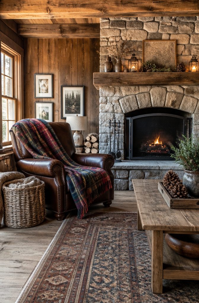
Classic plaid is the crossed-stripe pattern most people picture first: bands of different widths running both ways, usually in red, forest green and navy, often with a thin line of cream or black to break up the blocks.
It reads as cabin, lodge and traditional parlor before it reads as anything else, and that pull is mostly nostalgia.
Flannel shirts, wool blankets and holiday tablecloths all live in the same color family, so the pattern feels remembered before it feels decorated.
In a living room, classic plaid wins on warmth. It sits well against wood paneling, leather, brick and a fireplace.
Use it on one big piece, like a blanket, armchair or curtain panels, and keep the rest of the room in solids. Plaid on every surface tips a cozy room into a themed one.

Elegant Plaid Design: Authentic Scottish checkered pattern in rich dark green velvet creates sophisticated farmhouse charm. The classic plaid design adds texture and visual interest to any room while the luxurious velvet fabric provides depth and elegance to your window treatments.

BLACKOUT FARMHOUSE PLAID CURTAIN provides light blocking and noise reduction with soft linen texture and washable fabric

Premium Heavyweight Fabric: Crafted with a premium linen blend featuring a unique slub yarn texture, these curtains weigh an impressive 250GSM. The heavy, substantial fabric ensures excellent drape and a luxurious, earthy feel, instantly elevating your room's aesthetic with a high-end, hotel-like look. The dense slub weave effectively blocks out harsh sunlight while highlighting a rich, natural texture.
Vintage Plaid
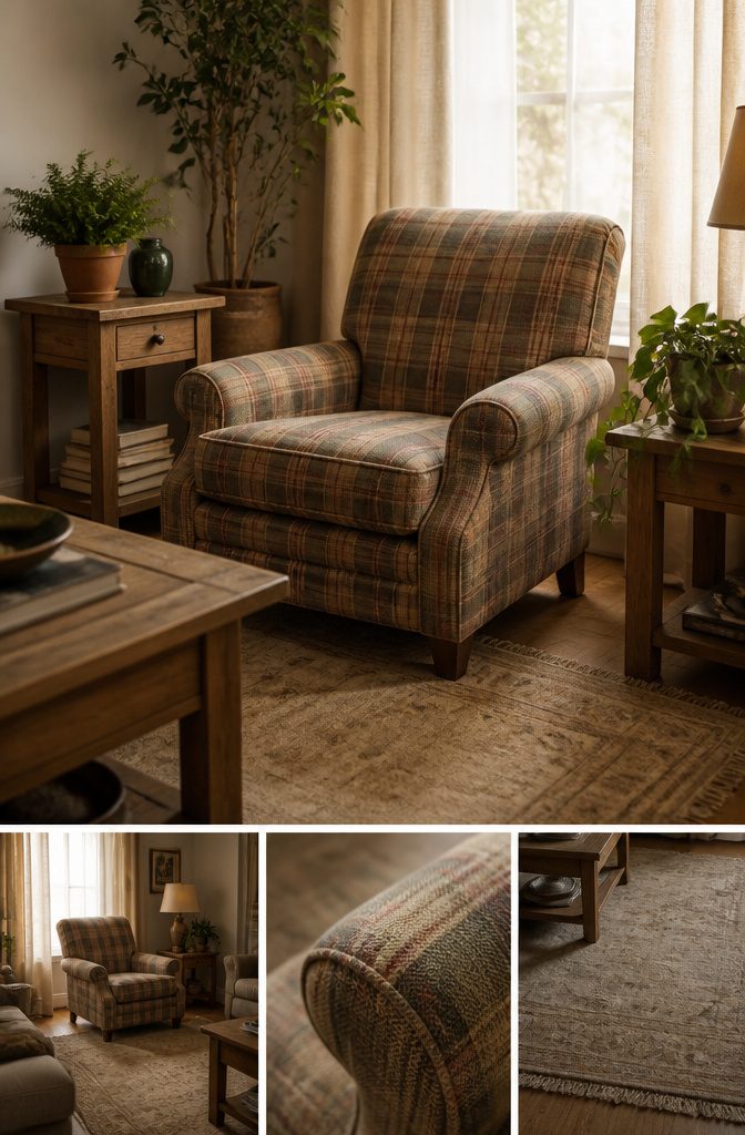
Faded plaid earns its place because the wear is already done.
A thrifted wool blanket, a flannel armchair or a worn tartan ottoman has softened lines and muted color that new fabric can’t fake, and it hints at a history you didn’t have to build.
Keep it from reading as dated by limiting it to one or two pieces and letting the rest of the room stay plain.
A faded plaid chair beside a clean-lined sofa looks collected; plaid on the sofa, curtains and rug looks like a time capsule.
Check thrifted pieces for odor, moth holes and sun-rotted fibers before you buy, since those are the flaws that don’t wash out.
Plain walls and simple wood tones keep the pattern in the spotlight, and I’d take one good worn piece over a set of matching reproductions.

【Exclusive Farmhouse Pillows Decorative Throw Pillows】: Cute and charming neutral brown and white plaid clashing pillow covers, these little things can decorate your bedroom in a flash! Not only for indoor cottage core decor, but also for outdoor decor.
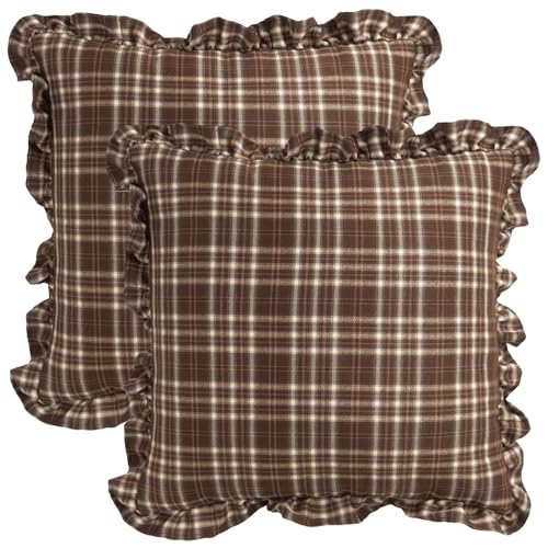
Vintage Brown Gingham with Ruffled Edge: Featuring a classic brown gingham check pattern and a delicate, sewn-on ruffle trim, these pillow covers bring a touch of traditional, vintage charm to modern farmhouse decor
Modern Plaid
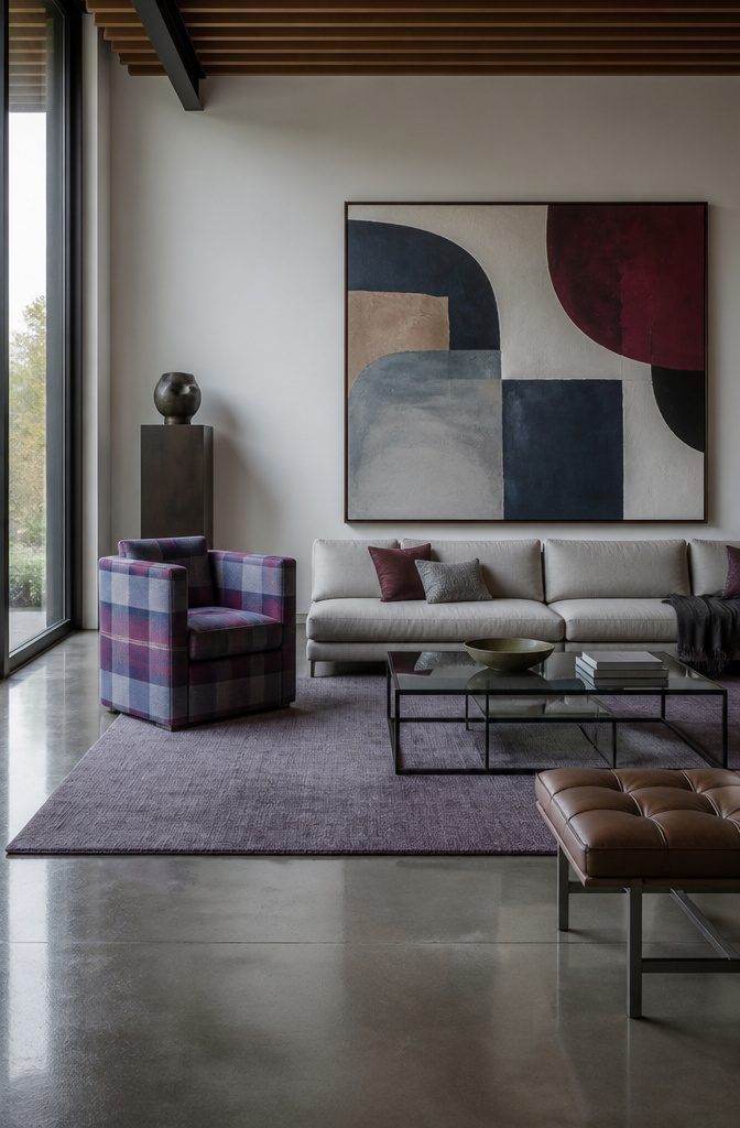
Modern plaid starts with scale. Where a traditional tartan repeats in tight, busy checks, the modern version stretches the repeat large enough that you read it as a graphic block, not a texture.
Pair it with clean-lined furniture, like a low sofa or a simple bench, and the pattern becomes the one loud thing in the room.
Color does the rest. Swap the expected red and green for plum and navy, or umber and slate blue, and the same pattern stops feeling like a lodge.
Keep the plaid on one or two pieces and let solids carry everything else, because a room full of check turns costume fast.
Plaid isn’t tied to one style, either. It has worked as curtains in plaid silk taffeta, as a cushion on rattan sofas, and as a subtle painted wall.

FARMHOUSE KITCHEN VALANCES FOR WINDOWS - Consists of one farmhouse valance curtain that measures 72 inches by 16 inches for a lovely everyday casual window accent for the dining area, bathroom or other rooms

Quality Material: our red Christmas area rug is made of soft loop pile, one of the most notable features of this quality material is its comfort; Whether you walk on it barefoot or sit or lie down, you can feel the soft and warm; And which has high density, resists color fading, wear resistance, dirt resistance.Please note that if you receive the rug with creases due to packaging, these can be reduced by ironing or washing and then letting it sit for a few days

[Christmas Holiday Plaid Charm] – Featuring a timeless plaid design in festive tones of red, green and navy on a beige textured base, this rug evokes cozy holiday vibes and traditional elegance, perfect for seasonal decor or outdoor front porch decor
Choosing the Right Plaid
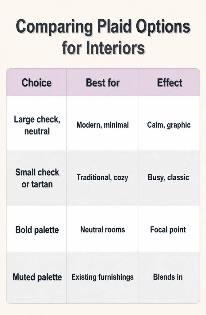
Tartan suits traditional, cozy rooms, while a larger check in neutral colors suits a modern, minimal one. Bold, contrasting colors make a plaid sofa the focal point of a neutral room; a subdued palette blends into what you already own.
For a first plaid piece, I’d go subdued, because harmony is easier to fix than a loud mistake.
The table below sorts the four choices.
| Choice | Best for | Effect |
|---|---|---|
| Large check, neutral | Modern, minimal | Calm, graphic |
| Small check or tartan | Traditional, cozy | Busy, classic |
| Bold palette | Neutral rooms | Focal point |
| Muted palette | Existing furnishings | Blends in |
Fabric texture: n/a
Color Coordination
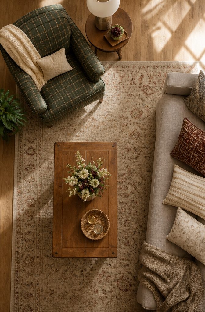
Start by finding the most prominent color in the plaid, usually the one covering the most area, and treat that color as the base for everything else in the room.
If a green plaid armchair is mostly forest green with thin red and cream lines, the rugs, curtains and larger pieces should lean green or sit quietly beside it.
Neutrals do the calming. White, gray and beige tone down a busy pattern, and I’d make them the largest share of the room after the plaid itself, especially on walls and the sofa.
Then pull two or three of the thinner stripe colors into pillows, a lamp base or curtains.
Repeating a color from the plaid ties the room together; adding a color it doesn’t contain usually makes the pattern look out of place.
Layering Textures
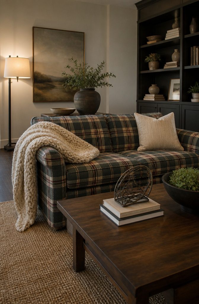
A plaid sofa or chair looks flat when everything around it is smooth, so pair a soft, plush throw with a coarser jute or sisal rug underfoot.
That contrast in hand-feel is what makes the room read as layered. Wood, metal and glass add more: a wooden coffee table gives rustic warmth, while a metal floor lamp brings an industrial edge.
For mixing prints, vary the scale. Set a bold plaid beside something small, like polka dots or subtle florals, and keep the whole room to one cohesive palette.
I’d also add a solid rug or a pair of solid curtains so the eye has somewhere to rest.
Pillows and Throws
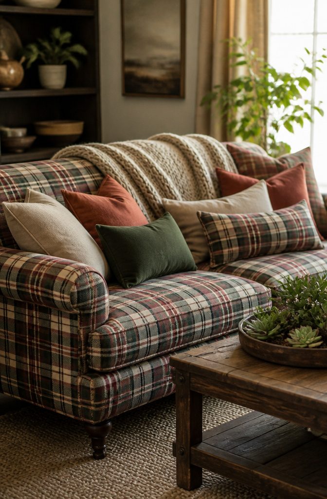
Pillows are the cheapest way to change a plaid couch, and the first move is to vary them: mix sizes and shapes, with a large square or two in back and a smaller lumbar in front.
Texture does more work than pattern here. Velvet, wool and knit all sit well against plaid because they add warmth without competing with its lines.
Pull one or two pillow colors from the hues already in the plaid, so the couch and the accents read as one plan. Keep at least one pillow solid to give the eye a place to rest.
A throw draped over the back or one arm looks casual and inviting. I would choose a chunky knit or soft wool, and skip a second pattern there.
Lighting for Plaid
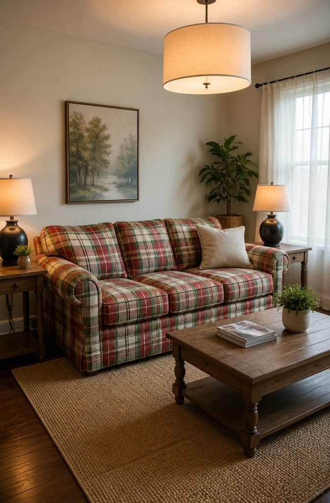
Plaid looks flat under one overhead fixture, and it looks worse at night, when a single ceiling light flattens every stripe into the same dull grid.
Layering fixes that: an overhead light for general glow, a table lamp at each end of the sofa, and a floor lamp in the corner or beside a reading chair.
Light that comes from different heights lets the woven lines and color shifts read clearly.
Bulb choice matters as much as the lamp. Warm bulbs keep reds, greens and creams rich, while cool white turns them harsh and a little gray.
Put a lamp or directed light near the plaid piece so it becomes the focal point, and keep task light by anywhere you read.
Frequently Asked Questions
How do I decorate a plaid living room?
Start with one plaid piece, such as an armchair, a blanket or curtain panels, and keep the rest of the room in solids.
Pick a pattern that fits your style: tartan for traditional and cozy, a larger neutral check for modern and minimal.
Pull colors from the plaid into pillows and lamps, then layer textures like a chunky knit throw and a jute rug so the room doesn’t look flat.
What colors go well with plaid?
Neutrals like white, gray, beige and cream go best, and they should take up the largest share of the room after the plaid itself.
Find the color covering the most area in the plaid and use it as the base for rugs, curtains and larger pieces.
Then repeat two or 3 of the thinner stripe colors in pillows, a lamp base or curtains. A color the plaid doesn’t contain usually looks out of place.
Can I mix plaid with other patterns?
Yes, if you vary the scale and keep one cohesive palette. Set a bold plaid beside something small, like polka dots or subtle florals, and add a solid rug or solid curtains so the eye has a place to rest.
Use plaid in small doses beside other patterns, since too much can feel kitschy.