Minimalist interiors range from bare white rooms with a single piece of furniture to warmer spaces layered with wood, linen, and a few chosen objects.
What makes the approach work is that every item in the room was picked on purpose and everything else was left out.
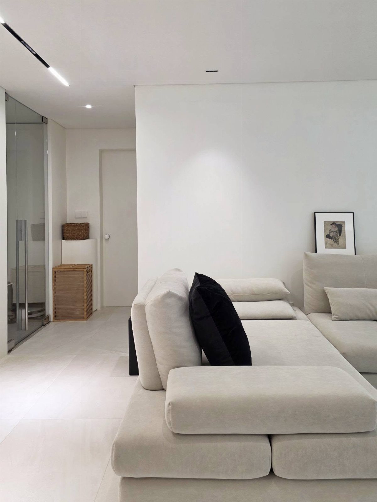
A low-profile sofa keeps sightlines open in a small apartment, while hidden storage behind flush cabinet panels clears surfaces without forcing you to get rid of what you actually use.
1. Neutral Color Palette
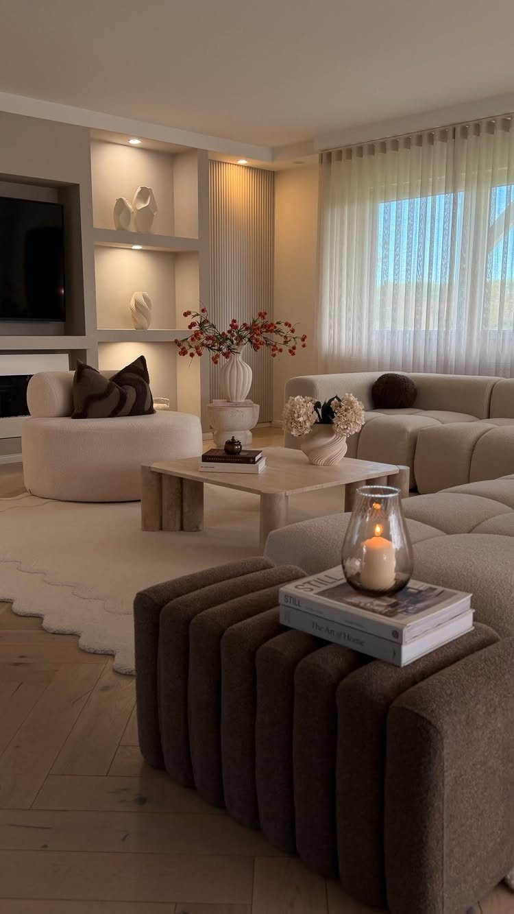
A neutral palette uses whites, beiges, grays, and soft tans to keep the room feeling calm rather than busy. I stick with two or three tones in a space and let texture do the work instead of adding more color.
This approach works especially well in small apartments where too much contrast can make the room feel tight.
If the space feels flat, add variation in finish: matte walls, a linen throw, polished stone. That gives the room depth without breaking the palette.
2. Clean Lines
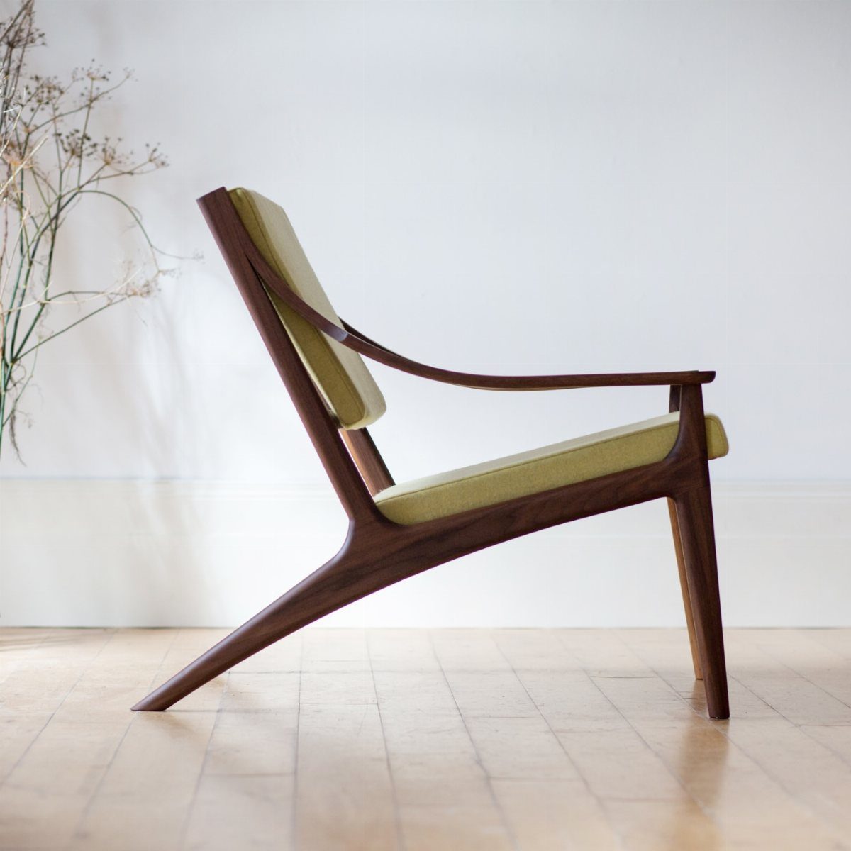
Furniture with clean lines skips carved detail, turned legs, and fussy trim in favor of simple forms defined by their edges.
A chair like this one, with exposed wood framing and straight angles, gives a room structure without adding visual noise.
I look for pieces where the joinery is part of the design rather than something the finish hides. That legibility is what makes minimalist furniture feel deliberate instead of plain.
Commit to it across the room or the effect falls apart. One ornate piece in a minimalist space pulls the eye for the wrong reason.
3. Natural Light
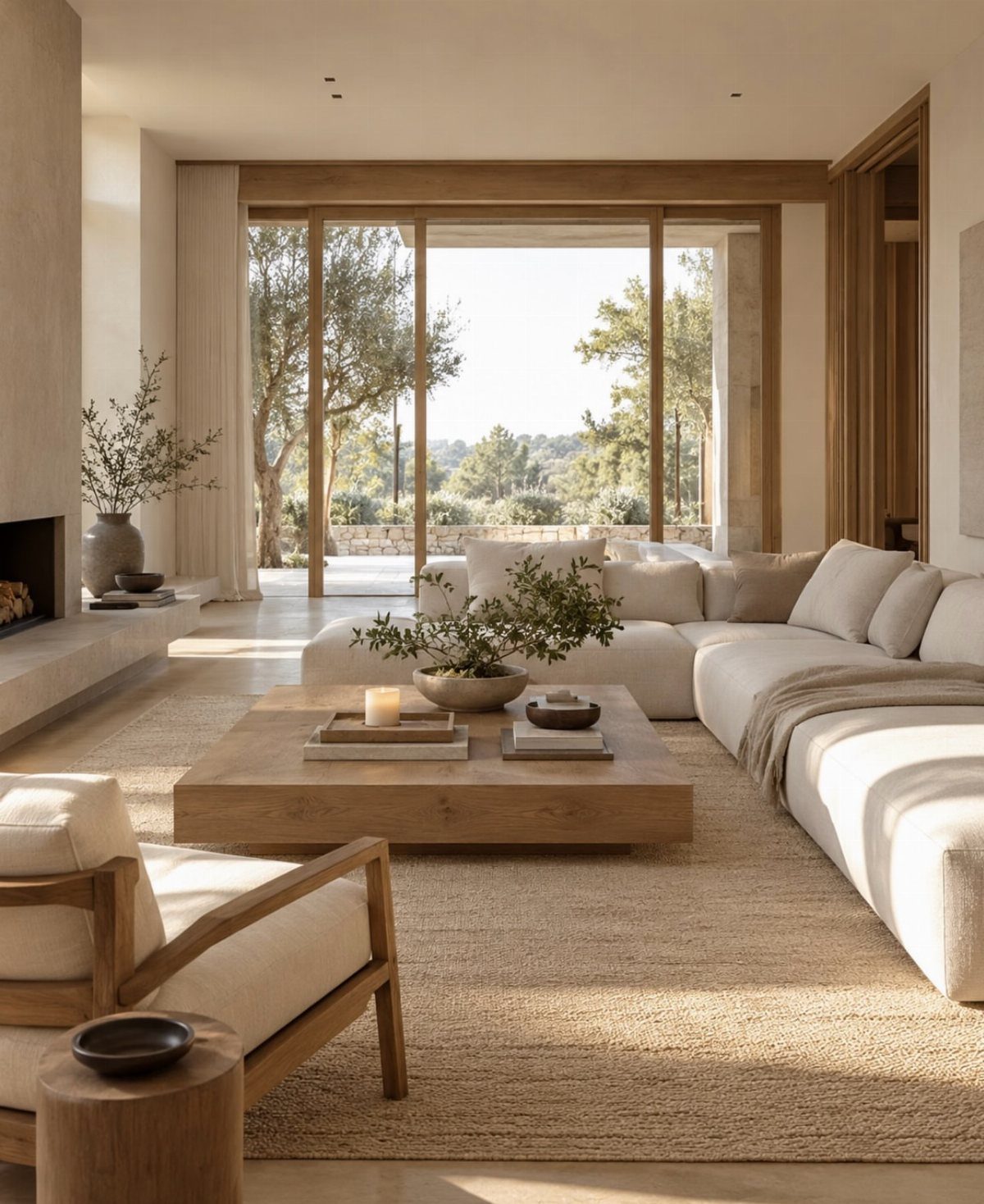
Natural light shapes a minimalist room more than any single piece of furniture. A glass wall like this one floods the space and makes the boundary between inside and outside feel less fixed.
If you have large windows, skip heavy drapes.
Sheer linen or no treatment at all keeps the light unfiltered. In rooms without much daylight, I paint walls white and position mirrors across from the windows to multiply what comes in.
Keep seating low and light in color so it does not block the view or the brightness.
4. Purposeful Decor
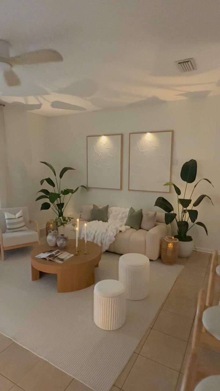
Purposeful decor means choosing a few pieces that matter to you and leaving out the rest. In this room, 2 large paintings and a handful of plants do all the decorating; nothing else competes for attention.
I pick artwork first, then let it set the scale for everything else. A single large piece reads stronger than a wall of small frames, and it takes up less visual space overall.
This approach suits anyone who feels overwhelmed by styling. A few considered objects will always look more finished than a crowd of random ones.
5. Open Floor Plan
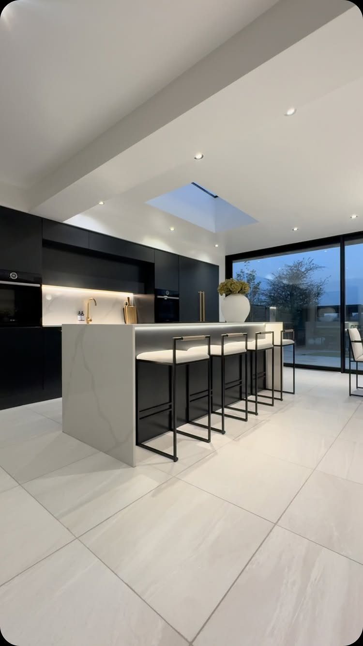
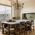
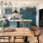
An open floor plan removes walls between the kitchen, dining area, and living room so the space reads as one continuous volume. The wide island here acts as the room’s anchor without dividing it the way a wall would.
This layout fits homes where circulation matters more than defined zones.
I have seen it fail in small apartments when there is no separation between cooking smells and seating, so consider a partial partition or a range hood with serious CFM if the kitchen sees heavy use.
The skylight pulls in overhead light, which helps an open plan feel airy instead of cavernous.
6. Hidden Storage
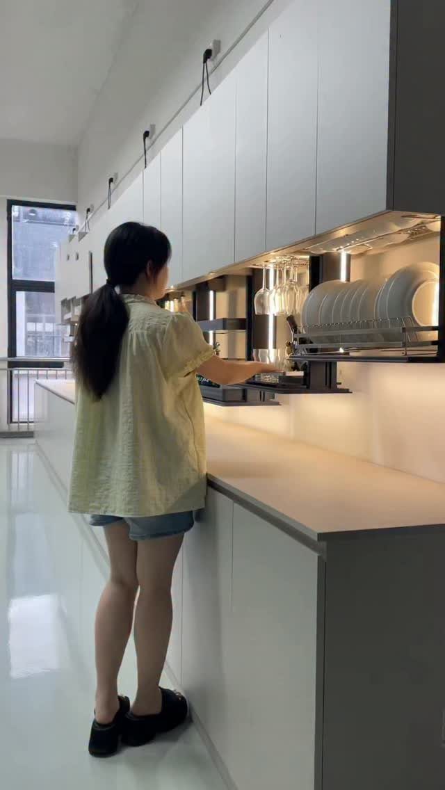
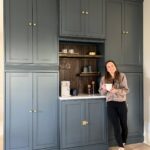
Hidden storage tucks everyday items behind cabinet doors, inside drawers, or within furniture so surfaces stay clear. The pull-down shelf visible here keeps dishes accessible without leaving them on display.
I install as much concealed storage as the room allows, then live with only what fits. That forces a useful edit and prevents the space from filling back up with things that do not earn their spot.
This suits renters and homeowners alike. In a rental, add freestanding cabinets with doors; in a home you own, built-ins with flush panels give the cleanest result.
7. Simple Geometric Furniture
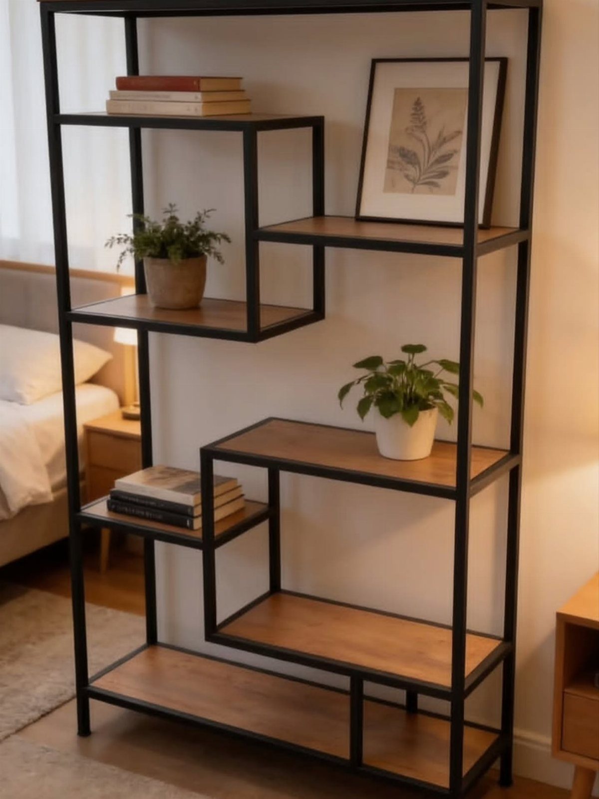
Geometric furniture uses repeating shapes to organize a room without adding decoration. A shelving unit built from squares or triangles holds books and plants in a way that feels intentional rather than crowded.
Metal and wood combinations work especially well because the contrast between materials makes the structure readable.
This suits small bedrooms where a heavy bookcase would feel out of scale. The openness keeps the wall from closing in.
8. Wood Accents
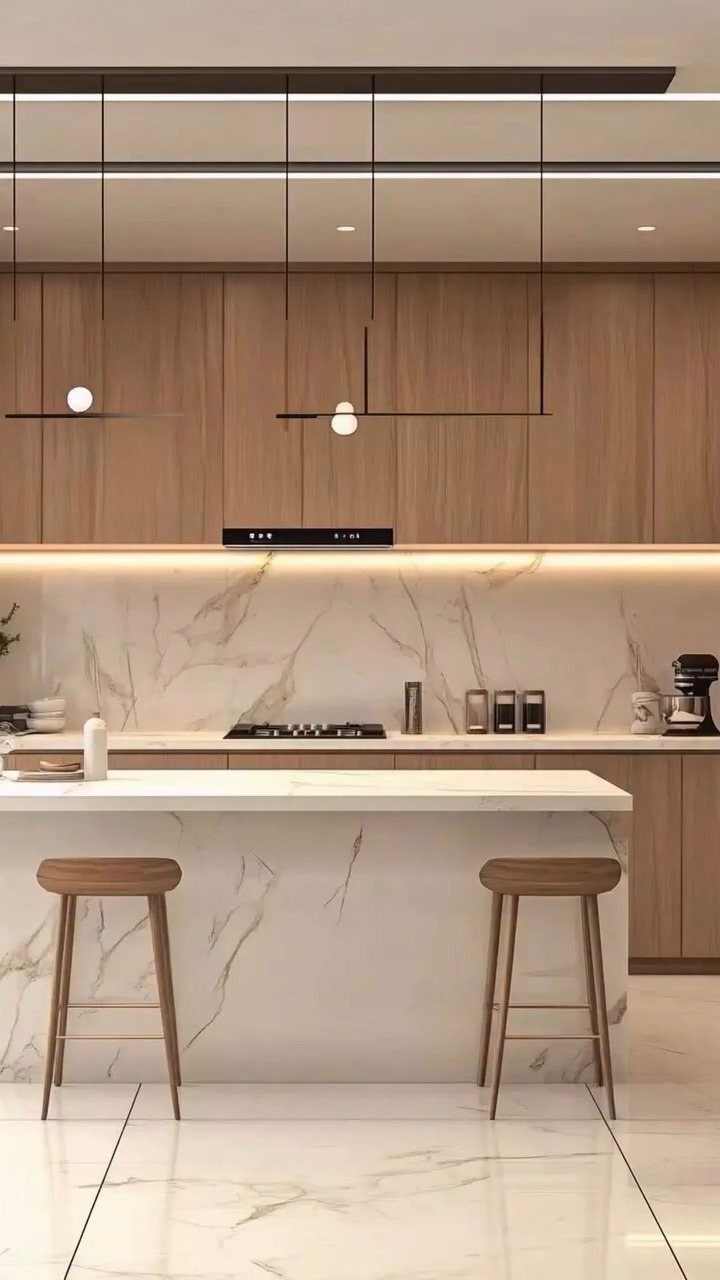
Wood brings warmth into a minimalist space without breaking the restraint. Light oak or ash cabinetry, like what is visible here, softens an all-white kitchen and gives the room a material you want to touch.
I use wood on one surface and let it anchor the palette. Cabinets, a dining table, or bar stools in a natural finish all do the job; pick one and keep the rest neutral.
Skip dark stains in small kitchens. They read heavy and cancel out the brightness wood is supposed to add.
9. Low-profile Sofa
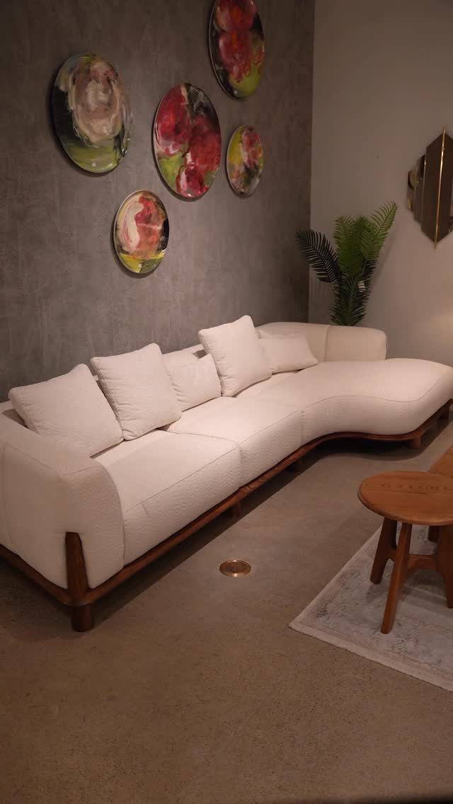
A low-profile sofa sits close to the floor and keeps sightlines open across the room. The curved silhouette here takes up less visual weight than a tall-backed sectional would in the same footprint.
This setup suits apartments with low ceilings or limited square footage, where a standard sofa height can make the room feel compressed. I look for seat cushions that sit low to the floor.
Pair it with a low coffee table so the proportions stay consistent. A tall side table next to a low sofa always looks like a mistake.
10. Plants as Accents
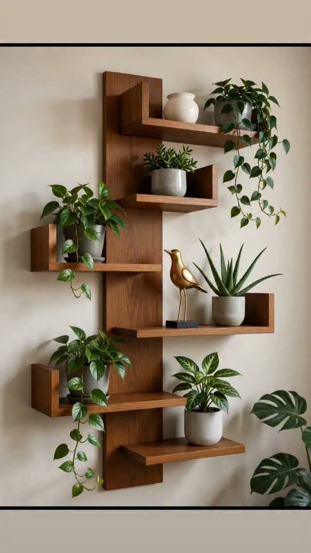
Plants add life to a neutral room without complicating the color scheme. A few potted greens on open shelving give the wall texture and movement that a blank surface cannot.
I use small to medium plants in simple pots and group them at different heights. Three or four on a shelf is enough; more than that and it starts to feel cluttered.
This suits renters especially well because plants are one of the few things you can add to a space without altering it permanently.
11. Minimalist Media Wall
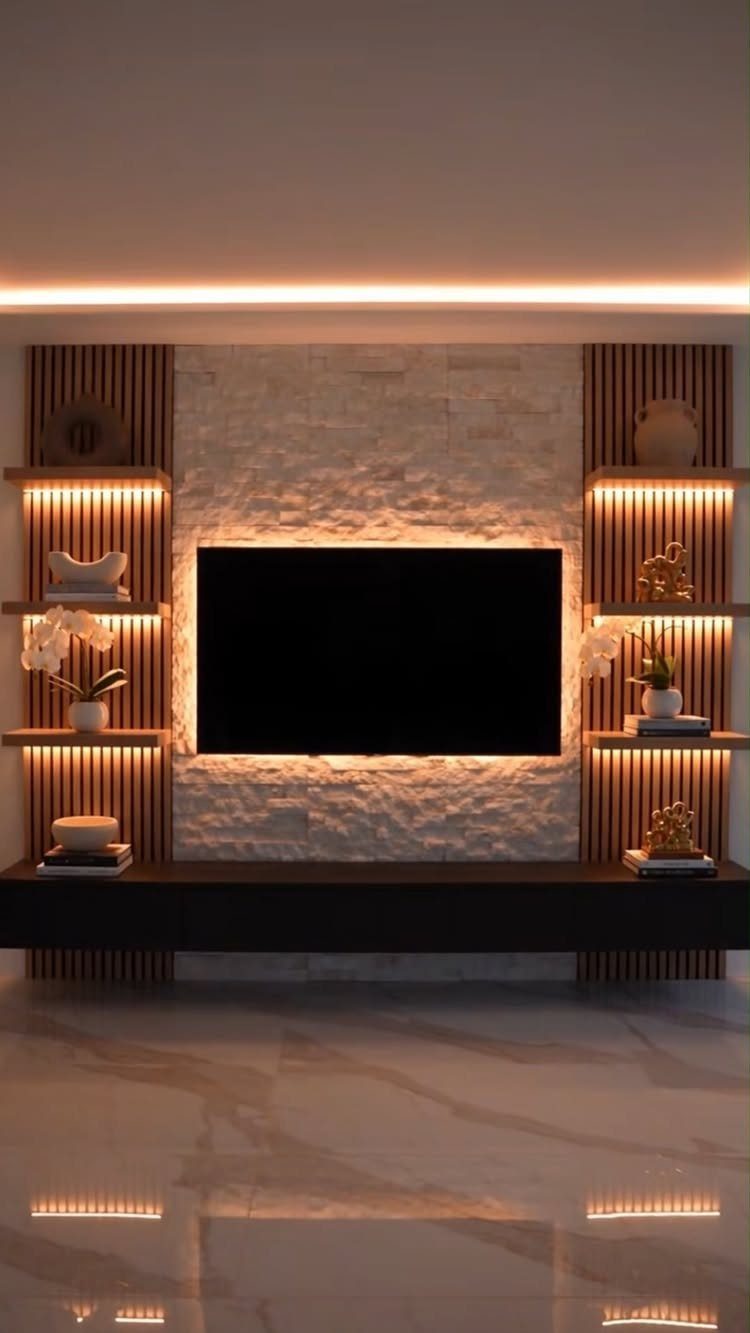
A minimalist media wall centers the television on a textured stone or marble panel and flanks it with slim shelving or a long cabinet. Integrated lighting, like the warm strips here, adds depth without adding objects.
I keep decor minimal on the shelves and let the stone do the work. The material itself is the feature, and anything that competes with it weakens the effect.
This setup fits living rooms where the TV is the focus but you do not want it to dominate. The stone gives it a backdrop that feels considered.
12. Under-counter Bar Stools
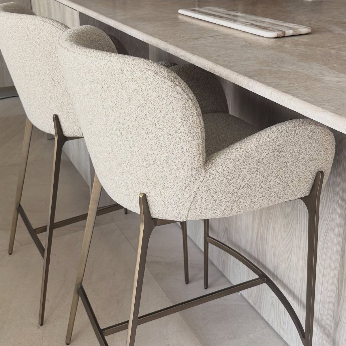
Under-counter stools with slim legs tuck completely beneath the countertop when not in use, which keeps circulation open in a small kitchen. Upholstered seats in cream or beige, like these, add softness without standing out against a marble counter.
I look for stools with a low profile and legs that taper. Bronze or brass-toned metal works better here than black because it reads warmer next to light stone.
This suits open kitchens where the island is visible from the living area and you do not want a row of stools breaking up the sightline.
13. Sculptural Wall Feature
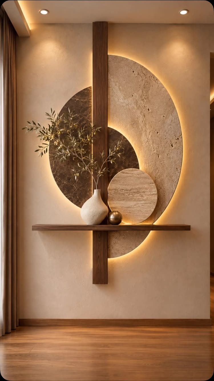
Overlapping stone circles mounted to a vertical beam with integrated backlighting add dimension to a flat wall without filling it with objects. The shelf beneath holds one or two pieces; anything more begins to look busy.
I install the beam first and use standoffs to hold the stone rounds at different depths.
That layering is what creates shadow and depth when the light comes on. Warm LED strips run behind the stone so the glow reads soft instead of harsh.
This suits a large living room or bedroom where you want a focal point that does not take up floor space.
14. Minimalist Hallway
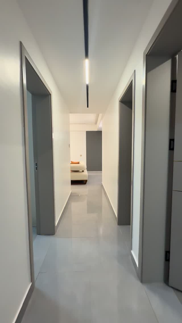
A minimalist hallway keeps walls bare and flooring uniform so the corridor moves your eye forward instead of holding it.
Polished light tile or hardwood in pale tones reflects whatever natural light reaches it and makes a narrow passage feel wider than it is.
Clear circulation matters more than decoration, and anything that narrows the path gives that up.
A single linear ceiling light provides enough brightness without creating the dim pockets you get from wall sconces.
15. Simple Surface Styling
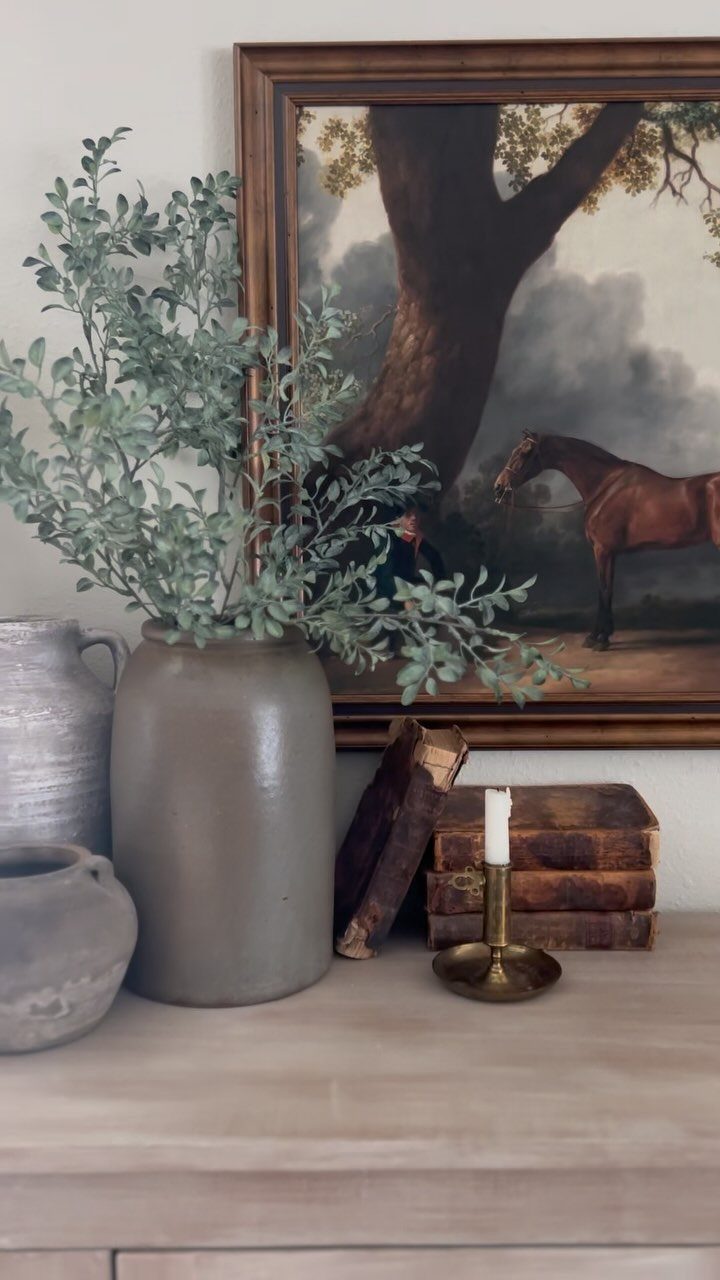
A wooden surface styled with two or three vases, a small stack of books, and a candle holder gives a room a finishing layer without crowding the space. Keeping the count low matters more than what you choose.
I group items at different heights and leave gaps between them so each one registers on its own.
This suits renters especially well because it personalizes a room without requiring any installation.
History and Design Influences
Minimalist interiors draw from several early 20th-century movements that valued clarity over decoration. Ludwig Mies van der Rohe’s modernist principle shaped furniture and architecture, while Japanese design and Zen aesthetics introduced the idea that empty space itself holds value.
De Stijl and the 1960s Minimalist art movements pushed restraint further, stripping form down to pure geometry and color. Those influences show up in interiors through flat panels, right angles, and limited palettes.
The open plan is older than minimalism as a style.
Good design doesn’t have to be loud—or in your face. For minimalist interior designers, there’s beauty in simplicity and restraint.
Minimalism Is Personal
What counts as essential changes from person to person. A minimalist room can hold a wall of books or only a bed and a chair; what makes it work is that every choice was made on purpose.
Effective minimalism takes editing.
Leaving a room empty is not the same as deciding what stays and what goes. I start by asking what a space needs to function, then add only the objects that matter enough to earn their spot.
Warmer tones soften the approach without giving up the discipline.
Jute rugs, plaster walls, and rich woods create a space that feels calming and comfortable instead of clinical. The restraint is still there, but the palette shifts away from stark white.
Minimalism and Related Styles
Minimalism overlaps with modern, Scandinavian, and Japandi design but differs in intent.
Scandinavian style brings warmth and light wood, Japandi mixes Japanese restraint with Nordic comfort, and minimalism strips down to empty space treated as carefully as the objects that remain.
The open layout common to minimalist rooms predates the style itself.
The difference between these styles shows up in how they treat warmth and detail. Scandinavian design adds texture and softness, Japandi layers natural materials, and minimalism strips down to structure and light.
Frequently Asked Questions
What is minimalist interior design style?
Minimalist interior design uses neutral colors, clean-lined furniture, and open space to create a calm room where every object has a purpose.
It values empty space as much as the furniture itself, drawing from early 20th-century movements like Bauhaus and Japanese Zen aesthetics. The style works by editing down to what matters rather than simply leaving a room bare.
What is the 3-5-7 rule for interior decorating?
Odd-numbered clusters of decor objects balance better visually than even-numbered ones.
In a minimalist room, I use it sparingly: 3 vases on a shelf or 5 small plants create a focal point without filling the surface. Even-numbered groupings feel more static and less intentional.
Is minimalism still popular in 2026?
Minimalism remains popular in 2026, but the mood has shifted toward warmer tones. The discipline stays, but the palette softens to feel more comfortable.
How does minimalist design still feel cozy?
Warm textures make minimalist rooms feel inviting without adding clutter.
I bring in linen throws, jute rugs, and light wood furniture to soften the space while keeping surfaces clear. The room stays restrained, but the materials give you something tactile and comfortable.
Is minimalist design suitable for small spaces?
Minimalist design works especially well in small spaces because clean lines and hidden storage prevent the cramped look.
I use concealed cabinets to clear surfaces and choose low-profile furniture that opens up sightlines. The result is a small room that feels larger than its square footage.
How do I declutter for a minimalist design?
Start by keeping only what the space needs to function, then add objects that matter enough to earn their spot.
I sort through belongings and remove anything that does not serve a clear purpose or hold personal value. Hidden storage keeps what remains organized and out of sight so surfaces stay clear.