Cabinet color sets the room’s mood and changes how light moves through the space, which matters more in a small kitchen or one with limited natural light than in a bright, open layout.
White and cream reflect light and make compact rooms feel larger, while darker shades like navy or forest green add richness but need good overhead and task lighting to keep the space from closing in.
1. White Cabinets
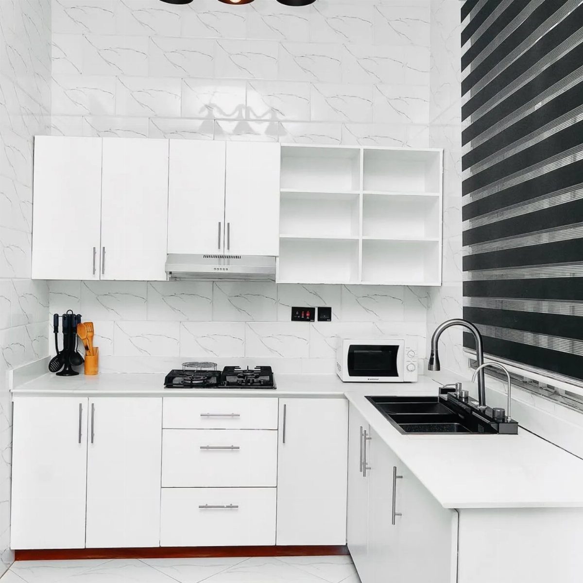
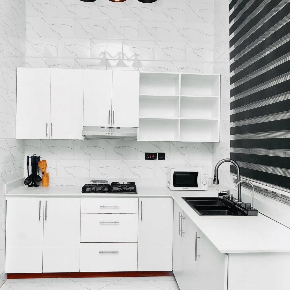
White cabinets reflect light and make a small kitchen feel larger, which is why they stay so common. They pair with nearly any countertop material and backsplash pattern without creating visual clashes.
The one risk is showing every fingerprint and splash. If you cook often, a satin or eggshell finish hides marks better than high gloss, and choosing a warm white over stark white keeps the room from feeling cold.
2. Green Cabinets
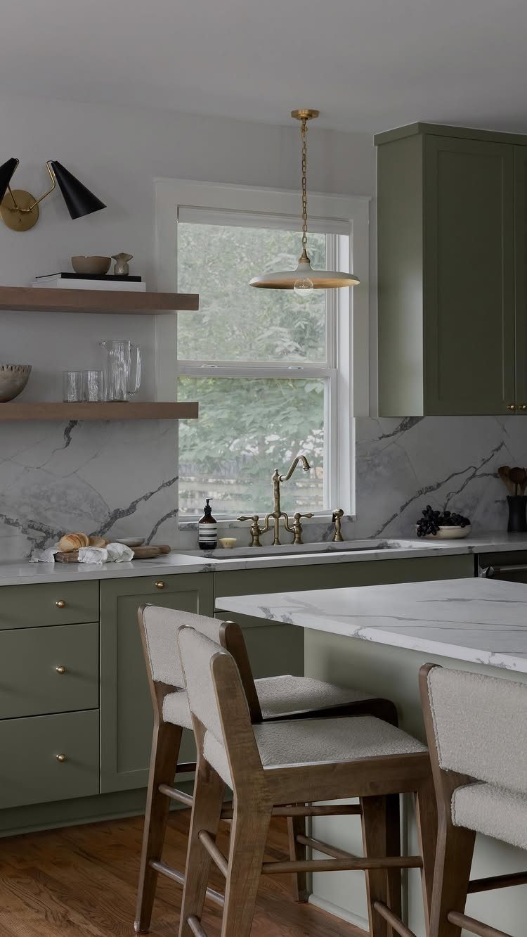
Sage green brings a soft, organic feel without reading as loud color.
It works especially well in kitchens with good natural light, where the tone shifts through the day. Pair it with white countertops and light wood or brass hardware to keep the palette grounded.
Darker greens like forest or hunter add richness but need careful balancing. If you go deep on the cabinets, keep the walls and countertops lighter so the room doesn’t close in.
3. Blue Cabinets
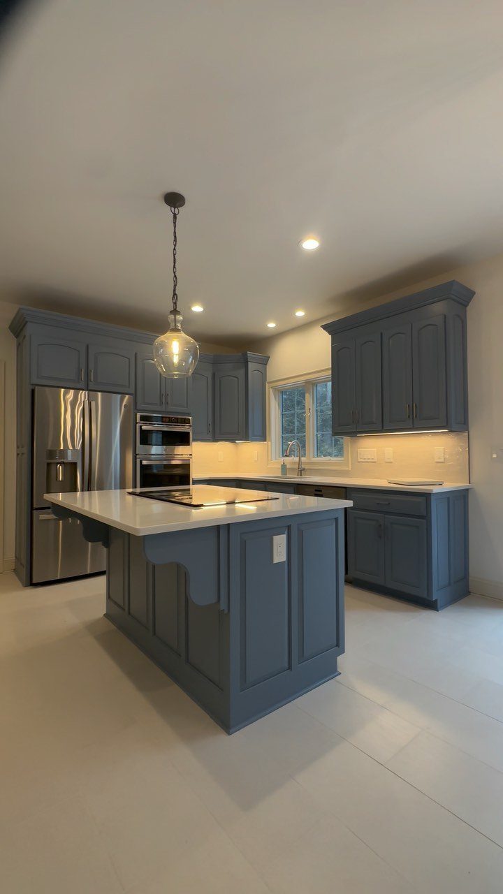
Blue cabinets bring a calm, collected tone to a kitchen, and the range is wide: pale powder blue for a soft look, navy for a more formal feel.
A mid-tone blue like this anchors the room without feeling heavy, especially when you balance it with white countertops and an island in a lighter finish.
If you’re repainting existing cabinets, blue hides imperfections better than white.
4. Two-Tone Cabinets
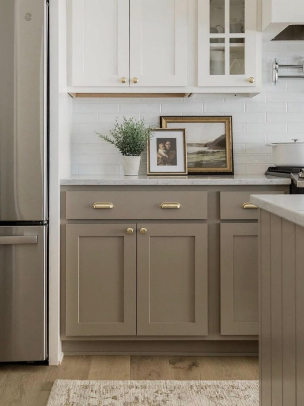
Splitting cabinet colors between uppers and lowers gives you more flexibility than committing to one shade throughout.
In this setup, white uppers keep the ceiling line light while taupe lowers add warmth and hide wear near the floor. Gold hardware ties the 2 tones together.
I prefer darker cabinets on the bottom when the kitchen is small, because it anchors the space without making it feel top-heavy. Keep the transition clean: no border trim or dividing rail, just a straight color break at the counter.
5. Natural Wood Cabinets
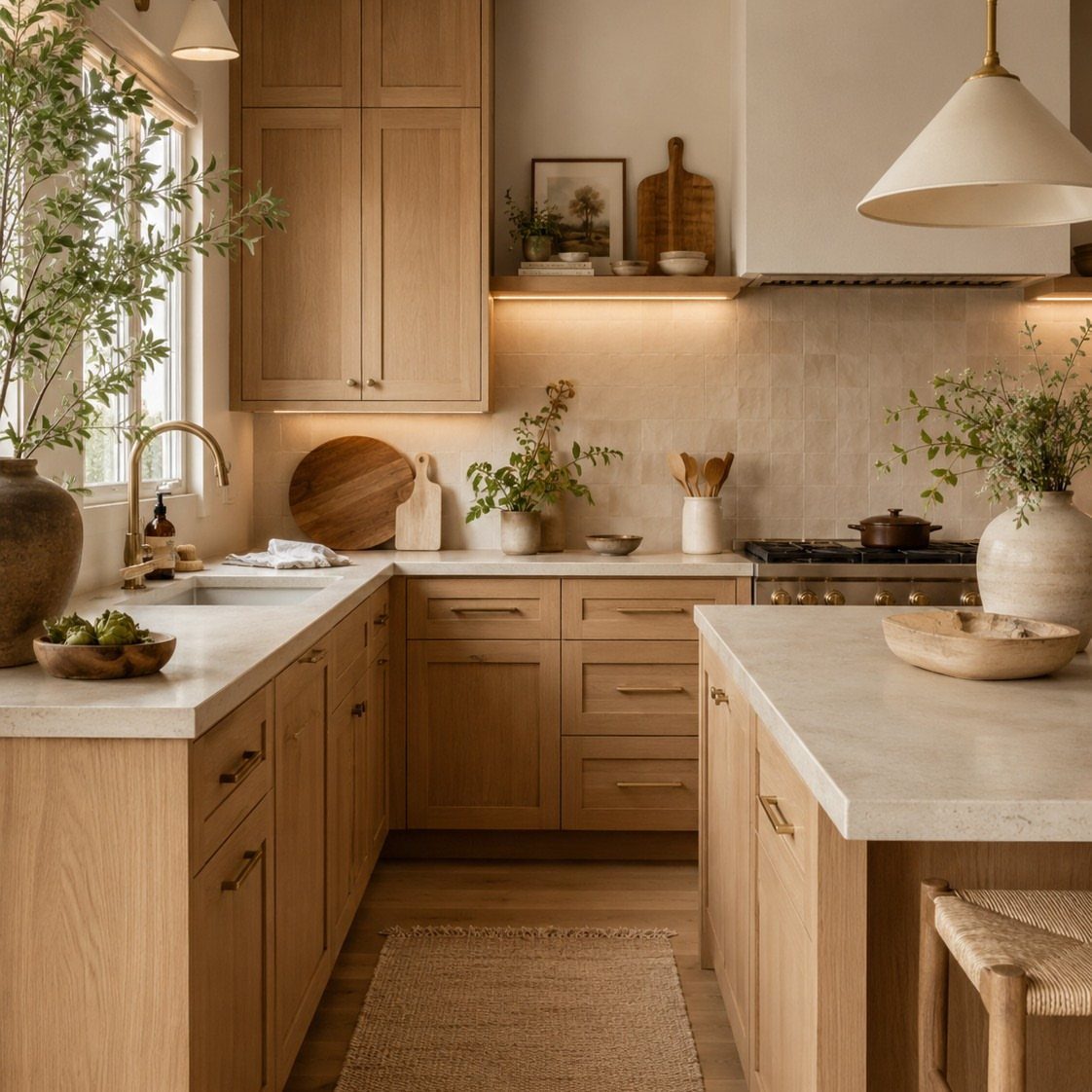
Light wood cabinets bring texture and warmth without needing much else in the room.
The grain itself creates visual interest, so you can keep countertops and backsplashes simple. White quartz or marble works, as does a plain white subway tile.
Wood finishes vary widely.
A natural or clear coat shows the grain fully, while a light stain adds color but still lets the wood pattern show through. If the kitchen gets a lot of use, a sealed finish protects better than raw wood.
6. Earthy Natural Shades
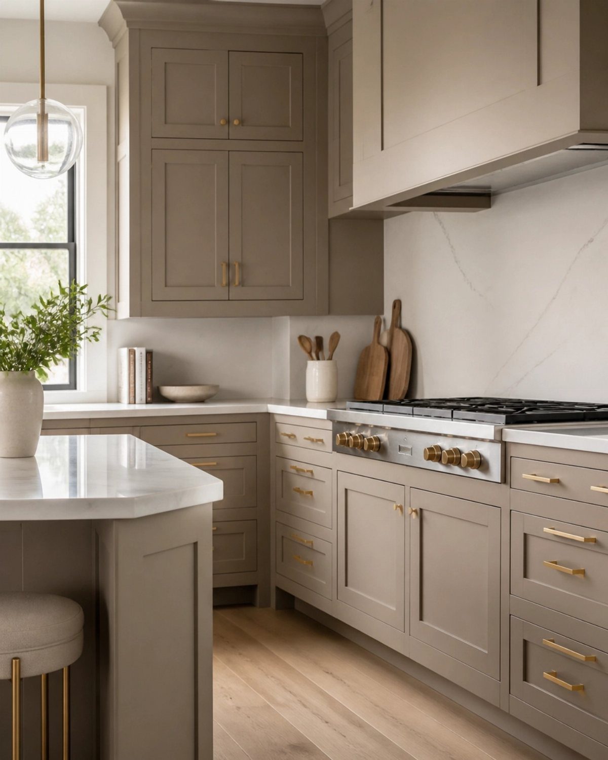
Taupe sits between beige and gray, which gives you more room to pair it with different countertops and floors without worrying about clashing undertones.
These shades work especially well when you want color but don’t want the kitchen to feel bold. Pair them with warm white walls and natural wood accents, and the palette stays cohesive without needing strong contrast.
While these hues might sound bold on the surface, they really act as quite the opposite. ‘They’ve stuck around because they behave like strong neutrals; they pair easily with wood and stone and don’t date the way trend-led colors can,’ she explains.
7. Gray Cabinets
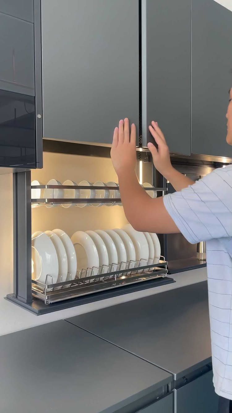
Gray cabinets work as a middle ground when you want something quieter than white but don’t want to commit to color. They pair easily with stainless appliances and white countertops, and the tone reads contemporary without feeling cold.
Lighter grays keep a small kitchen open, while darker charcoal adds weight and works better in larger rooms with strong natural light.
If you’re repainting, a gray with warm undertones avoids the flat, institutional look that straight cool gray can give.
8. Pastel Cabinets
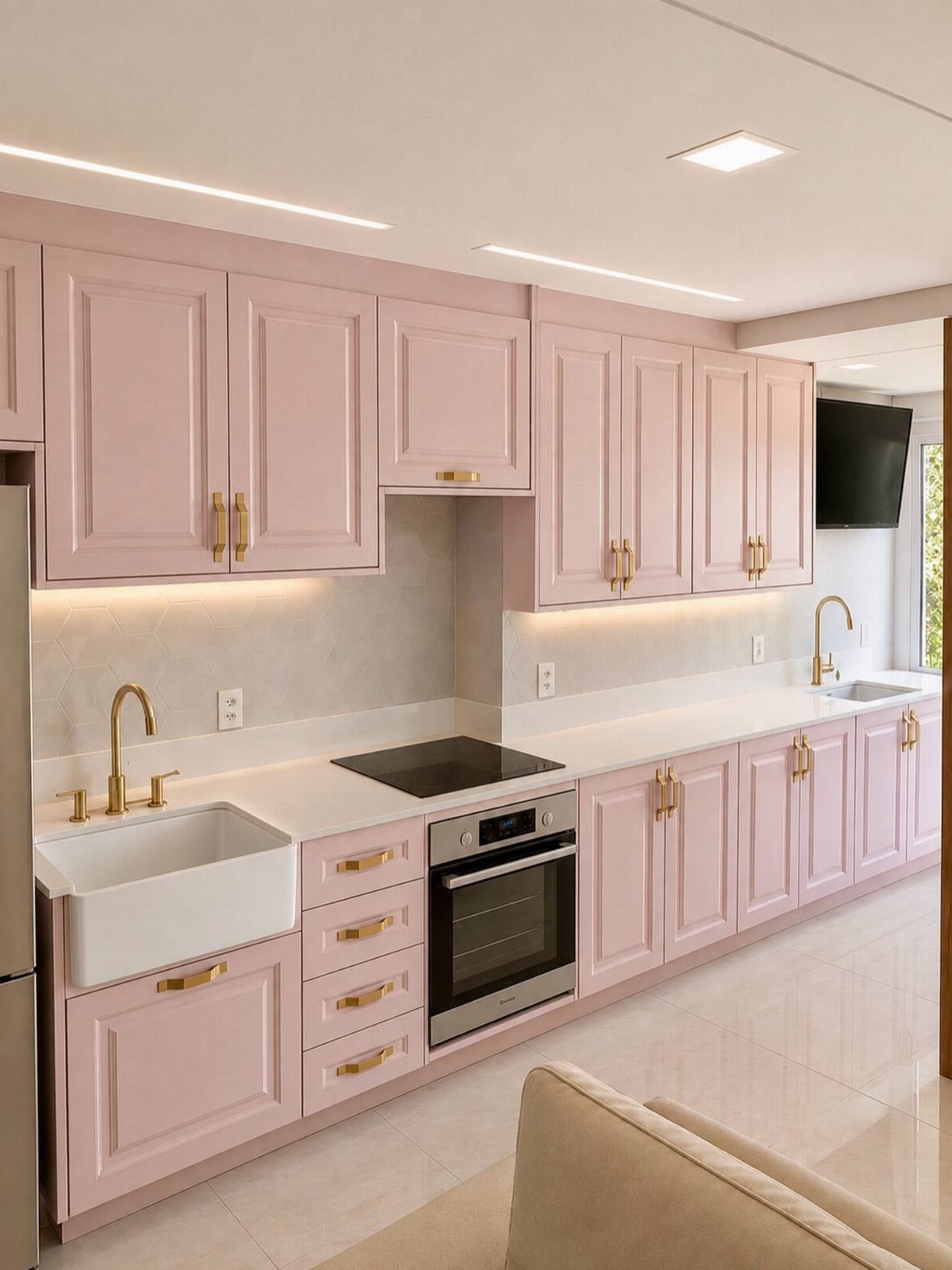
Pale pink cabinets soften a kitchen without reading as loud or trendy.
Bright rooms with plenty of natural light keep the shade from tipping into overly saccharine territory. Gold hardware adds just enough contrast to define the cabinet edges, and white countertops balance the color without competing with it.
This choice suits someone who wants personality but doesn’t want the kitchen to feel bold. If pink feels too much, a pale peach or blush tone gives a similar warmth with slightly more neutrality.
9. Dark Cabinets
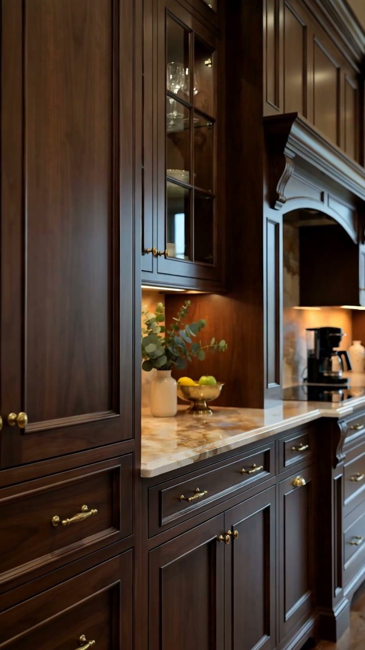
Dark wood cabinets in a warm brown tone add richness without the stark contrast of black.
The grain shows through, which gives the room texture, and the color itself feels grounded rather than dramatic. Marble countertops lighten the palette, and under-cabinet lighting keeps the lower cabinets from disappearing into shadow.
Good overhead and task lighting are non-negotiable here, since dark surfaces swallow light instead of bouncing it back. If the room is small or dim, keep the uppers lighter or skip them entirely.
10. Sand-Tone Cabinets
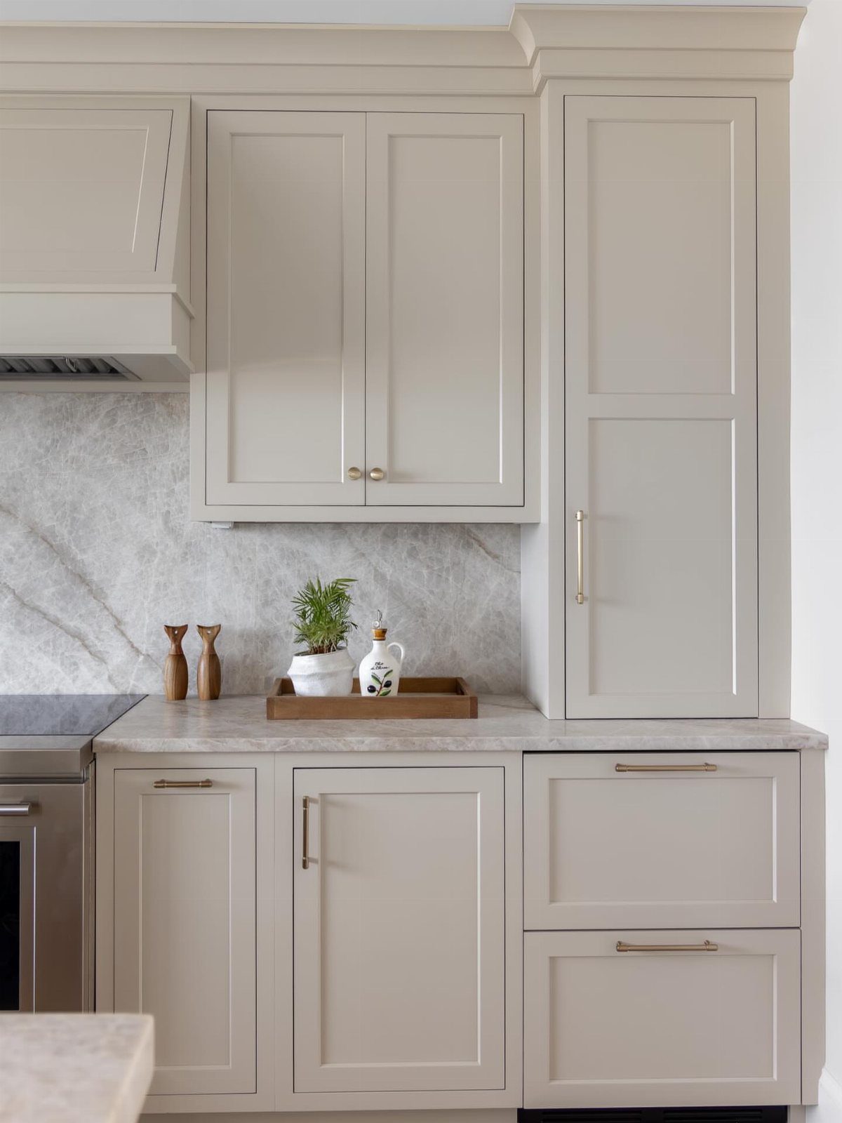
Sand tones sit between beige and tan, warm enough to feel inviting but neutral enough to pair with almost any countertop or floor.
Gold hardware adds definition without creating sharp contrast, and a marble backsplash keeps the palette clean. If you’re painting cabinets yourself, sand tones are forgiving: they hide brush marks and uneven coverage better than white or black.
11. Creamy White Cabinets
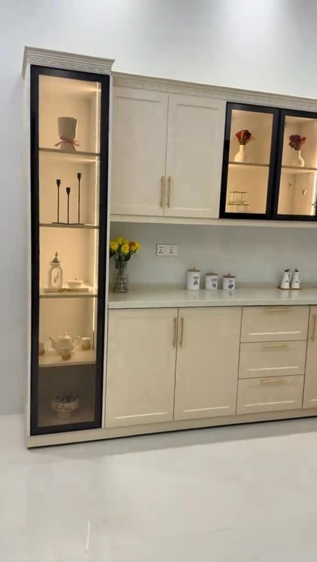
Cream brings warmth that bright white cabinets don’t, and the difference is more visible in low light or rooms with north-facing windows.
The tone pairs well with warm metals like brass or gold, and it reads softer against natural wood floors.
If you already have white cabinets and want to shift the mood without a full repaint, swapping out cool white for a warm cream on just the island or lowers gives you the effect without committing to the whole room.
Choosing Colors for Space and Light
Lighter cabinet colors reflect more light, which makes a small kitchen feel larger and more open. White, cream, and pale gray work well in compact layouts or rooms with limited natural light.
Darker finishes like navy, charcoal, or deep green add warmth and weight, but they need space and strong lighting to keep the room from feeling closed in.
Natural light changes how a cabinet color reads through the day.
A sage green that looks soft in morning sun can feel richer by afternoon. Artificial lighting matters just as much: warm bulbs bring out the yellow in cream cabinets, while cool LEDs make gray look flatter.
In a small kitchen with north-facing windows, stick with lighter shades. In a large room with good overhead and task lighting, darker cabinets hold their own.
Coordinate Kitchen Materials
Cabinet color sets the tone, but every other material in the kitchen has to support it.
A white cabinet pairs easily with nearly any countertop or backsplash, while a bold color like navy or forest green needs careful coordination to avoid clashing.
Neutral cabinets give you the most flexibility. Taupe, sand, and soft gray work with marble, quartz, or butcher block without creating visual competition.
If you’re using a strong cabinet color, keep countertops and backsplashes simple: white subway tile or a plain quartz slab lets the cabinets stay the focus.
Flooring and hardware matter too. Warm wood floors soften a cool gray cabinet, and brass or gold hardware adds definition to cream or white without creating harsh contrast.
Personal Taste and Longevity
Cabinet color should reflect what you actually want to live with, not just what looks current. Trends shift, but a kitchen cabinet finish can sit there a long time before you repaint or replace it.
Neutral tones like white, cream, and gray hold appeal across different tastes, which helps if resale matters to you. A bold color personalizes the space but may narrow the pool of buyers who see it as move-in ready.
If you’re drawn to a trendy shade, consider using it on a smaller surface like an island or lower cabinets, where it’s easier to repaint later.
That way you get the personality without committing the whole room to a color that may feel dated in a few years.
Frequently Asked Questions
What is the most popular color for new kitchen cabinets?
White remains the most popular cabinet color, appearing in about 40% of new kitchens. It reflects light to make small spaces feel larger, pairs with any countertop or backsplash, and gives buyers a neutral base if you sell later.
Warm whites and creams have gained ground over stark white because they feel softer in low light.
What color is replacing gray in 2026?
Warm neutrals like taupe, sand, and greige are taking over from cool gray. Gray is still around, but homeowners are choosing versions with warm undertones instead of flat, cool tones.
What colors to avoid in kitchen cabinets?
Avoid stark white in kitchens that don’t get much natural light, because it can feel cold and institutional.
Jet black and very dark finishes close in a small kitchen and demand strong lighting to work. Trendy bold colors like bright red or loud color combinations can feel dated quickly and narrow your buyer pool if you sell.
How do you choose the right cabinet paint color?
Start with the size and light in your kitchen: lighter colors like white or cream make a small or dim room feel open, while darker shades need space and good lighting.
Then look at your countertops, floors, and backsplash to make sure the cabinet color pairs without clashing.
If you want a bold color, test it on just the island or lower cabinets first so you can repaint later without redoing the whole room.
What kitchen cabinet color is right for me?
Pick the color you want to look at every day, not just what ranks as trendy right now.
Neutrals like white, cream, taupe, and soft gray work with almost any countertop and hold appeal over time, which matters if resale is on your mind.
If you’re drawn to a stronger color like navy or sage green, make sure your kitchen gets enough natural light to keep the tone from feeling heavy.