White subway tile is the top pick because the 3-by-6-inch shape and 50% offset pattern work in nearly every kitchen without dating themselves.
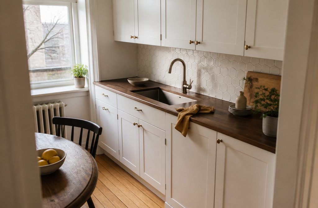
But if your space already has white cabinets and white counters, you need a backsplash with more texture or pattern to keep the room from reading flat.
Herringbone, hexagon, or mosaic tiles add detail without introducing color, and they give the wall enough dimension that the kitchen doesn’t disappear into itself.
1. White Subway Tile
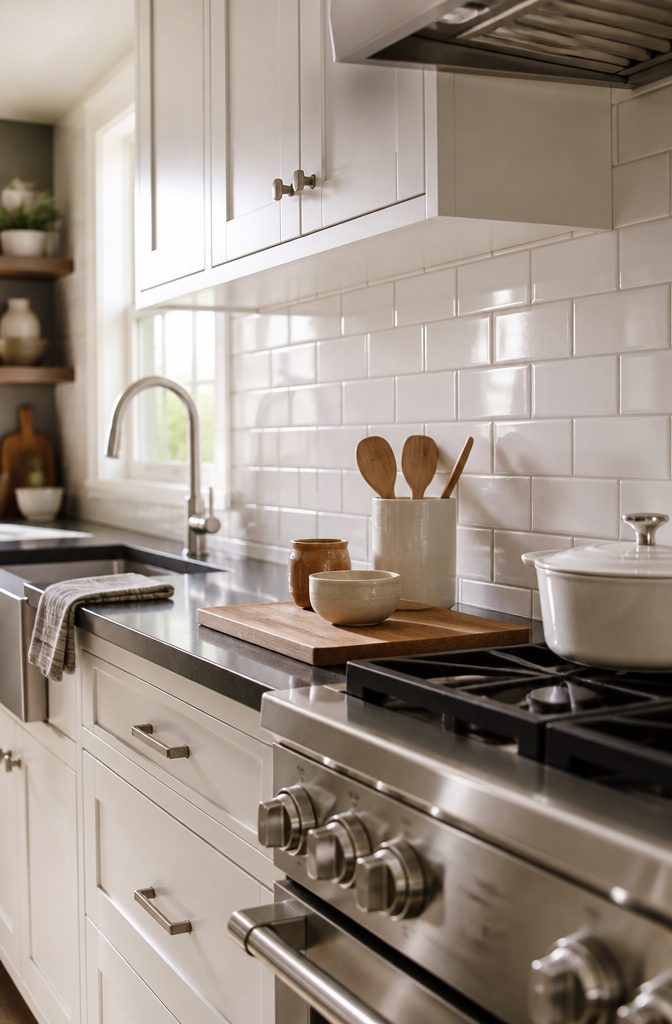
White subway tile is the one backsplash that works in nearly every kitchen, and that reliability comes from two things: the 3-by-6-inch rectangular shape installed horizontally and the 50% offset pattern, where each row starts at the midpoint of the tile below it.
The pattern was built for the New York City subway system and hasn’t changed because it didn’t need to.
The offset keeps grout lines from stacking into long vertical seams, which would look rigid, and the horizontal orientation makes a wall read wider.
Ceramic subway tile holds up well because the material resists heat and moisture without much maintenance.
That durability is why minimalist designers keep coming back to it—it doesn’t compete with cabinets or countertops, and it doesn’t date itself the way a bold pattern can.
If you’re working with white cabinets or stainless appliances, a white subway backsplash adds enough contrast in the grout lines to define the wall without introducing a second colour you’ll need to live with for years.
2. White Mosaic Tile
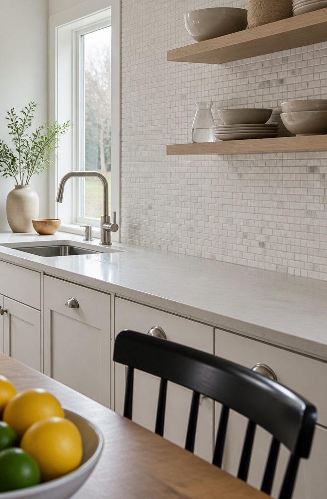
Small tiles arranged in mosaic patterns bring detail and visual weight that a plain white backsplash often lacks on its own.
The patterning can be subtle or busy depending on the tile shape and layout, but either way the effect is more layered than a flat field of subway or large-format slabs.
I’ve found mosaic works especially well when white feels too quiet by itself and the room needs a bit more going on without introducing a second color.
Mosaic tiles come in many shapes—squares, hexagons, ovals, linear strips—and the pattern is what carries the interest.
A linear mosaic, for example, reads as clean and directional, while a more varied arrangement can look almost like an art installation across the wall.
The intricate detailing gives the kitchen a sense of individuality that a single-tile format doesn’t offer as easily.
If pure white still feels too neutral, mosaic tiles with gray accents add a hint of contrast and depth while keeping the overall look bright.
The combination keeps the space luminous but introduces enough variation that the backsplash doesn’t disappear into the walls.
3. White Herringbone Tile
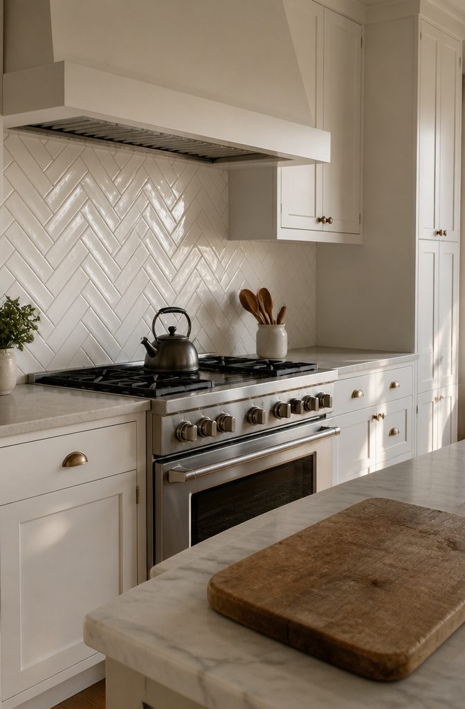
The zigzag arrangement puts rectangular tiles in a V-shaped pattern, each one offset at a 45-degree angle to the next, so the blocks interlock in a way that gives the wall more texture than straight rows would.
Most herringbone uses tiles with block edge lengths in a 2:1 ratio, though 3:1 shows up as well.
The uneven edges mean the pattern reads as movement rather than static grid, which helps when the rest of the kitchen leans simple—white cabinets, a plain island, not much else competing for attention.
I like herringbone behind a range where the added detail balances clean cabinetry without requiring color or a second material.
Both matte and glossy finishes work, and the choice there comes down to how much light you want bouncing back: glossy reads sharper, matte stays softer.
4. White Geometric-Patterned Tile
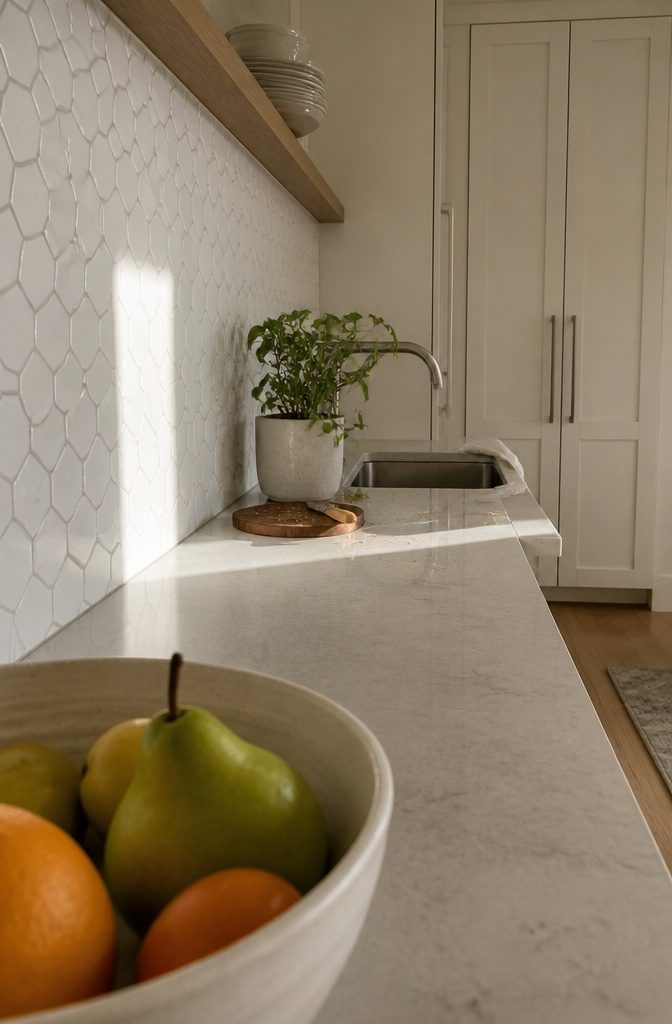
Geometric patterns deliver clean angles and repeated shapes that separate a backsplash from a basic grid. The repetition itself does the work: triangles, squares, or hexagons laid in a deliberate sequence read modern without being loud.
That repetition builds a rhythm across the wall, and the pattern shows even when the tile is white from edge to edge.
Hexagon tiles land somewhere between simple and complicated.
The six-sided shape adds geometry without needing bold color, and white keeps the pattern from overwhelming a small kitchen. I find the honeycomb arrangement brings sophistication that subway tile doesn’t offer, especially when the rest of the room stays neutral.
The irregular angles catch light differently than flat rectangles, so the backsplash feels more finished even when the material is ceramic.
You can also go asymmetrical. Irregular tile patterns let you step away from perfect alignment and show that the layout was a decision, not a default.
The off-angle framework works best when the rest of the kitchen holds back, because the backsplash becomes the detail that decides the look.
5. White Marble
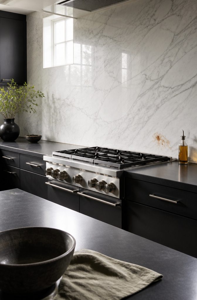
White marble brings gray veining through a pristine surface, and that contrast is what keeps it at the top of the list for white kitchen backsplashes.
The natural stone pairs elegantly with styles that range from contemporary to vintage, and the inherent sparkle catches light in a way tile does not quite match.
Marble is one of the pricier backsplash materials, but the look justifies the cost when the rest of the kitchen is understated enough to let the stone stand out.
I recommend pairing white marble with dark elements—black cabinets or black granite countertops—so the veining becomes the focal point rather than getting lost against pale surroundings.
White Carrara is the classic, available in subway, herringbone, hexagon, or penny tile patterns, and all of them hold up visually over time. Marble needs sealing to protect against stains, especially behind a range or sink.
6. White Hexagon Tile
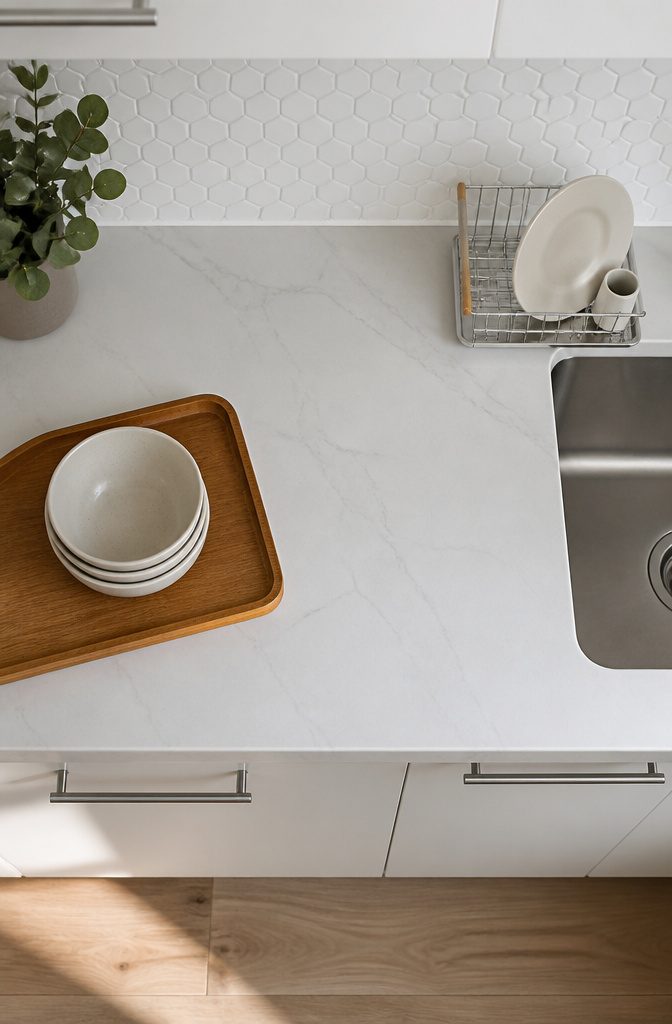
The six-sided tile forms a honeycomb pattern that reads contemporary without tipping into trendy.
I like hexagon tile when the kitchen leans minimal but needs something to hold your eye, because the geometry does the work without color or heavy texture.
It strikes a balance between plain and busy that works especially well with flat-panel cabinets and simple hardware.
White hexagon ceramic tile brings brightness and makes a small kitchen feel more open. The repeating shape adds visual interest at a scale that stays calm, which matters when countertops, appliances, and open shelving are already competing for attention.
The tile works in a full honeycomb layout or spaced out for a more minimal approach, and both read clean rather than cluttered.
If you want personal style but settled on white for practical reasons, the hexagon shape gives you that without introducing pattern complexity that fights the rest of the room.
7. White Glass Tile
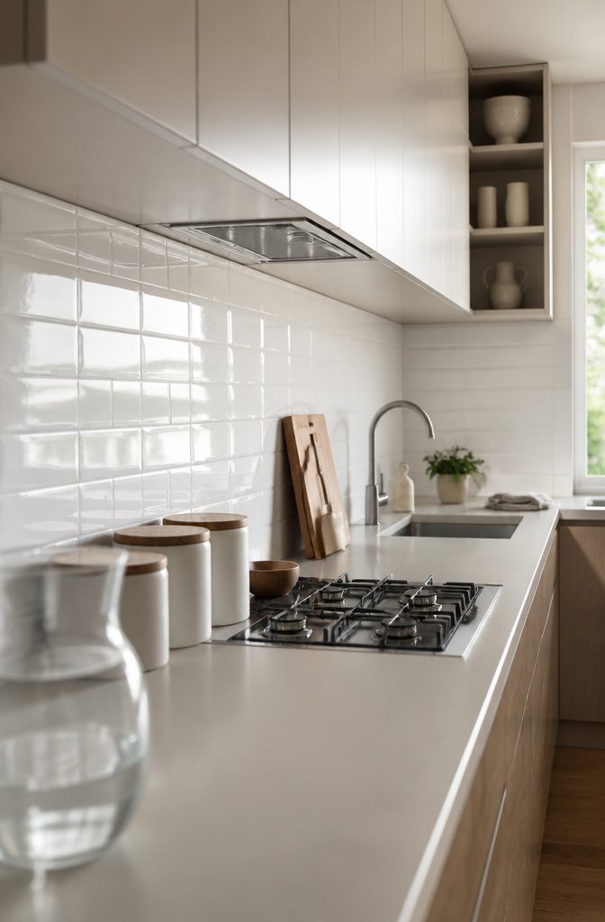
White glass tile reflects light back into the room, which makes it a good fit when the kitchen is on the small side or when natural light is thin.
The reflective surface brightens the space and gives the impression of more square footage than the walls actually enclose. That optical lift is practical in a galley kitchen or anywhere the counter runs along a windowless wall.
The modern look suits contemporary kitchens, and the sleek surface keeps the aesthetic clean.
But glass does show fingerprints quickly, so if the backsplash sits behind the cooktop or near a prep area where hands land often, expect to wipe it down more than you would with ceramic or stone.
The extra cleaning effort is the trade for the brightness.
8. Metallic Accents
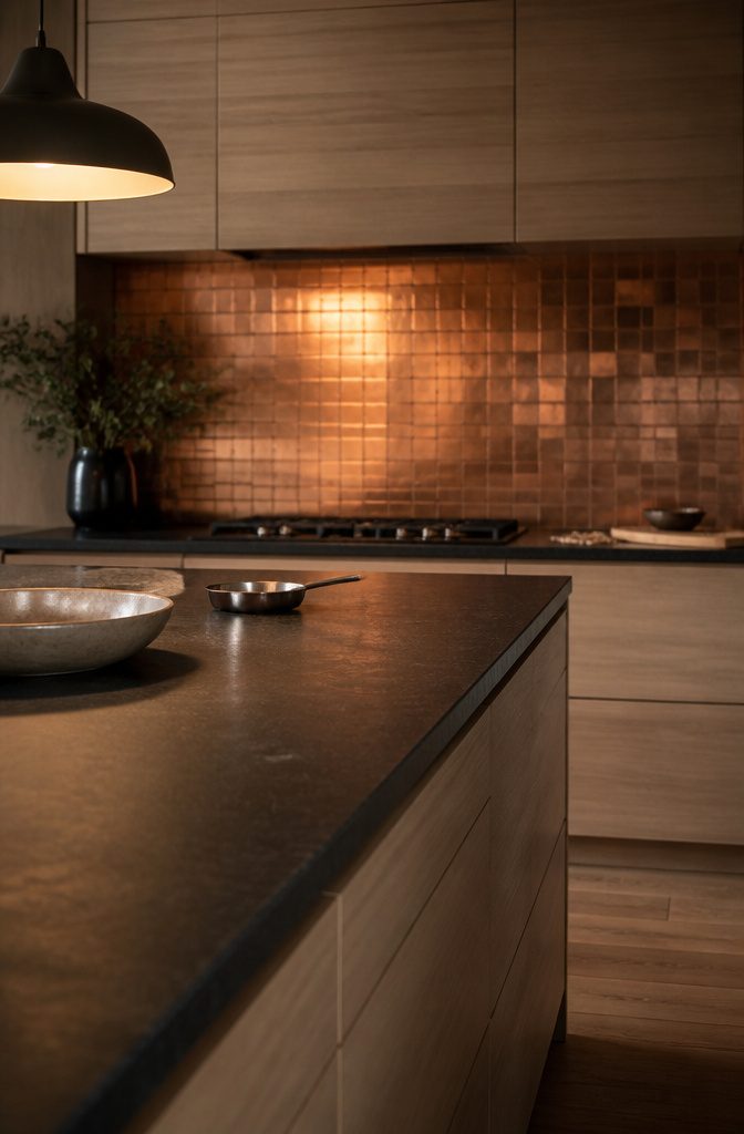
Brushed gold, copper, or stainless-steel finishes bring two moods at once: the warmth of metal tones and the clean, industrial edge of reflective surfaces.
I keep coming back to metallic tiles in kitchens where white feels too flat but the room can’t take on another bold color.
The metal catches light in a way ceramic and stone don’t, which makes the backsplash read as intentional without fighting for attention.
The finish you choose shifts the feel.
Brushed gold leans warm and pairs well with white oak or walnut. Copper does the same but ages over time, which some people want and others don’t.
Stainless steel stays cooler and works better in modern or industrial layouts. All three are durable enough for high-traffic kitchens, so the decision comes down to how much warmth you want on the wall.
9. Wood-Look Porcelain
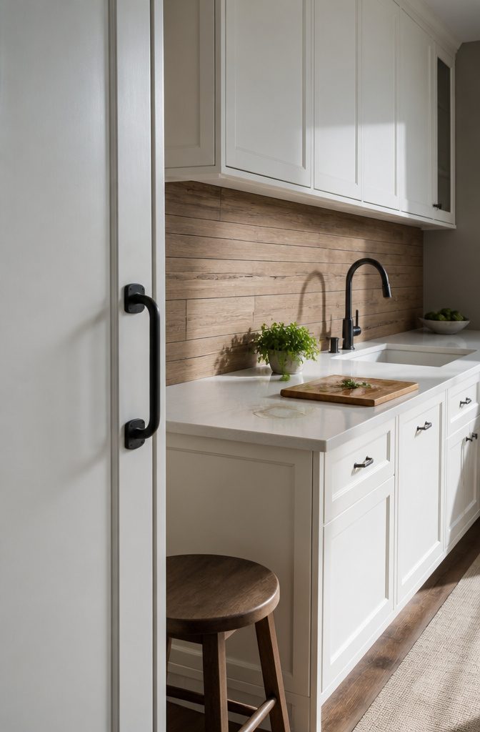
Wood-look porcelain gives you the warmth of timber without the maintenance that real wood demands in a kitchen.
The grain texture reads as authentic, but the surface resists stains and moisture the way glazed tile does—a practical trade for a backsplash that sits behind a cooktop or sink.
I’d pair it with black or brass hardware to pull in a contemporary farmhouse feel.
The combination keeps the space grounded without pushing it too rustic, and the metal finish you choose shifts the tone: black leans modern, brass brings in more warmth.
Either way, the wood texture softens a white kitchen that might otherwise feel sterile, and the porcelain construction means you’re not dealing with sealing or refinishing years down the line.
10. Large-Format Minimalist Slabs
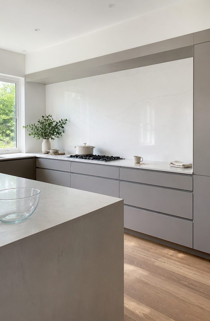
Large-Format Minimalist Slabs
Porcelain or ceramic slabs sized large enough that grout lines nearly disappear give a white kitchen backsplash a unified look that reads modern without busy pattern.
The slabs often carry faux marble or concrete finishes with subtle veining, which keeps the wall interesting at arm’s length but calm when you step back.
I prefer this option when the kitchen already has plenty going on in the cabinetry or countertop, because the backsplash recedes instead of competing.
Pairing large-format slabs with minimalist cabinetry pushes the cohesive look further. Flat-panel doors, handleless edges, and a white or light-gray cabinet finish let the backsplash do its quiet work without adding visual weight.
The bonus is spatial: a backsplash with fewer grout lines makes a small kitchen feel larger, since the eye doesn’t stop and start on tile breaks every few inches.
11. 3D Textured Tile
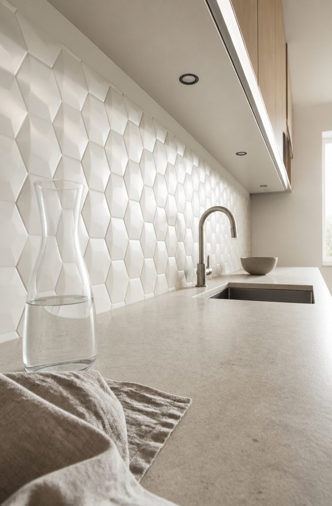
Raised geometric patterns or patterned surfaces give a white backsplash sculptural depth that flat tile cannot match. The pattern catches light differently through the day, so the backsplash reads as its own layer instead of a backdrop.
I find the effect works best when the rest of the kitchen stays simple—white or light countertops, minimal upper cabinets, and hardware that doesn’t compete.
If you add three-dimensional texture to a backsplash and then layer on bold grout or high-contrast shelving, the room gets noisy fast.
The contemporary look comes from the geometry itself, not from busy color or decoration.
A repeated hexagonal face or a wave that runs horizontally gives you visual interest without feeling busy, because it’s still monochrome. That restraint is what keeps it modern instead of decorative in the traditional sense.
12. White Brick
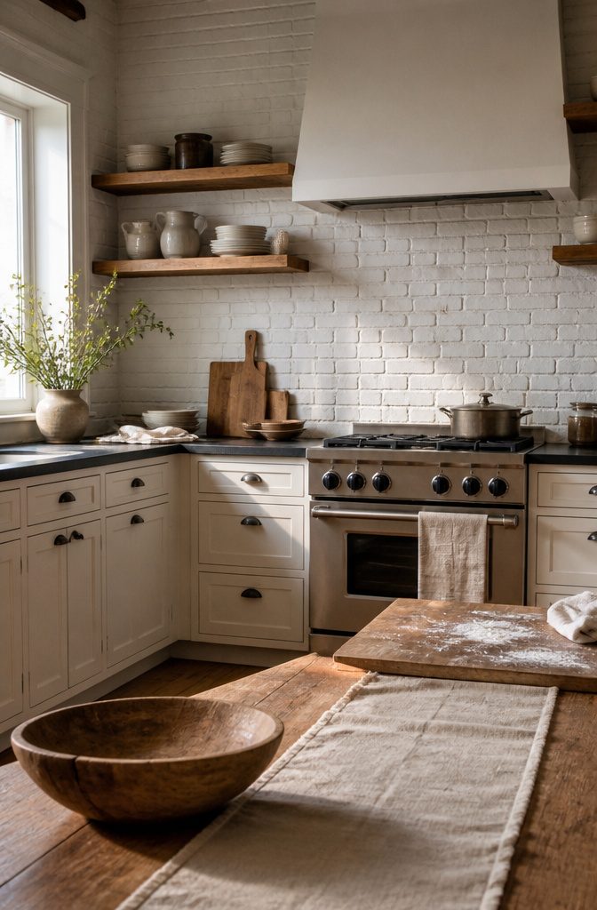
Brick brings structural texture and depth that work across more styles than most backsplashes can claim.
The look works in rustic kitchens with exposed materials, industrial spaces with raw finishes, traditional designs that want warmth without pattern, and farmhouse kitchens built around worn-in character.
What makes it adaptable is the edge: brick reads as a building material first, which gives it weight other white surfaces don’t carry.
The white finish softens that industrial backbone enough to keep the kitchen from feeling too warehouse-hard, but the texture still shows through. I’d use it where you want the backsplash to add dimension without introducing color or busy tile work.
It pairs well with wood tones and works especially well in kitchens where the cabinets are clean-lined and need something with more presence behind them.
Grout lines and texture collect more than a smooth slab would, so expect to wipe it down more often.
13. White Fish-Scale Tile
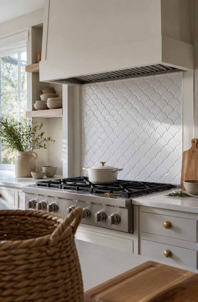
White fish-scale tile brings the rounded, overlapping shape of ocean scales to your backsplash, and that mermaid-inspired look makes a statement whether you go full-wall or keep it to a small zone behind the range.
The pattern reads aquatic without tipping into theme-park territory, especially when you keep the grout tight and the color pure white.
I use fish scale when the kitchen already leans coastal or when a client wants one distinctive surface in an otherwise simple space.
It works best where you can see the whole field at once: a short backsplash over a narrow counter, or a feature panel that stops at the hood.
If you carry the pattern across too many walls or break it up with windows and outlets, the effect scatters and the tile starts to look busy instead of intentional.
The shape also means more grout lines than subway, so plan for slightly longer install time and more frequent cleaning if you cook with oil.
14. White Arabesque Tile
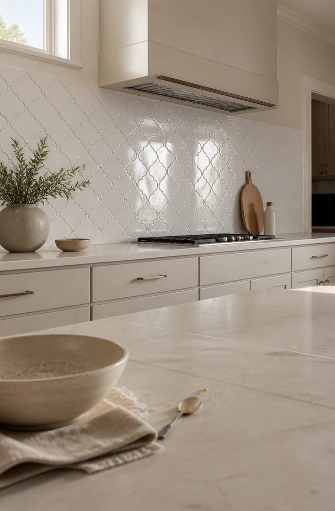
The ornate, curving pattern brings a sophisticated, grand feel that reads formal without tipping into fussy. The design pulls from Middle Eastern art, and the effect in a white kitchen is that the backsplash becomes the detail people notice first.
Each tile curves and interlocks, so the pattern moves across the wall rather than sitting in rigid rows.
I like arabesque tile best in kitchens where the cabinets and countertops are plain, because the backsplash needs space to stand out. If everything else competes for attention, the pattern gets lost.
Installation takes longer. The curves mean more cuts and more careful alignment, so labor runs higher than it would for subway or straight-set tile.
Matching the Backsplash to Your Kitchen Style
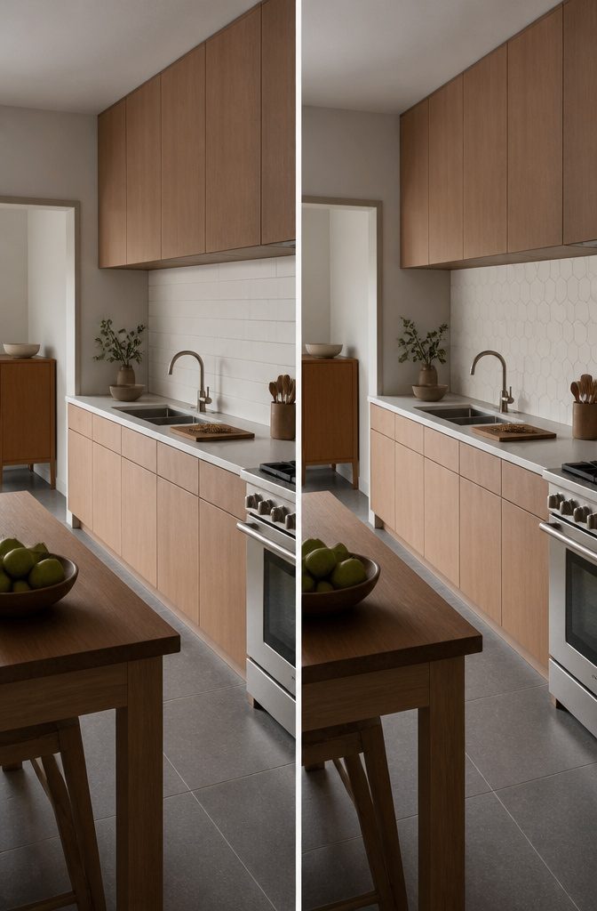
A white backsplash doesn’t need to match the kitchen exactly, but it needs to answer to the cabinets and countertop it sits between.
If you’re working with white cabinets and white counters, the backsplash is where you add the detail that keeps the room from reading flat.
Herringbone or hexagon patterns bring texture without color, and they work especially well when the rest of the design is straightforward.
The pattern does the work. If your cabinets have wood tones or your countertop carries veining, a simpler backsplash like stacked subway tile keeps the room balanced instead of competing for attention.
Brick-style white backsplash fits farmhouse and industrial kitchens because the edge and structure read rustic without looking precious.
The material carries character on its own, so it doesn’t need much around it. For minimalist or modern spaces, large-format slabs or geometric patterns hold the clean lines better than anything with visible grout joints every few inches.
One thread on Reddit showed someone choosing between herringbone, hexagon, and plain subway for a kitchen with wood cabinets, white quartz with veining, and gray floors.
Several responses pointed out that herringbone and hexagon are busy patterns, and the room already had enough movement in the countertop and floor. The suggestion was to go simpler or pick something clearly modern rather than layering pattern on pattern.
The style question comes down to whether the backsplash should blend or contrast.
Matching the backsplash tone to the cabinets keeps the room cohesive and calm. Contrast pulls the eye and defines the work zone, but it only works if the rest of the finishes support it.
How White Backsplash Changes the Room
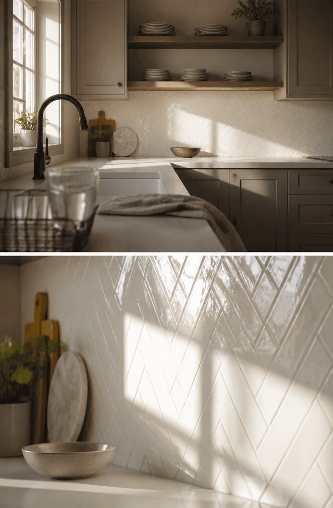
A white backsplash affects how the whole kitchen reads. White reflects light, so a room that felt dim in the morning picks up whatever sun comes through the window and sends it back across the counters.
The effect is strongest on glossy tile—subway, glass, anything with a surface that catches rather than absorbs.
White by itself can feel flat, which is where texture and pattern come in. Mosaic tile, herringbone, anything with dimensionality, adds depth without introducing new colors.
The pattern creates shadows that shift as you move through the room, so the wall reads as more than a single plane. That balance between simplicity and detail is what keeps a white kitchen from feeling sterile.
For personality, white works best when the material itself carries some variation.
Marble brings gray veining, mosaic brings fractured geometry, three-dimensional tile brings actual relief. The backsplash becomes the surface where character lives, especially when cabinets, counters, and walls are all neutral.
What Each Material Asks For
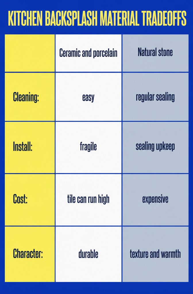
Ceramic and porcelain are durable and easy to clean, but they’re fragile during install and the tile itself can run high.
Natural stone brings texture and warmth, though it’s expensive and requires regular sealing to stay stain-resistant. I lean toward it when the kitchen has good light and the budget allows for upkeep.
Glass tiles look sleek and modern, but they show fingerprints fast and need more frequent cleaning than other materials.
Quartz is non-porous and stain-resistant, which makes it a practical middle ground between marble’s look and a tighter budget. It holds up well against spills and doesn’t need sealing.
Peel-and-stick tiles are the cheapest and fastest to install, though they’re less durable than ceramic or stone.
I use them in rentals or short-term spaces where the install matters more than longevity. They’re obviously not premium, but for a weekend project on a tight budget, they work.
Frequently Asked Questions
Is a white backsplash a good idea?
Yes, white backsplash works across nearly every kitchen style and reflects light back into the room, which makes smaller spaces feel more open.
The neutral base pairs with any cabinet color or countertop without competing for attention, and you can add detail through pattern or texture rather than color.
White by itself can feel flat, so most successful white backsplashes rely on geometry, veining, or three-dimensional relief to keep the wall interesting.
What is the most popular backsplash for a white kitchen?
White marble with gray veining is the most popular choice for white kitchens, especially when paired with white cabinets.
The natural stone brings sophistication and inherent sparkle that tile doesn’t match, and the veining provides contrast without introducing a second color.
White subway tile runs a close second for its reliability and clean horizontal lines that work in nearly every kitchen.
What are the best materials for a white kitchen backsplash?
Ceramic and porcelain are durable and easy to clean, making them the most common choice.
Natural stone like marble brings more warmth and texture but requires regular sealing to resist stains. Glass tile reflects the most light and suits small or dim kitchens, while quartz is non-porous and stain-resistant without the maintenance stone demands.
Peel-and-stick tiles are the cheapest and fastest to install but less durable, so they work best in rentals or short-term spaces.
How do I clean a white kitchen backsplash?
Most ceramic, porcelain, and glass backsplashes wipe clean with a damp cloth or mild cleaner. Natural stone like marble needs sealing to protect against stains and may require more intensive cleaning depending on the finish.
Textured surfaces like brick or three-dimensional tile collect more than smooth slabs, so count on wiping them down more often if you cook with oil.
Why is white a good color for a kitchen backsplash?
White reflects light, so it brightens the room and makes small kitchens feel larger.
The color pairs with any cabinet finish or countertop material without introducing a second tone you need to build around, and it doesn’t date itself the way bold patterns can.
White also serves as a neutral backdrop that lets you add personality through tile shape, texture, or material rather than relying on color.
Should the backsplash be lighter or darker than the cabinets?
Matching the backsplash tone to the cabinets keeps the room cohesive and calm, while contrast pulls the eye and defines the work zone.
If your cabinets and countertops are both white, the backsplash is where you add detail through pattern or texture to keep the room from reading flat.
If your countertop already carries veining or your cabinets have wood tones, a simpler backsplash like stacked subway tile keeps the room balanced instead of layering pattern on pattern.
What is a cheap backsplash?
Peel-and-stick tiles are the cheapest and fastest option, suitable for rentals or short-term spaces where install speed matters more than longevity.
Standard ceramic subway tile is affordable while still durable and easy to maintain. Glass and natural stone run higher, and arabesque or fish-scale patterns cost more in labor because the curves require more cuts and careful alignment during install.